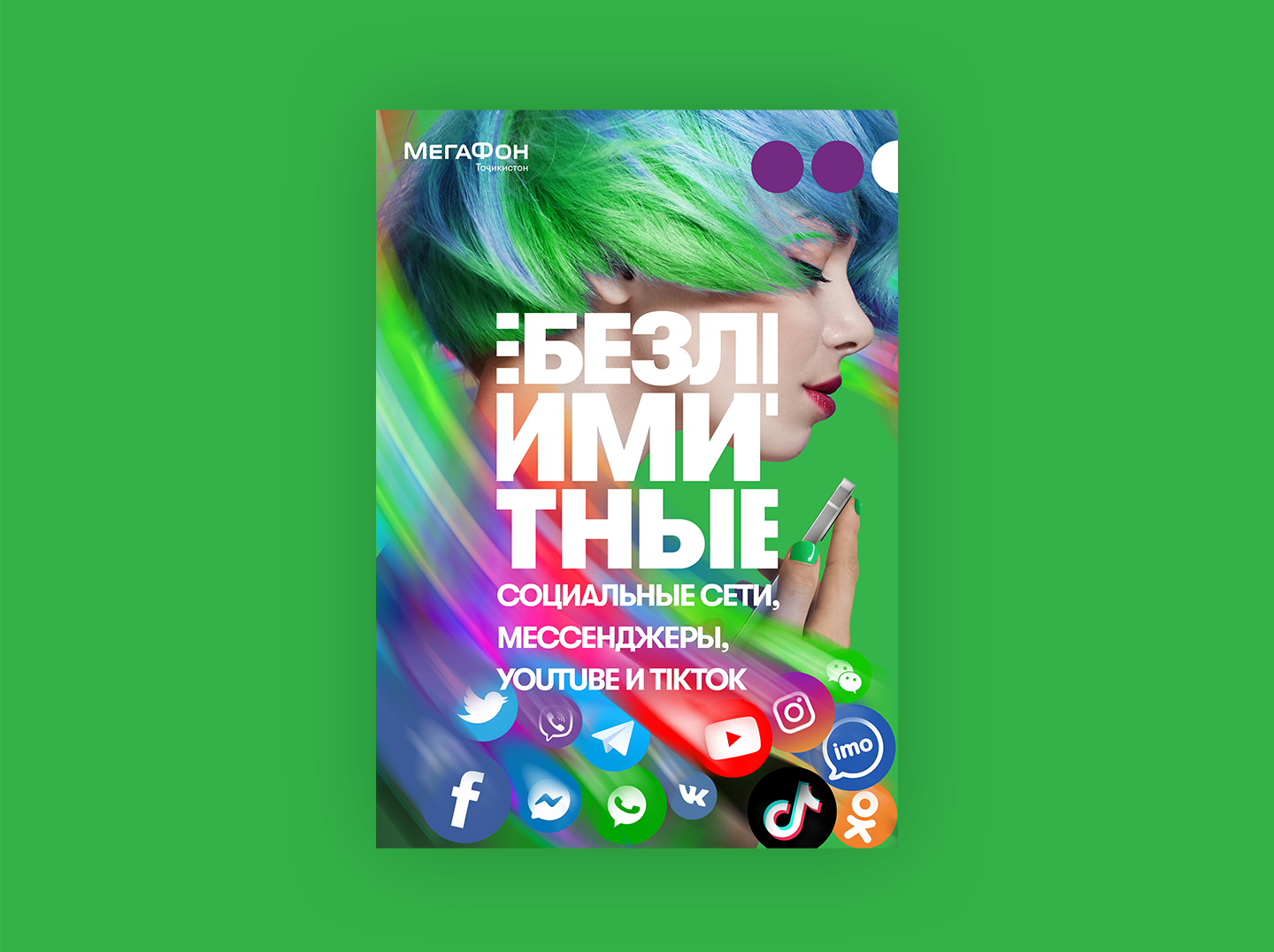
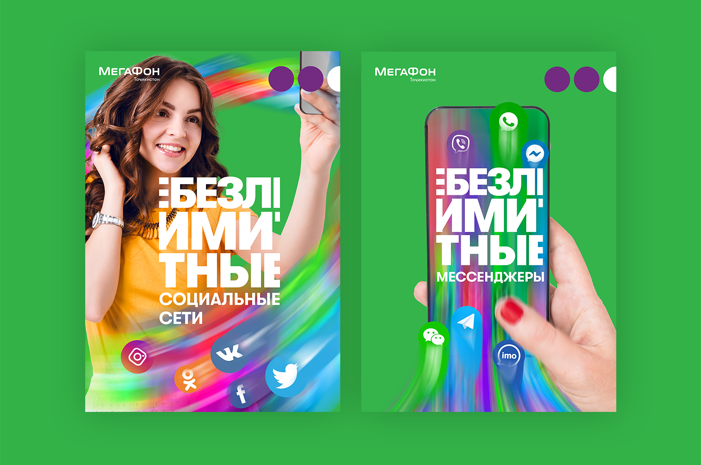
The "UNLIMITED"
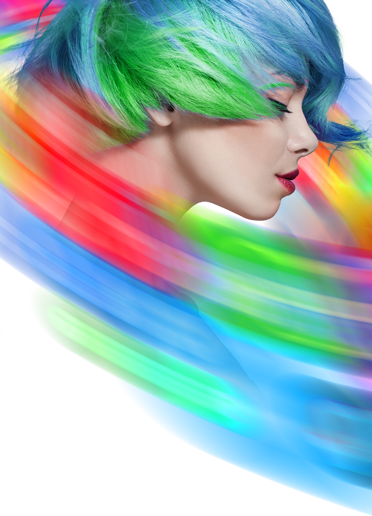
The local internet provider wanted me to visualize their new internet tariff that was about unlimited interned for messengers, social media and YouTube. The whole concept revolves around the theme of infinity and unlimited possibilities. I wanted to find a way to visually capture that idea right in the title. The word БЕЗЛИМИТНЫЕ translates from Russian as Unlimited. In the end, it transformed into an endless spinning ribbon, as shown in the animation.
The local internet provider wanted me to visualize their new internet tariff that was about unlimited interned for messengers, social media and YouTube. The whole concept revolves around the theme of infinity and unlimited possibilities. I wanted to find a way to visually capture that idea right in the title. The word БЕЗЛИМИТНЫЕ translates from Russian as Unlimited. In the end, it transformed into an endless spinning ribbon, as shown in the animation.

In the static version, I left fragments of the letters to visually link the beginning and end of the title. While this approach made the text slightly harder to read, the emphasis was placed on visual storytelling and symbolism rather than straightforward legibility

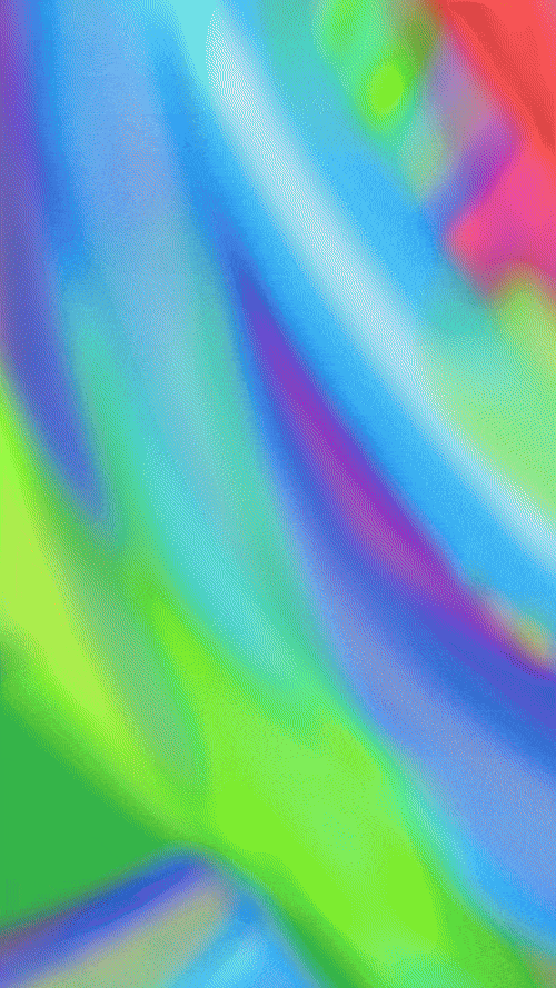
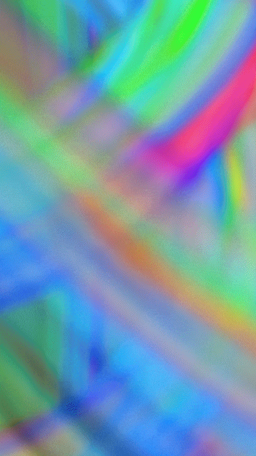
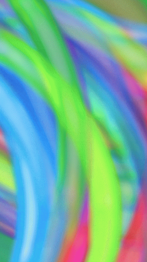
How did I create that colorful infinity symbol effect and bring it to life? I could have simply thrown together a random abstract rainbow blur—but instead, I chose a more deliberate approach. I arranged all the app icons into the shape of an infinity sign and set them in rapid motion, until they fused into a vibrant, luminous beam of color.
The concept was all about speed, aiming for a sense of pure dynamism. As expected, animating the entire piece came with its own challenges. To achieve the effect, I literally spun the app icons at high velocity, creating a vibrant trail that captured their motion in a colorful streak.
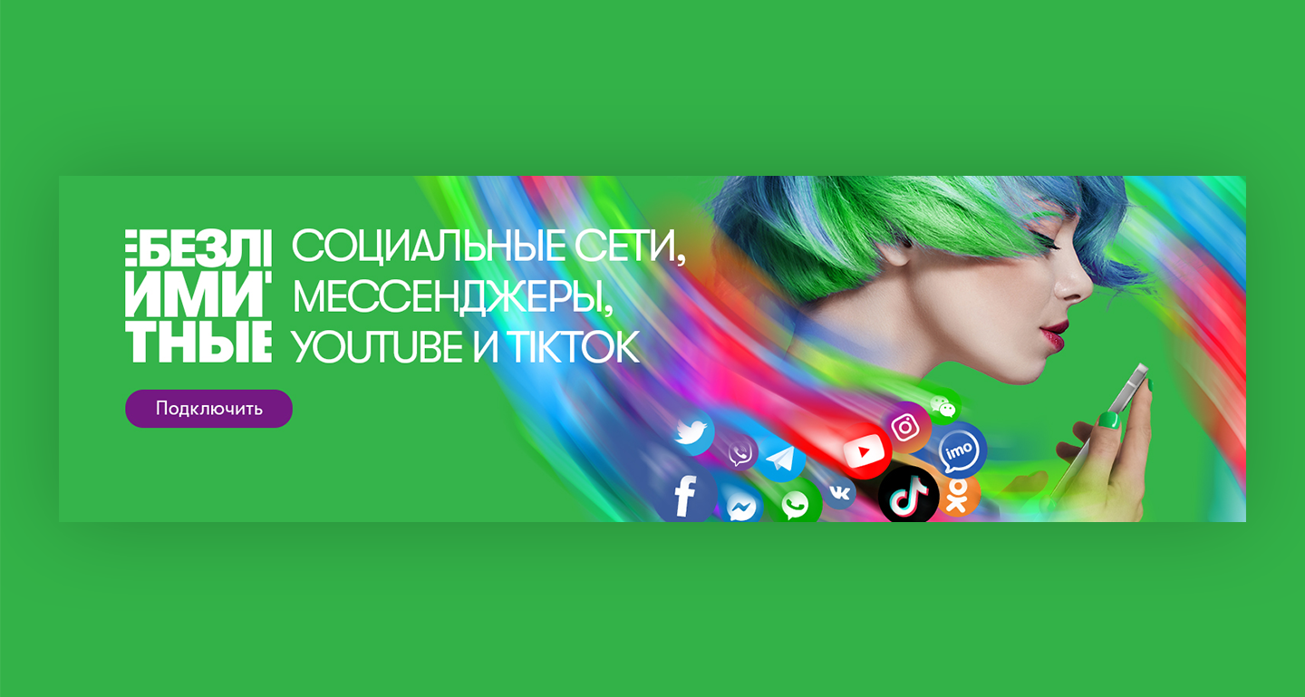
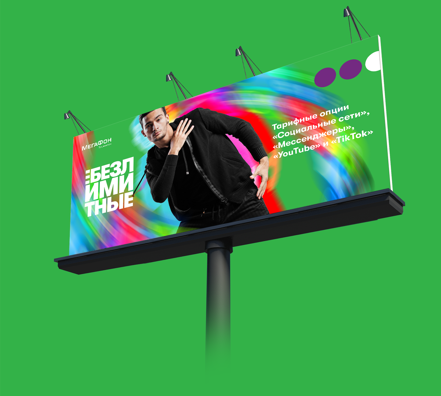
Once the concept was finalized, I extended the idea across other materials.
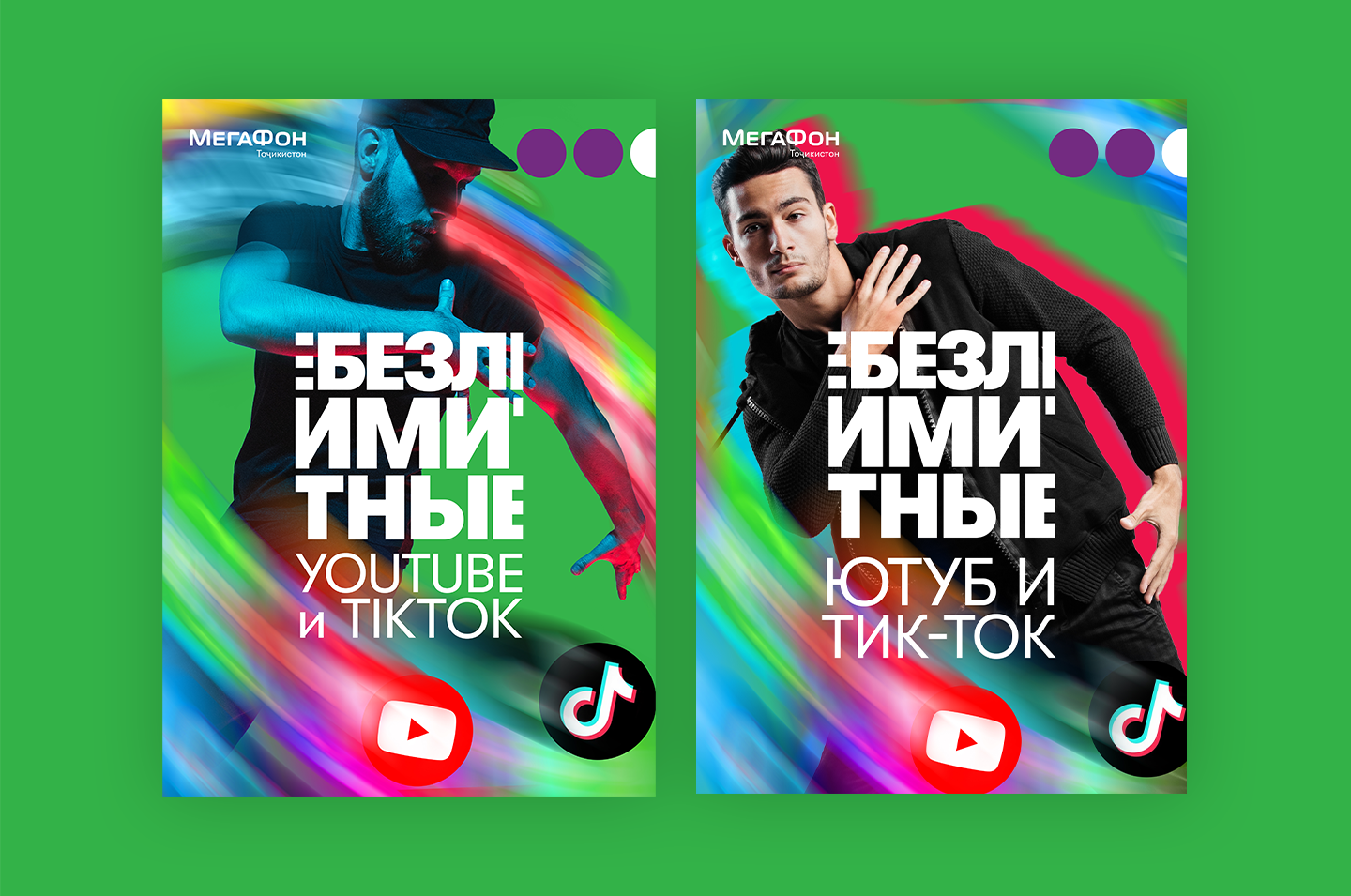
And of course I animated all of them too. Because they mostly were posted on social medias they were originally adapted to vertical format.
Here are the videos showing how it actually appeared on social media. The vertical and horizontal versions are nearly identical, so depending on your device, you can watch either format.
Thank you for watching