I almost said “no” to this project. At first, it seemed like just another routine, boring gig—but the amazing people on the team quickly changed my mind. I had no idea a local project could turn into something global.
This is one of those rare projects that completely reshaped me and the way I approach design.
It split my creative life into “before” and “after.” And nope, that’s not clickbait.
One day, I got a call from Kuma (Kumushoi Murtazakulova), a UNICEF worker. She told me UNICEF was celebrating its 75th anniversary, and the local office in Tajikistan wanted someone to design merch with a traditional, local twist.
At the time, merch design wasn’t really my thing—I was more into big, complex projects that told stories. But thankfully, my grumpy side didn’t win, and Kuma managed to convince me to meet them and hear them out.
I showed up to the meeting and met Kuma and Umeda (Umeda Fazylova). We had a great chat, and I could instantly feel their passion for creating something fun and memorable.
Before I knew it, I was hooked—in the best way possible.
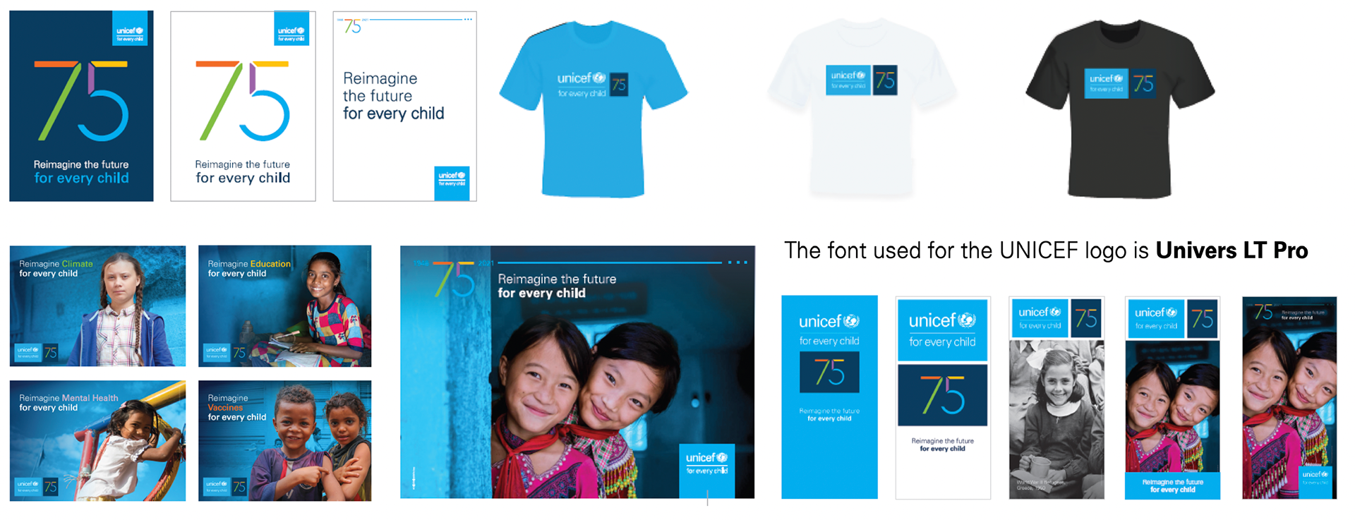
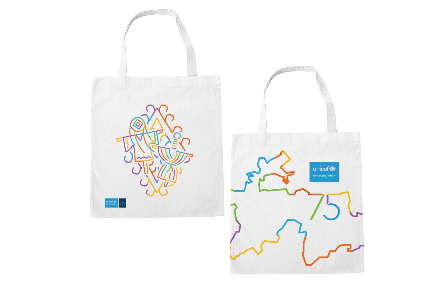
The whole UNICEF 75th Anniversary Visual Identity Guideline was already in place before I joined, so my job was to study it and figure out how to turn it into something that worked for local merch. I had to come up with more than just slapping a logo on things—I needed extra visual elements to make it truly ours.
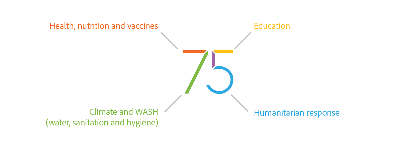
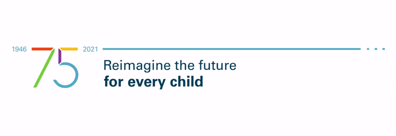
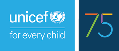
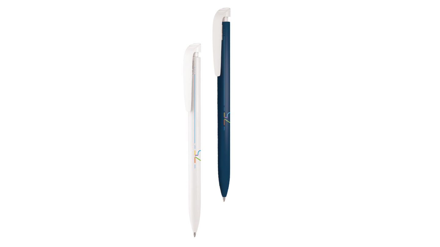
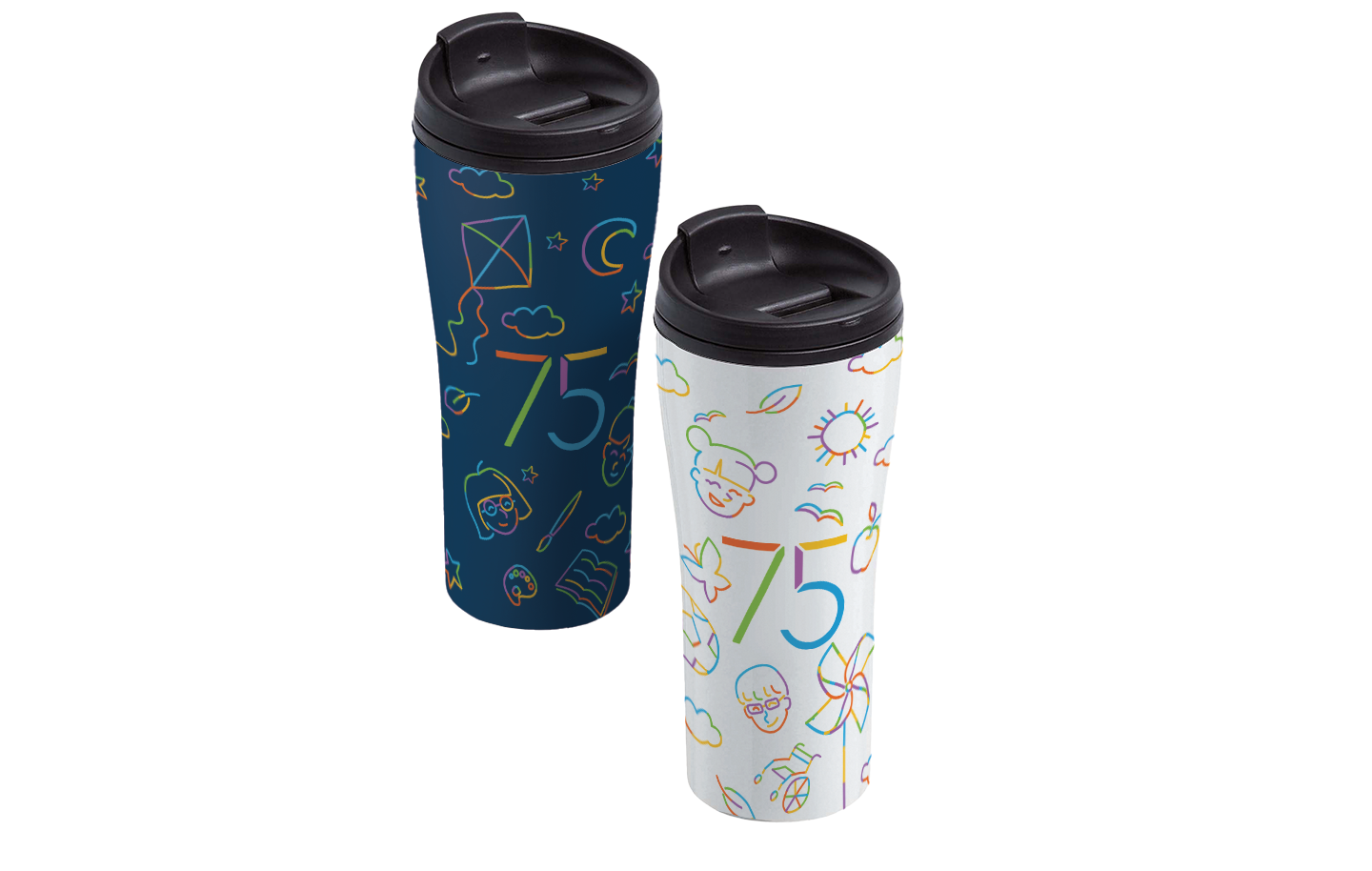
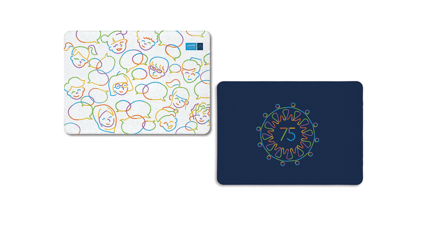
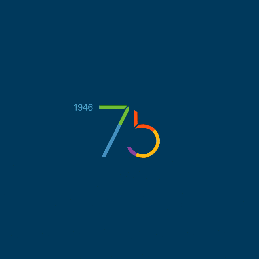
Each color in the number “75” had its own meaning, and I combined that with a line representing UNICEF’s journey from 1946 to 2021.
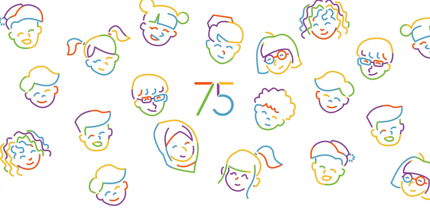
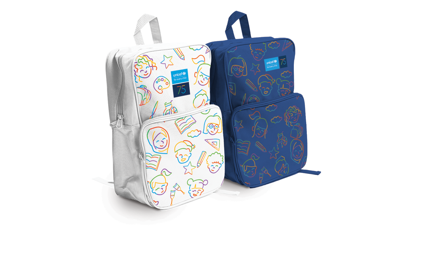
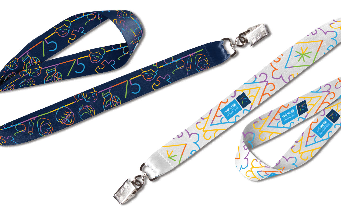
But the most important part? This was all about kids—their rights, health, and happiness. Luckily, my inner child is still alive and kicking, so it helped me sprinkle a bit of playful, childlike energy into the project.
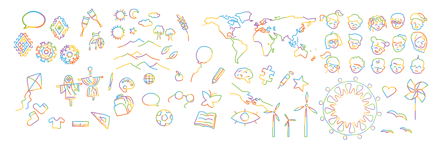
So I started sketching all kinds of shapes and objects that captured the ideas I had about this theme. I wanted it to feel childish, colorful, and full of optimism. After all, that’s what an ideal childhood is all about… right?
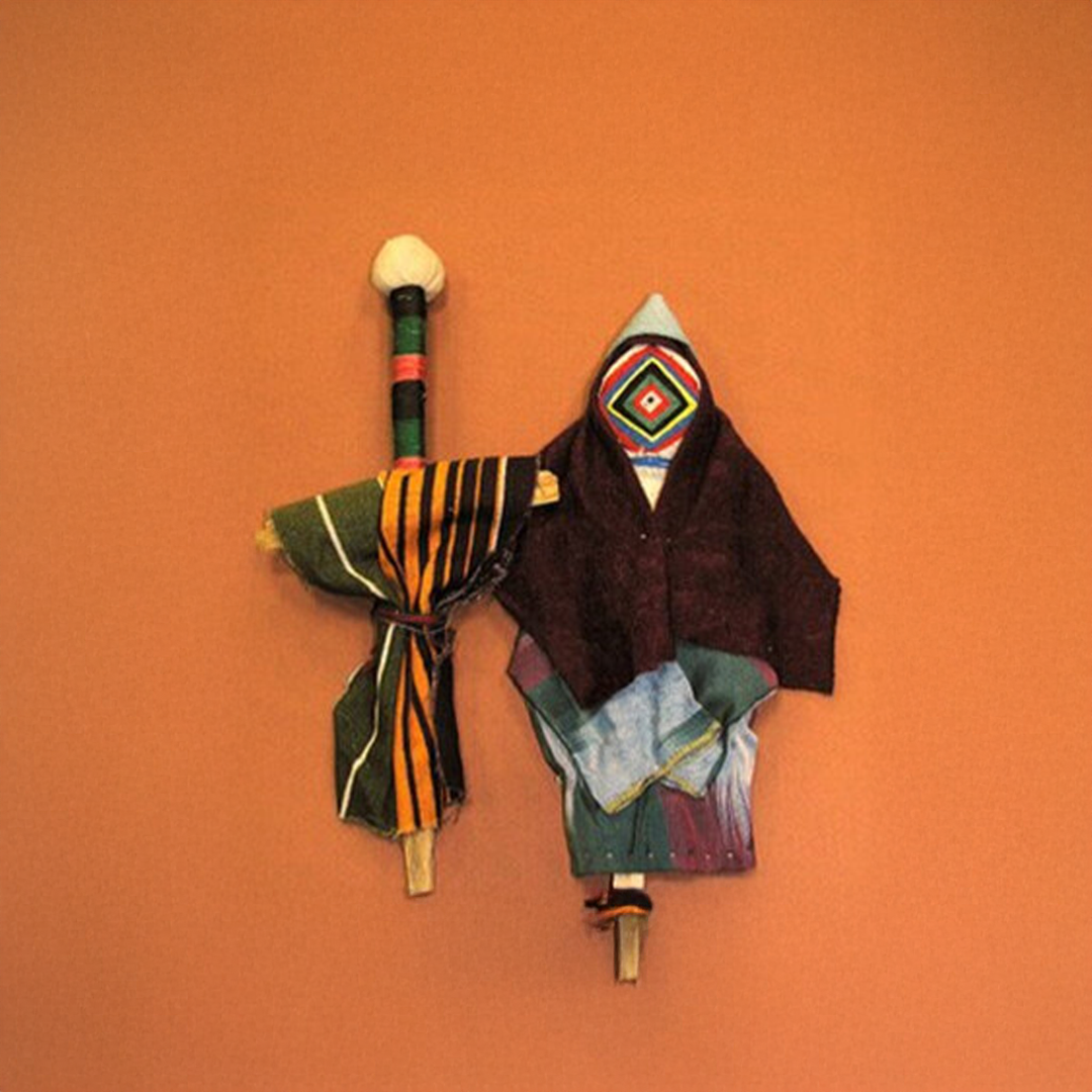
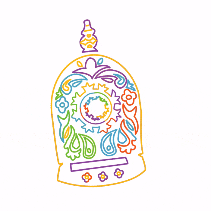
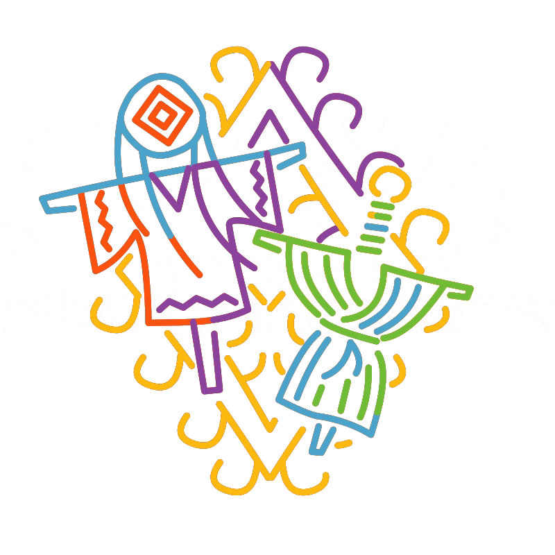
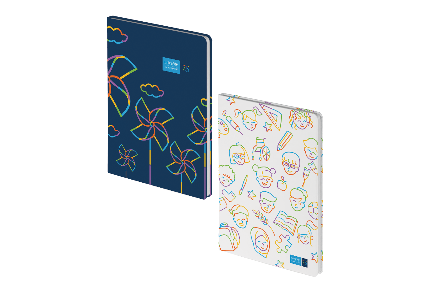
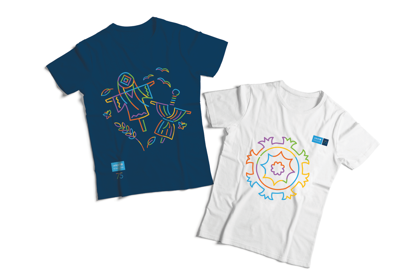
Let’s not forget—I also had to weave in some traditional Tajik visual elements. So I gathered everything connected to childhood, simplified it, and turned it into illustrations.
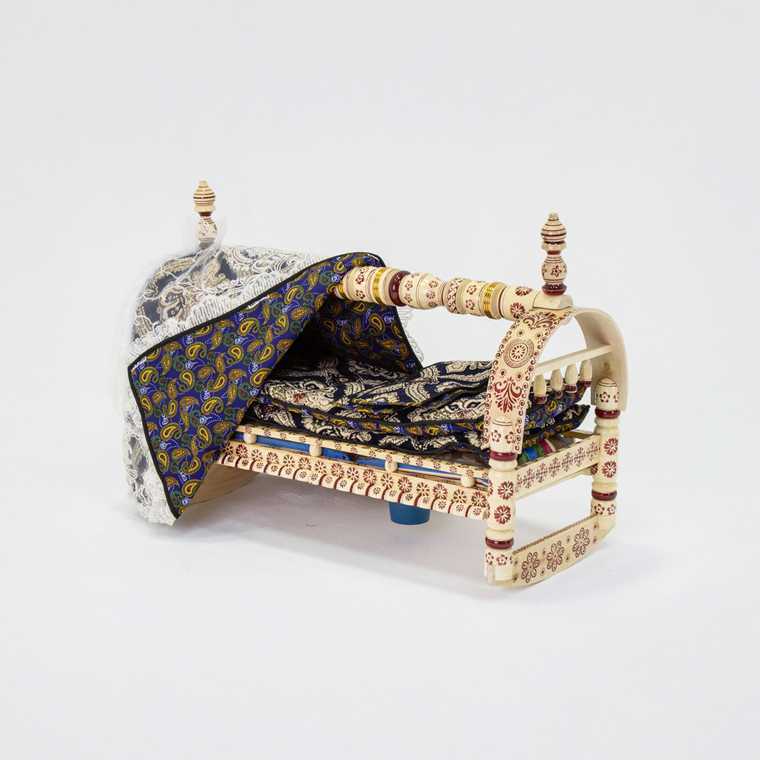
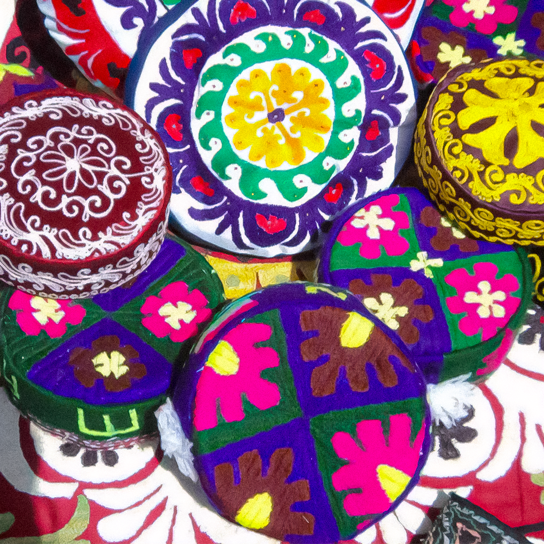
For example, in the first image at the top, you can see old traditional dolls called Lukhtak. The second image shows a traditional cradle, the Gahvora. And the third features local skullcaps decorated with traditional shapes and patterns. Around here, everyone has a special connection to these objects—especially from their early childhood.
Once all the illustrations were ready, I just dropped them into the mockups and started seeing everything come to life.
I was pretty happy with the results—I felt like they captured everything we needed.
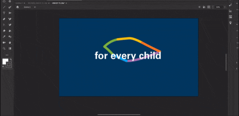
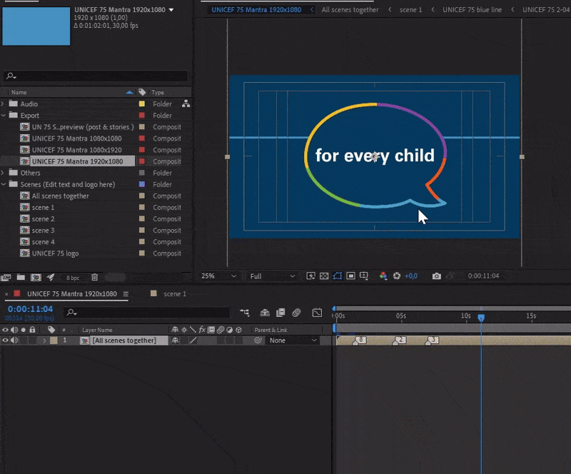
I was all set to present the project to the client, but while going through the brand guidelines, I stumbled across something… the UNICEF Mantra!
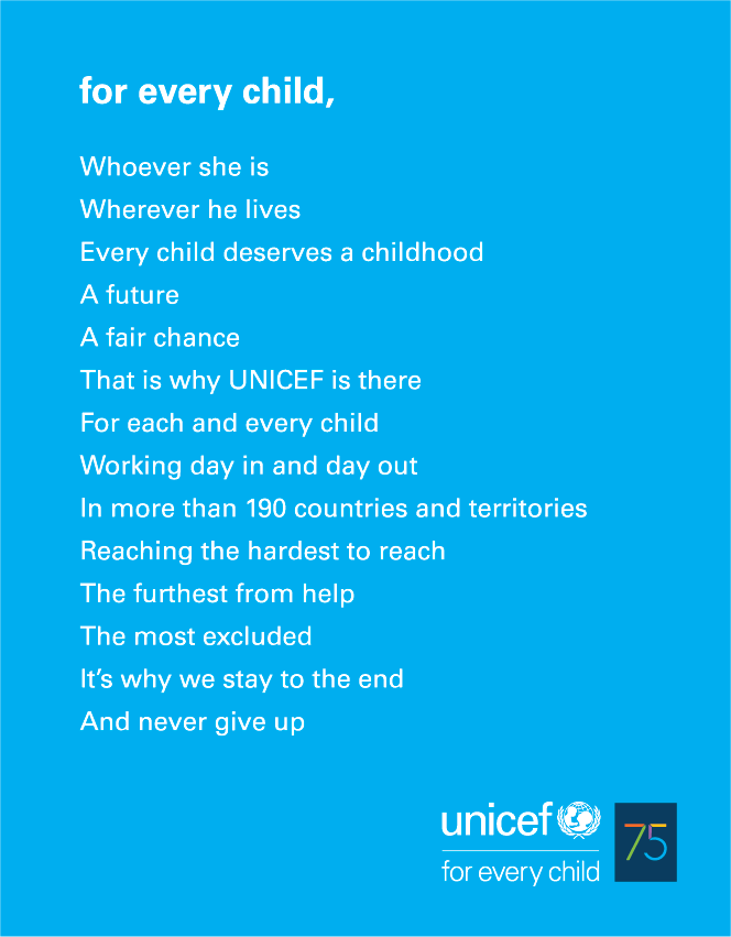
This little piece of text on a blue background changed everything. It was simple, inspiring, and—most importantly—it perfectly captured UNICEF’s mission. I was instantly fired up to do something with it. I remember pacing back and forth in my room, completely obsessed, trying to figure out how to bring it to life visually. I even searched the web to see if anyone had already worked with the “Mantra,” but to my surprise, I found nothing. Which, honestly, felt like great news.
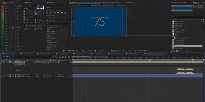
I only had a couple of days before the deadline, so I jumped straight into making an animation. My goal was to create something for the UNICEF team themselves—a reminder of what they’re fighting for, something to inspire them to do their work with even more passion.
The deadline was tight, and animation wasn’t something they had asked for, so I was a bit worried they might think I was pushing something extra they didn’t want.
I built the animation as a timeline, showing UNICEF’s journey through the years. 4 main colors shaped simple visual metaphors, each one reflecting the meaning of the text.

While the merch with traditional patterns was aimed more at the local audience, the animation was something I wanted to feel global. The visual storytelling had to be clear and relatable to anyone—no matter where they were from.

In the end, the animation shows a child representing all the kids in the world—heading toward a bright future with optimism.
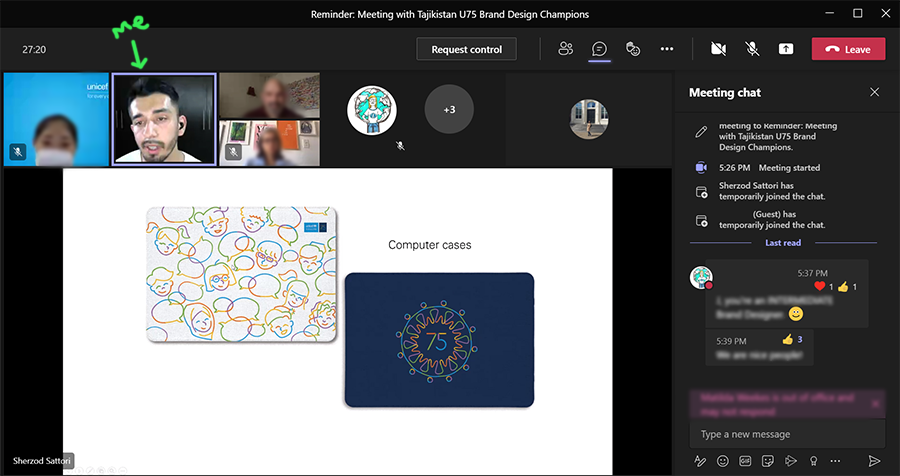
Then came the day I had to present the concept to the UNICEF team. I started with the merch, walking them through the whole idea. They liked it and thought that was it—but then I told them I had something else to share. After a short explanation, I played the UNICEF Mantra animation for them.
And here it is—watch it below.
After watching it, they started clapping and even asked me to play it again—that’s when I knew they really loved it. They approved the idea and accepted the animation with just a few minor tweaks.
While I was busy wrapping up the animation and merch, Umeda pushed the whole concept—including the animation—to senior management. And then, one day, she called me with news that left me stunned: UNICEF’s New York Headquarters had watched the animation and wanted me to present the the whole concept. Saying I was shocked would be an understatement.
A big part of it was also the music. The track Bigger Fish by Marc Robillard added so much emotion to the animation.
We had a video call where I basically walked them through the whole presentation again. I explained that the heart of this concept was simple: to unite all UNICEF workers around the world. It needed to feel emotional, something everyone could connect to. I also mentioned that I had designed it so it could be easily translated into any language—making it truly global. To unite everyone. Kind of like in comic books: “UNICEF, assemble!”
So they happily accepted the concept, and I set out to make the animation super simple—so anyone could easily edit the text. I even made a short tutorial video explaining how to do it.

I also created a bunch of other animated templates for both static and video content to make sure all visuals felt unified. On top of that, I prepared local and global merch.
Man, I was insanely productive during that time!
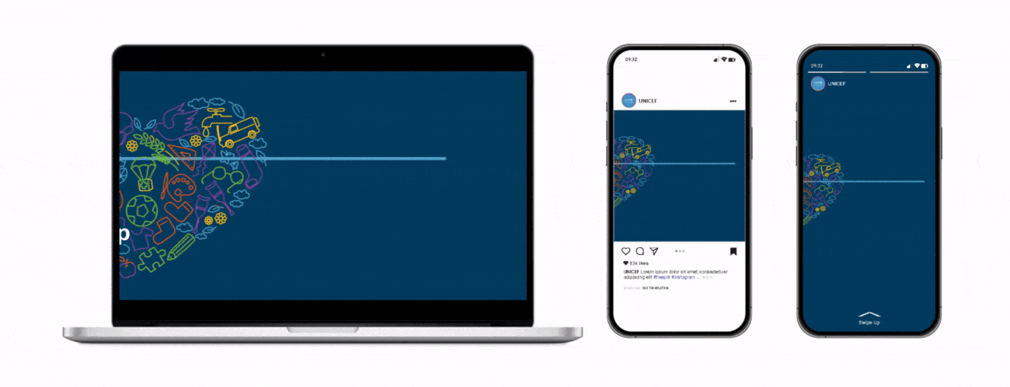
I designed the animation so it could adapt to any format. Plus, if you edit the text, it automatically updates across all three formats—so you don’t have to do it three times. I really wanted to make it as easy as possible for anyone to edit.
And then, the day of the celebration finally arrived.
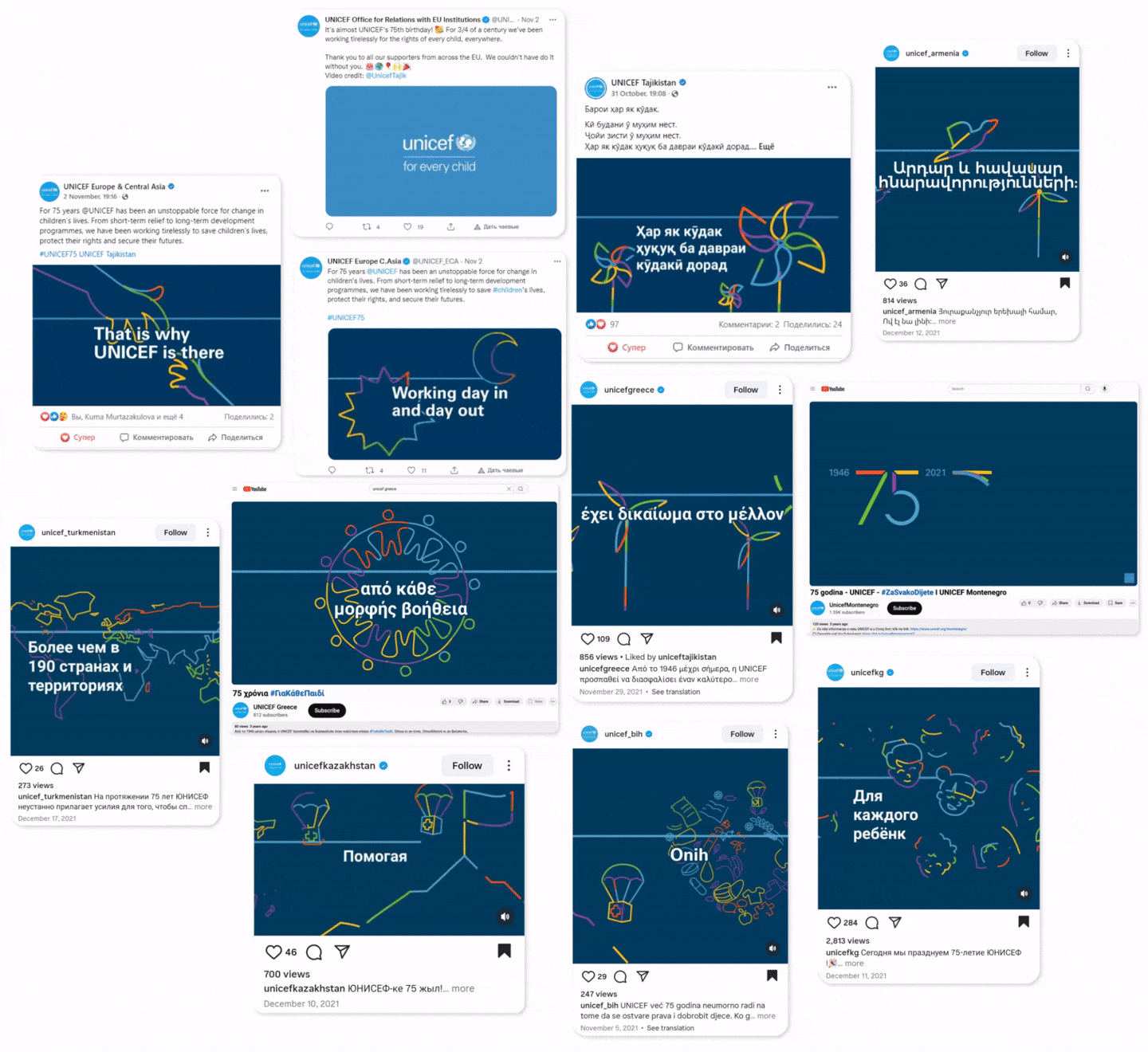
In the end, my animation was shared on several UNICEF social media pages—from multiple countries and in several languages. Seeing that was absolutely mind-blowing. It felt like such a uniting moment. What started as a simple local merch project had turned into a global UNICEF flashmob. But it wasn’t just me—there were amazing people whose passion sparked my interest in this project and helped push the concept further so it could be noticed.
As an artist, I learned to trust my instincts and always try to bring something extra to a project, beyond what was originally planned. I also learned to be more open to suggestions that I might have otherwise said no to.
What an amazing journey!