"Tech Jam is a large-scale event aimed at supporting the field of technology and innovation in the country. The event is one of the largest IT forums in Tajikistan. Tech Jam provides young people with the opportunity to interact with speakers and improve their knowledge in the relevant field."
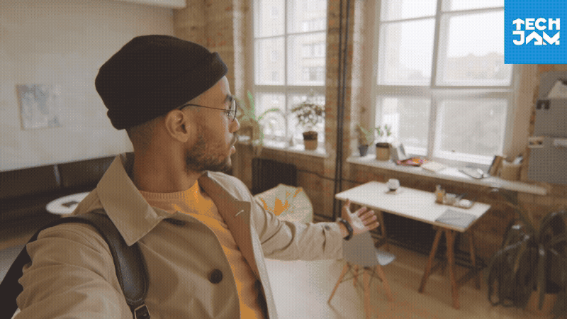
Hi! This is me, having a speech about how I designed the visual identity for Tech Jam — at Tech Jam itself. Not for the first time, either.
By this point, I had already gained experience designing identities for several large events and festivals, but this one was a different kind of challenge. Why? Because I was obsessed with the idea of making the visuals as dynamic as possible — and I only had a week to come up with the concept and present it to the client.
So, as you might’ve guessed, developing a concept for a major festival in just 4–5 days and animating the whole thing was insane… but I managed to pull it off. Sweet sleepless night.
Scroll down to see what I presented to the client at the end of that week.
So why did I decide to make everything dynamic?
Because the IT industry is one of the most fast-moving and constantly evolving industries out there. It never stands still — and I wanted to reflect exactly that. The client also asked us to focus on IT and convey a sense of scale and ambition. The main audience was young people aged 16–25 — ambitious, full of energy, and not yet disappointed by life.
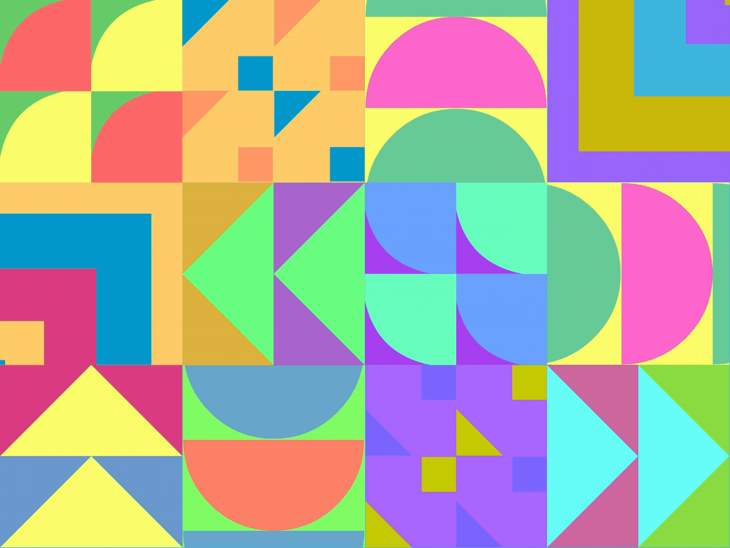
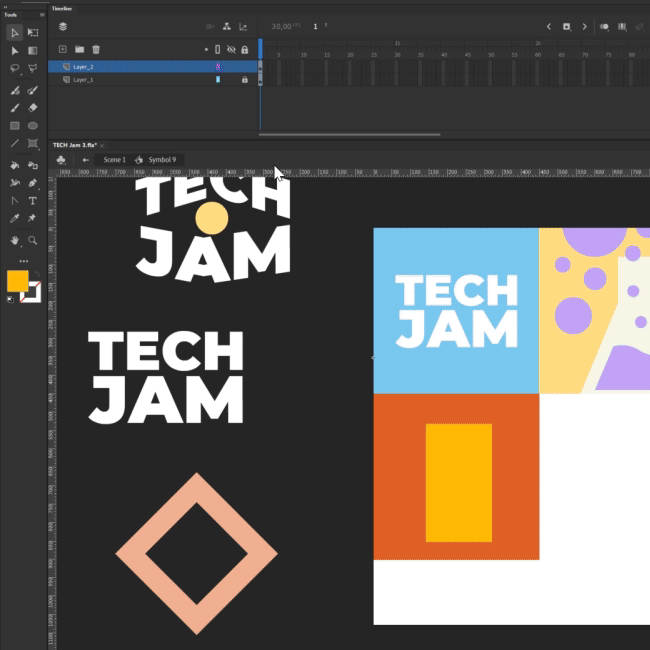
The logo itself was the easiest part. I wanted it to be relatively simple and not overloaded with colors, so it wouldn’t clash with other icons. This whole project is about moving forward — and I think that comes through clearly in the design.
Each icon animation on its own is pretty simple, but when combined, they create something that looks much more complex — in a good way.
As we know, the IT industry touches many different fields, and these icons represent that idea—simple, colorful, and easy to understand.
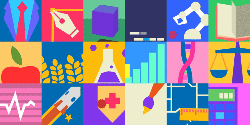
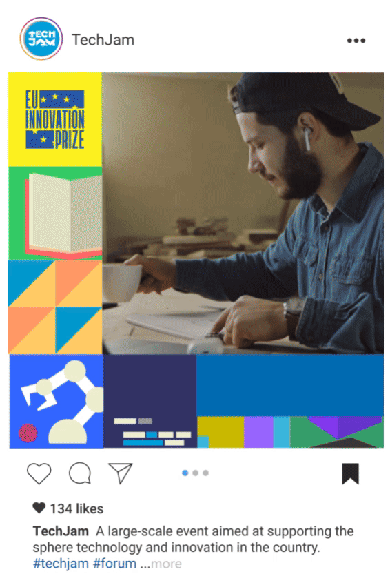
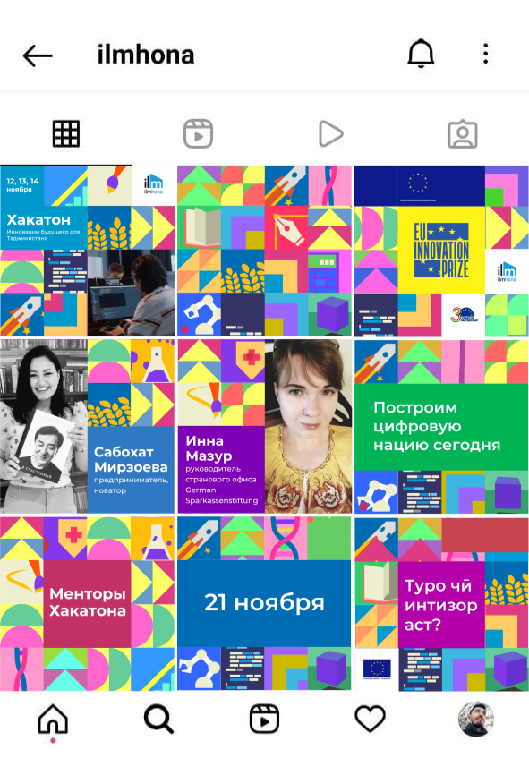
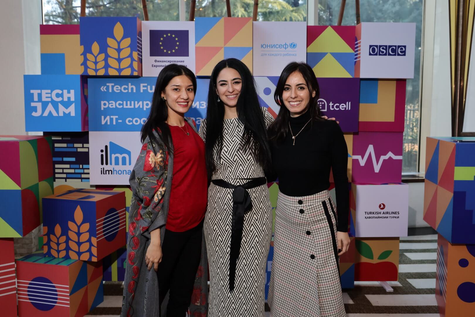
The idea of designing all the elements in a box shape gave me a lot of flexibility — it fit seamlessly into every format. So I started designing the posts like LEGO bricks — modular, playful, and made to fit together perfectly.
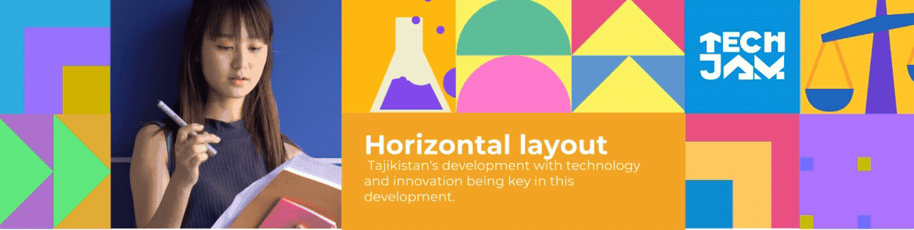
This visual identity fits perfectly with every social media post aspect ratio, so people can appreciate our posts even while doomscrolling.
The plan was for all the posts to align perfectly and form a seamless pattern. That was before Instagram changed the grid layout to rectangles — and frustrated a lot of perfectionists who had carefully crafted their grids. Oops!
I also started creating templates for video content. As I mentioned, the boxy icons fit everywhere — thankfully, every screen is rectangular too.
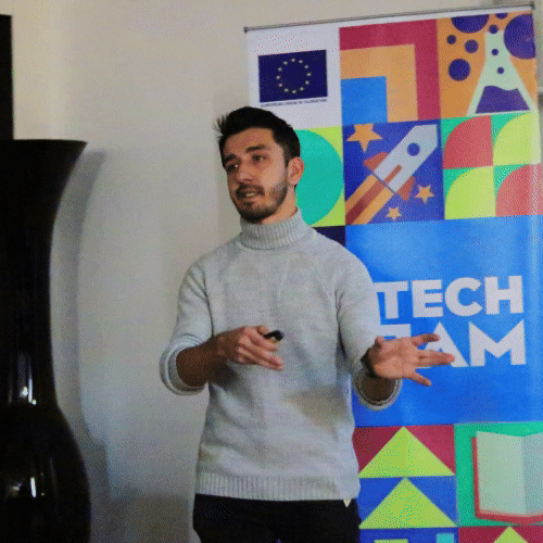
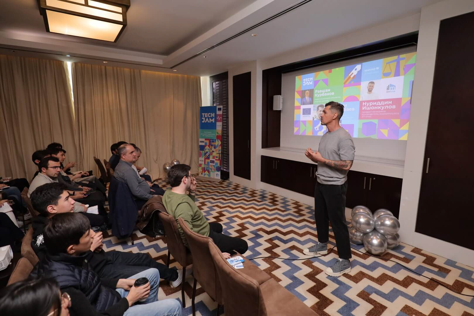
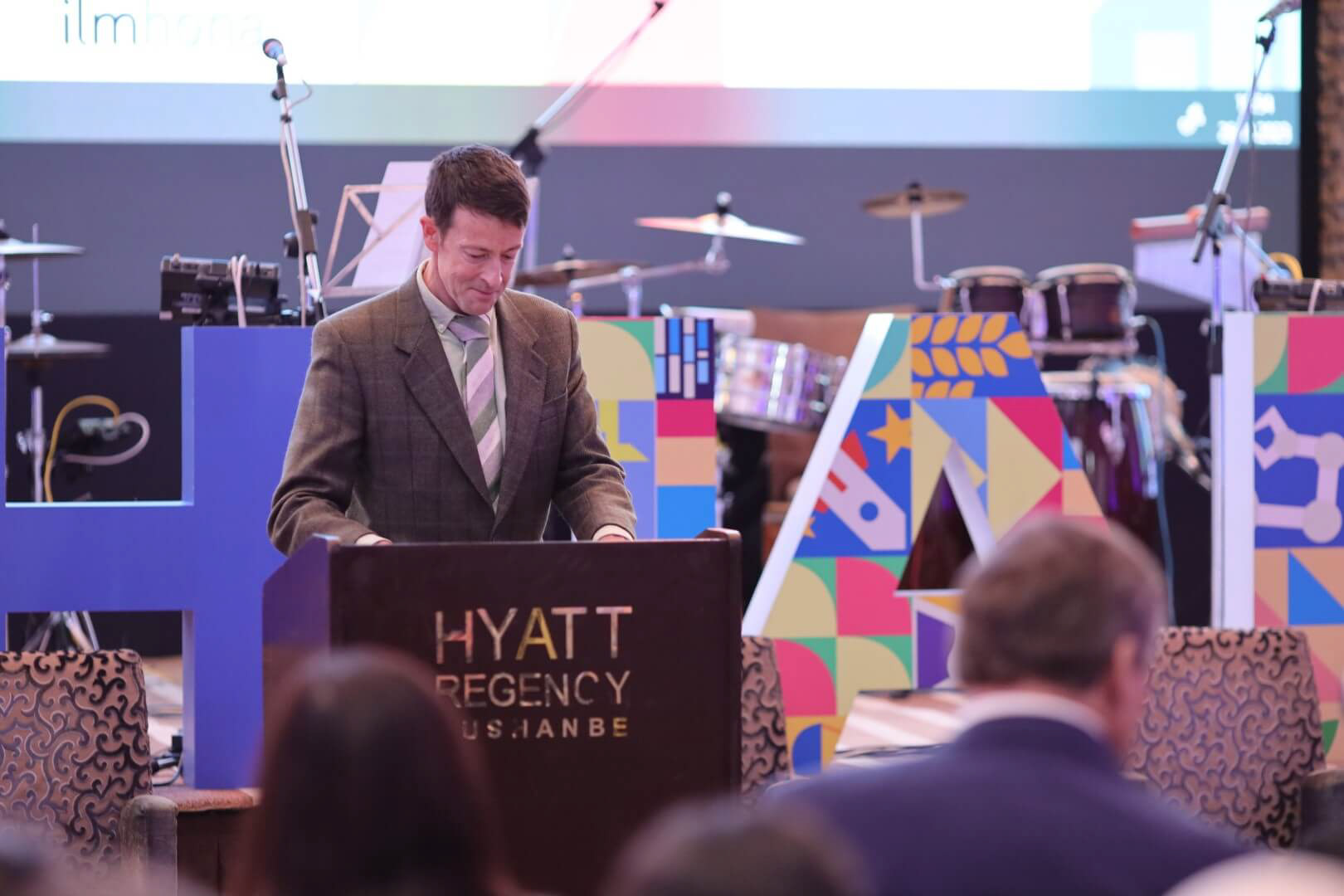
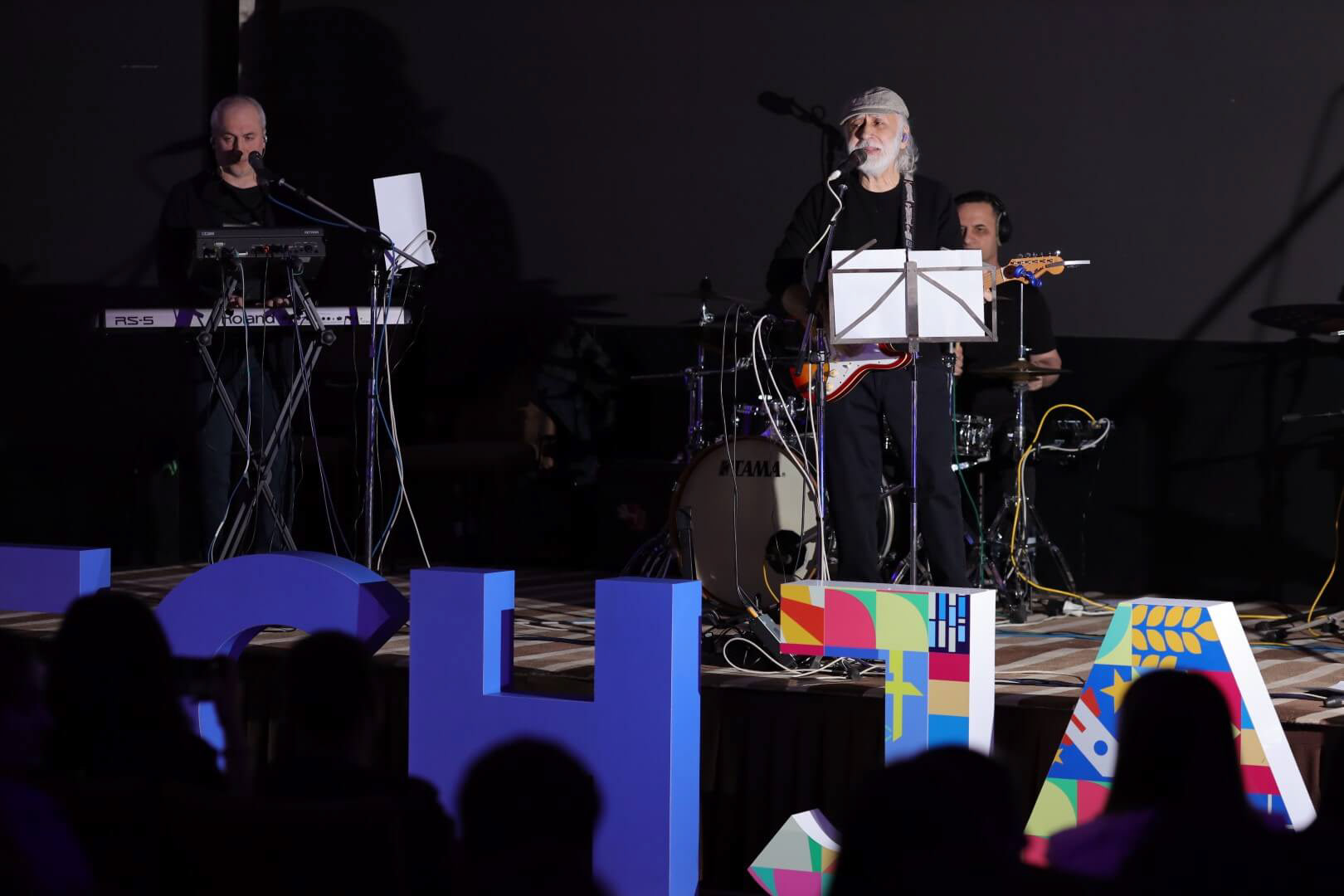
Now you can imagine how the visual identity comes to life on stage screens.
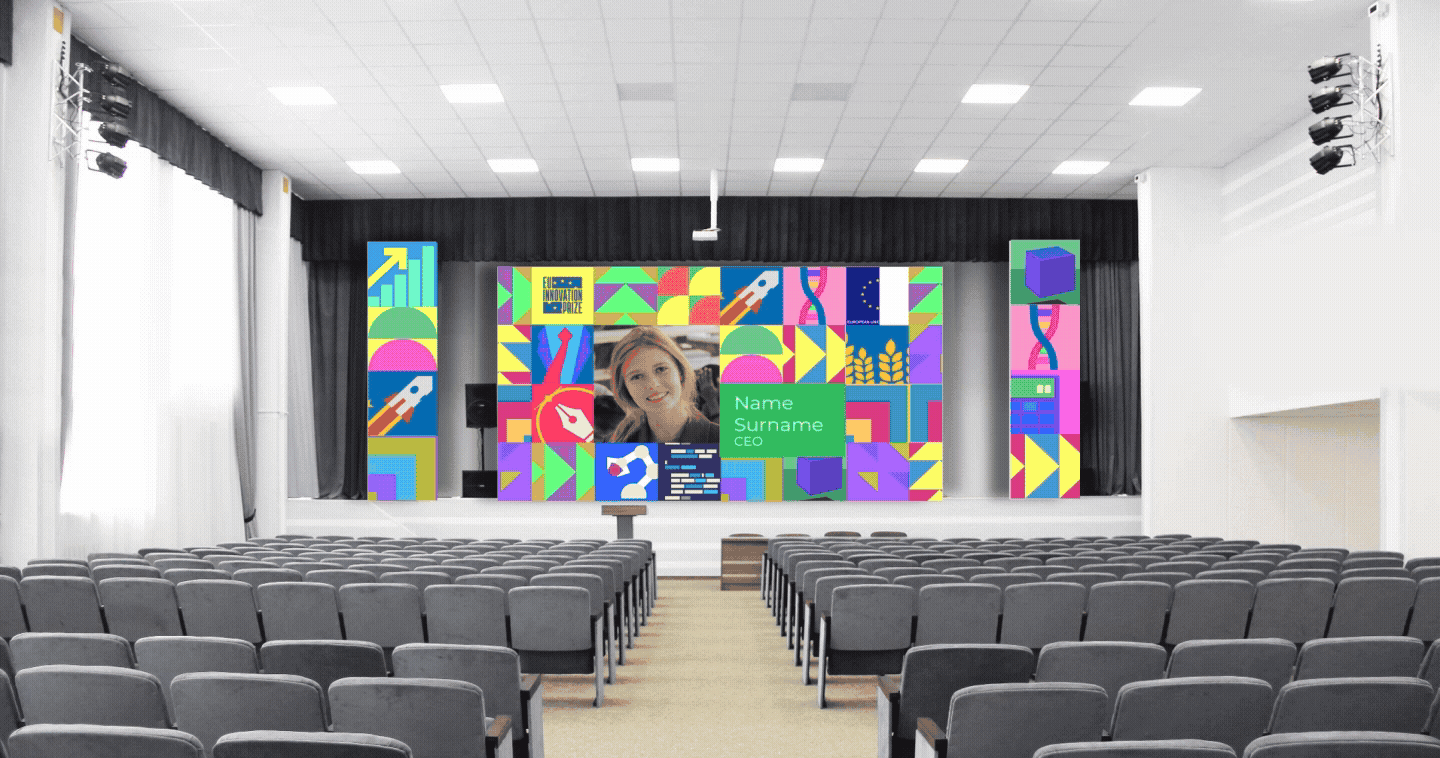
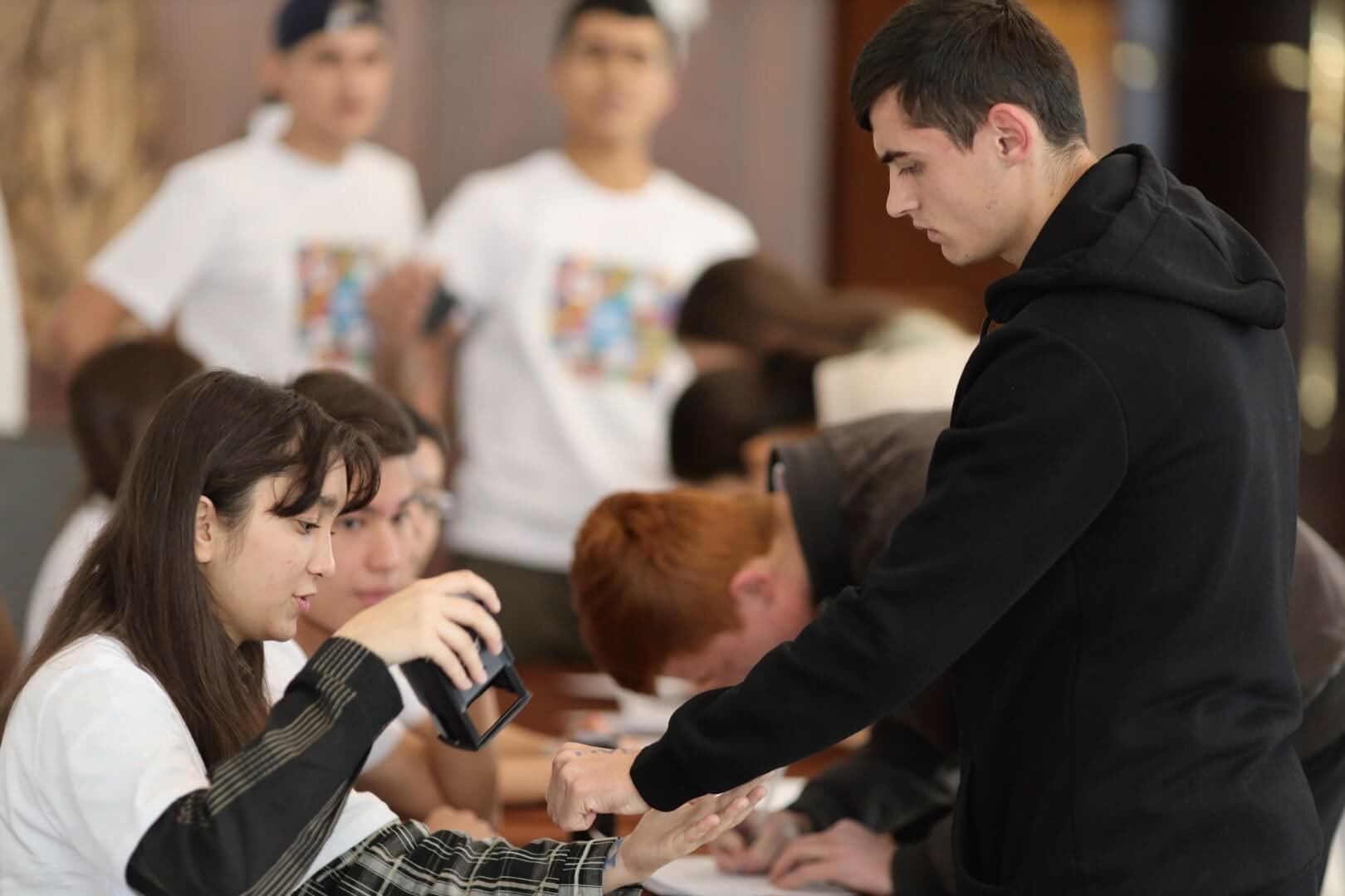
Or you don’t have to imagine — just take a look at the real photos to see how it actually looked.
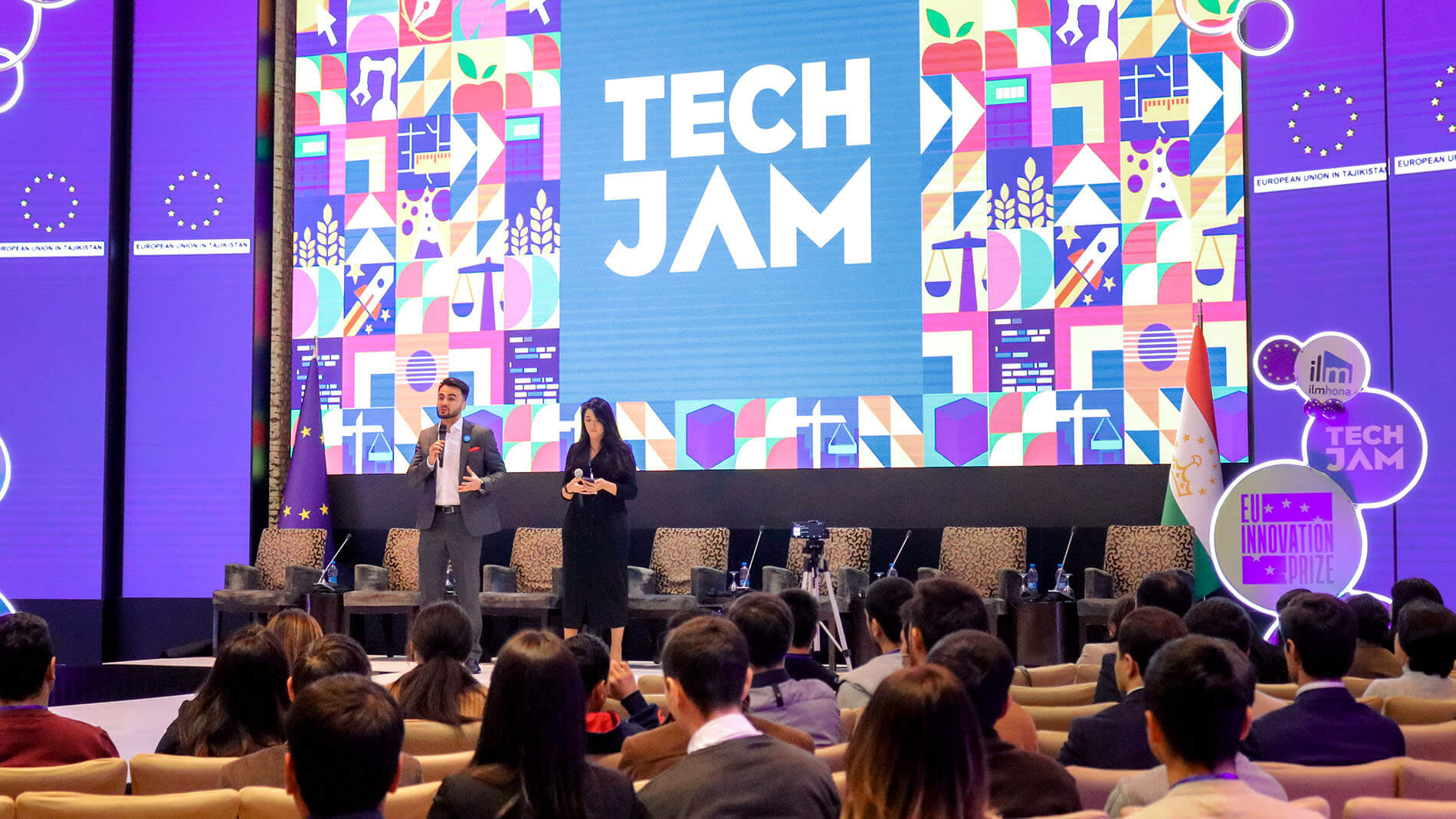
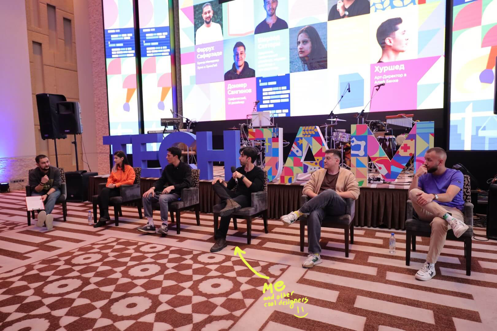
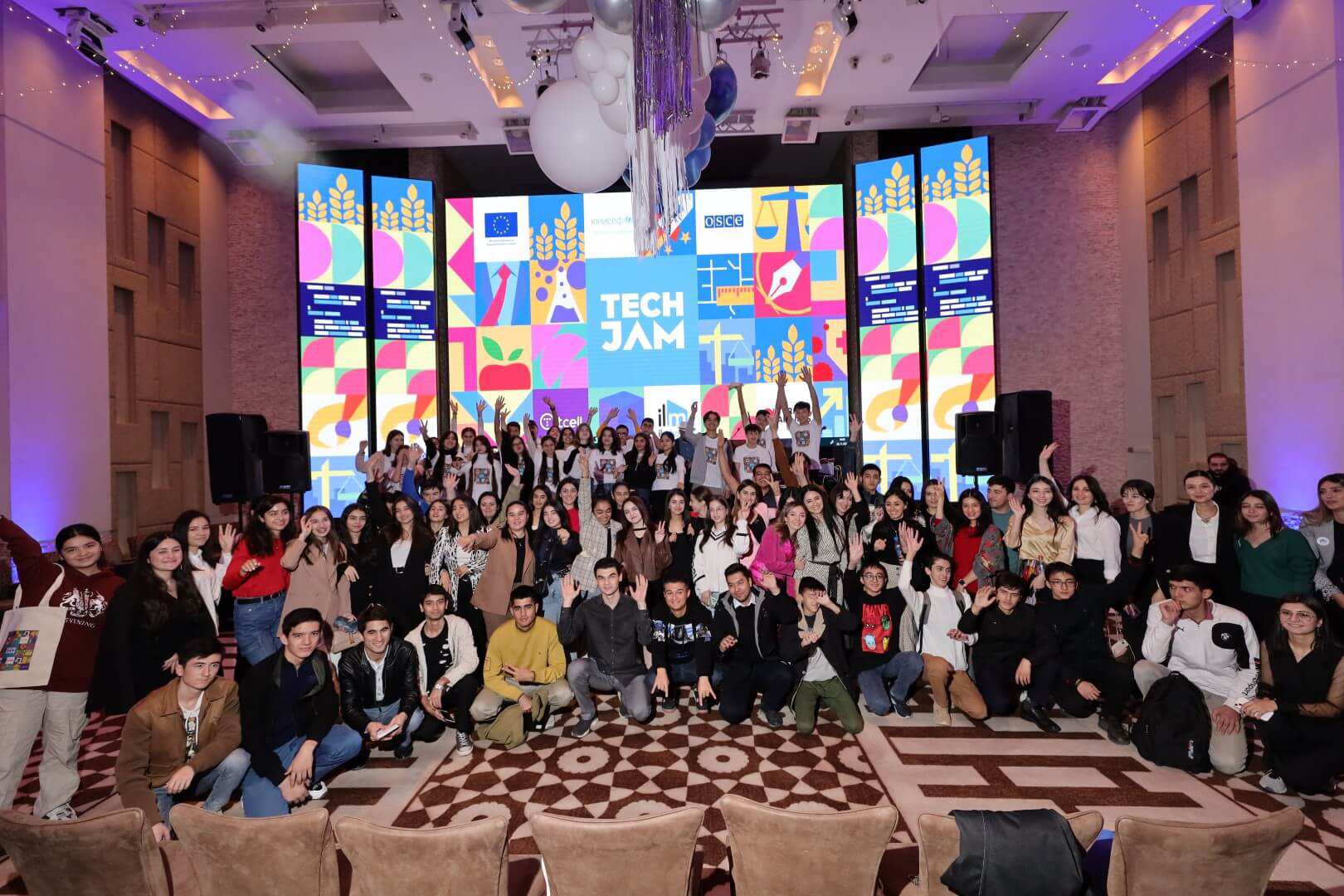
As for the visuals, I believe we successfully conveyed the idea of moving forward and inspiring the audience. It was a fun experience being involved in this project both as a graphic designer and as a speaker at the same time.
P.S. By the way, if you noticed, the logo looks a bit different in some images. The funny part is—I have no idea why we decided to do that. It’s a total mystery to me.
Anyway, thanks for your attention. See you next time!
©UstoDesign