This was one of those rare moments when my two worlds collided — graphic design and sports.
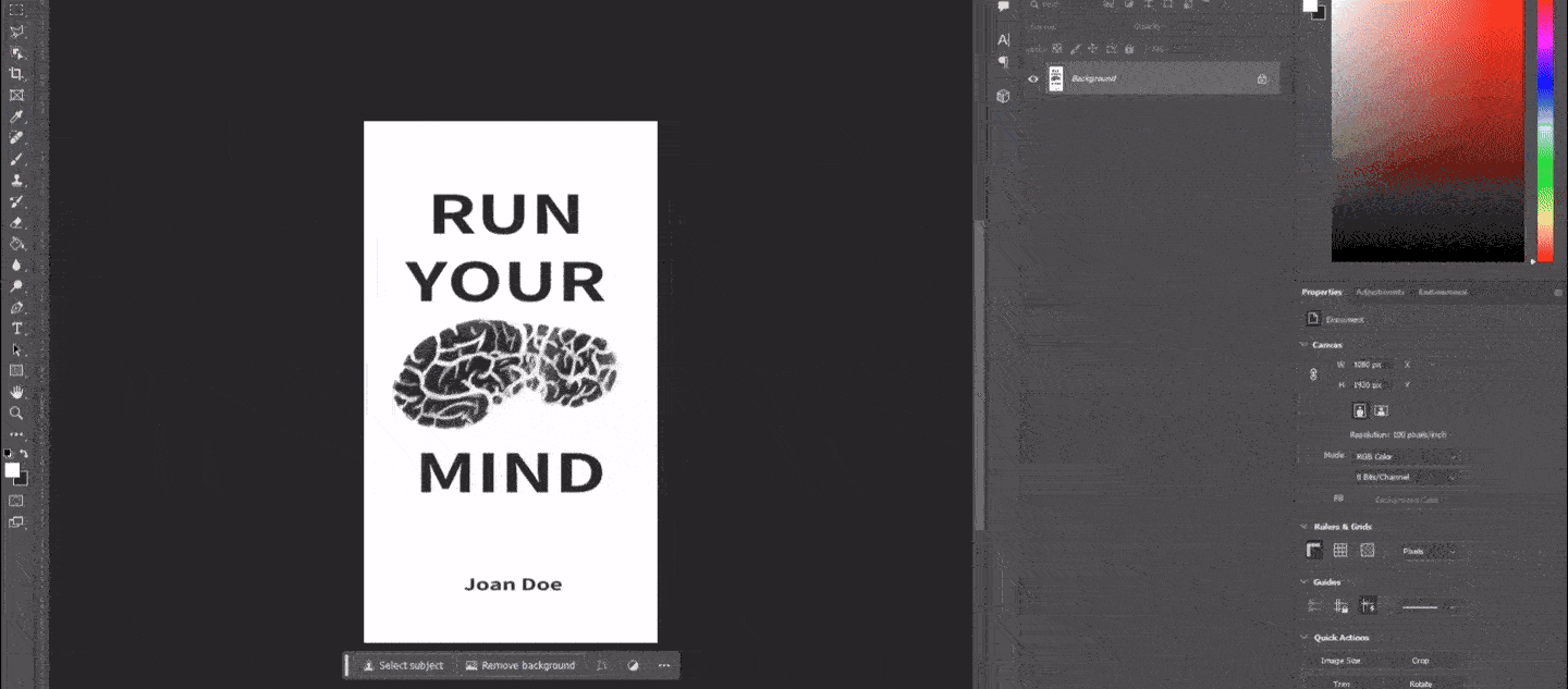
Ainur Kaparova reached out to me to design the cover for her book Run Your Mind. We had a short but very insightful video call, and she sent me the first draft so I could understand what the book was really about.
To me, the book spoke about physical activity and personal growth, two things I deeply relate to. I do sports almost every day and went jogging regularly for two years. From my own experience, I can say that sports have helped me tremendously with my mental health. People often underestimate the connection between body and mind — but truly understanding it can make us better in every way.
All of that was in my mind while I was designing the cover.
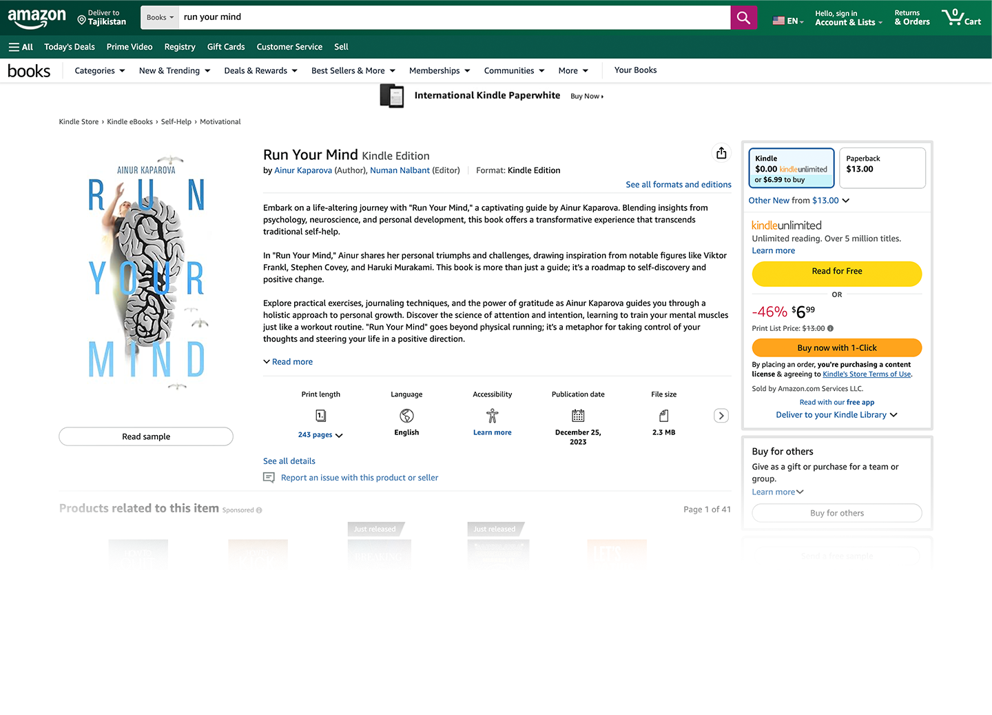
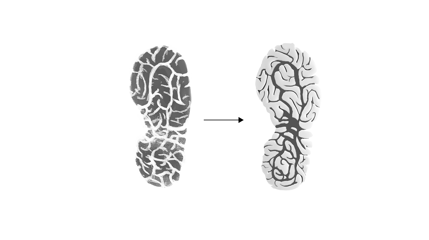
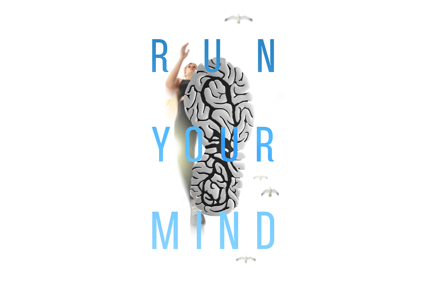
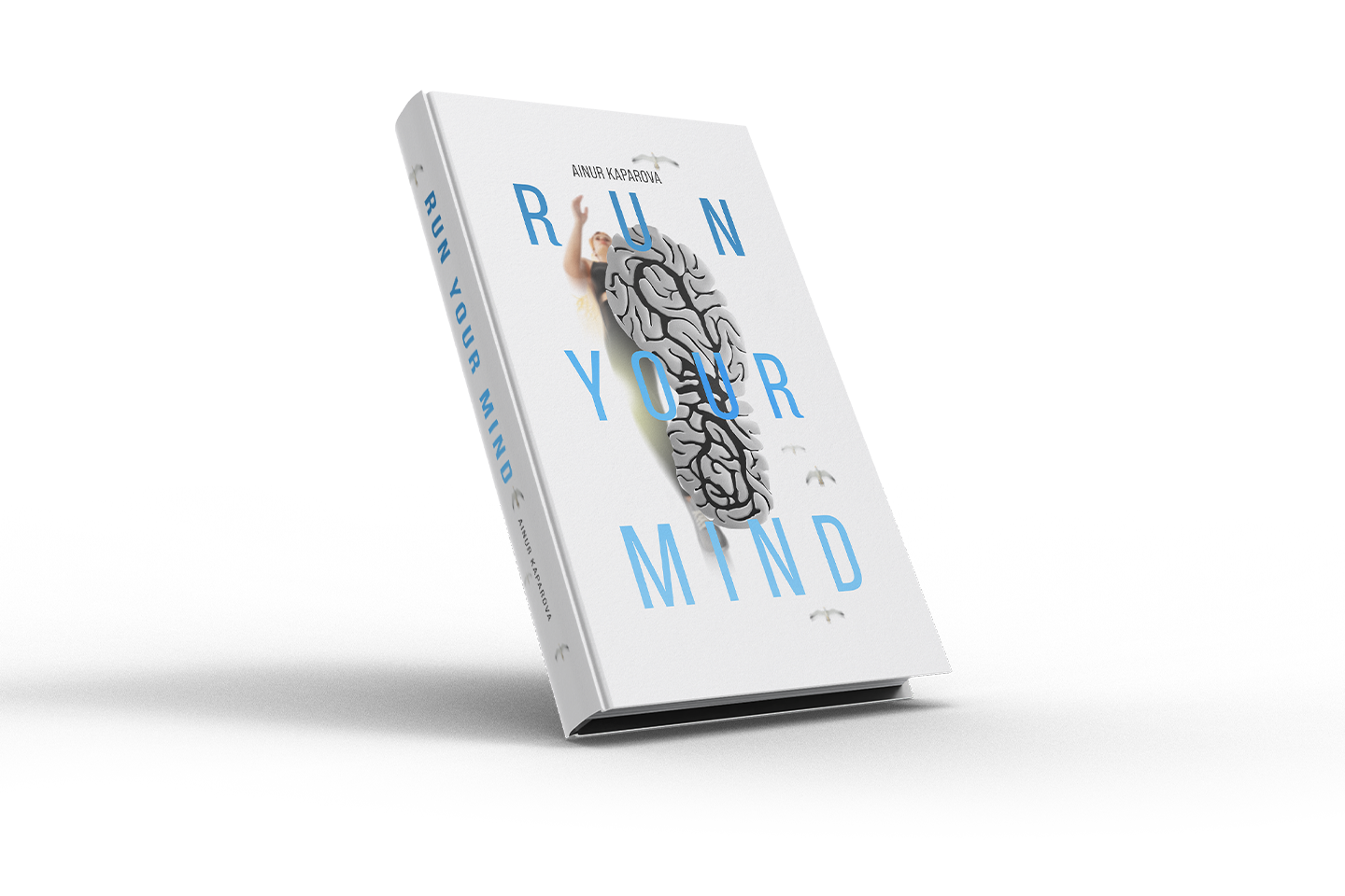
My first instinct was to merge the concepts of “Run” and “Mind” — to translate them into a single, literal visual idea.
The idea of the shoe track came from an old video game I used to love — Mirror’s Edge. It’s about rebel runners in a dystopian city, always sprinting across rooftops. Maybe that’s why the image of running stuck with me and resurfaced for this project.

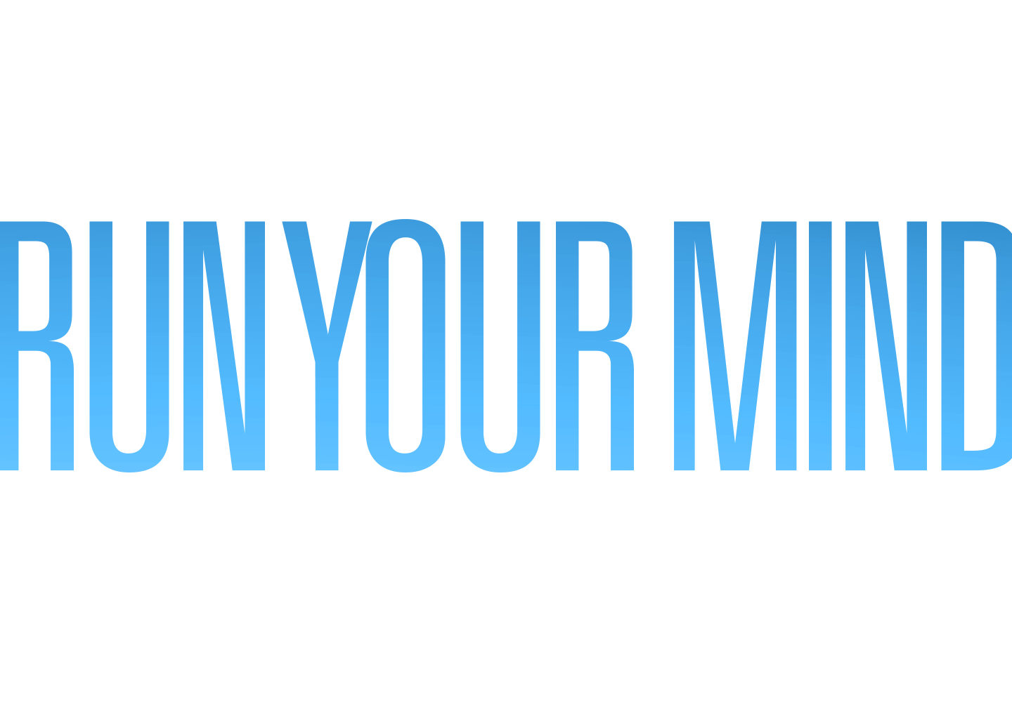
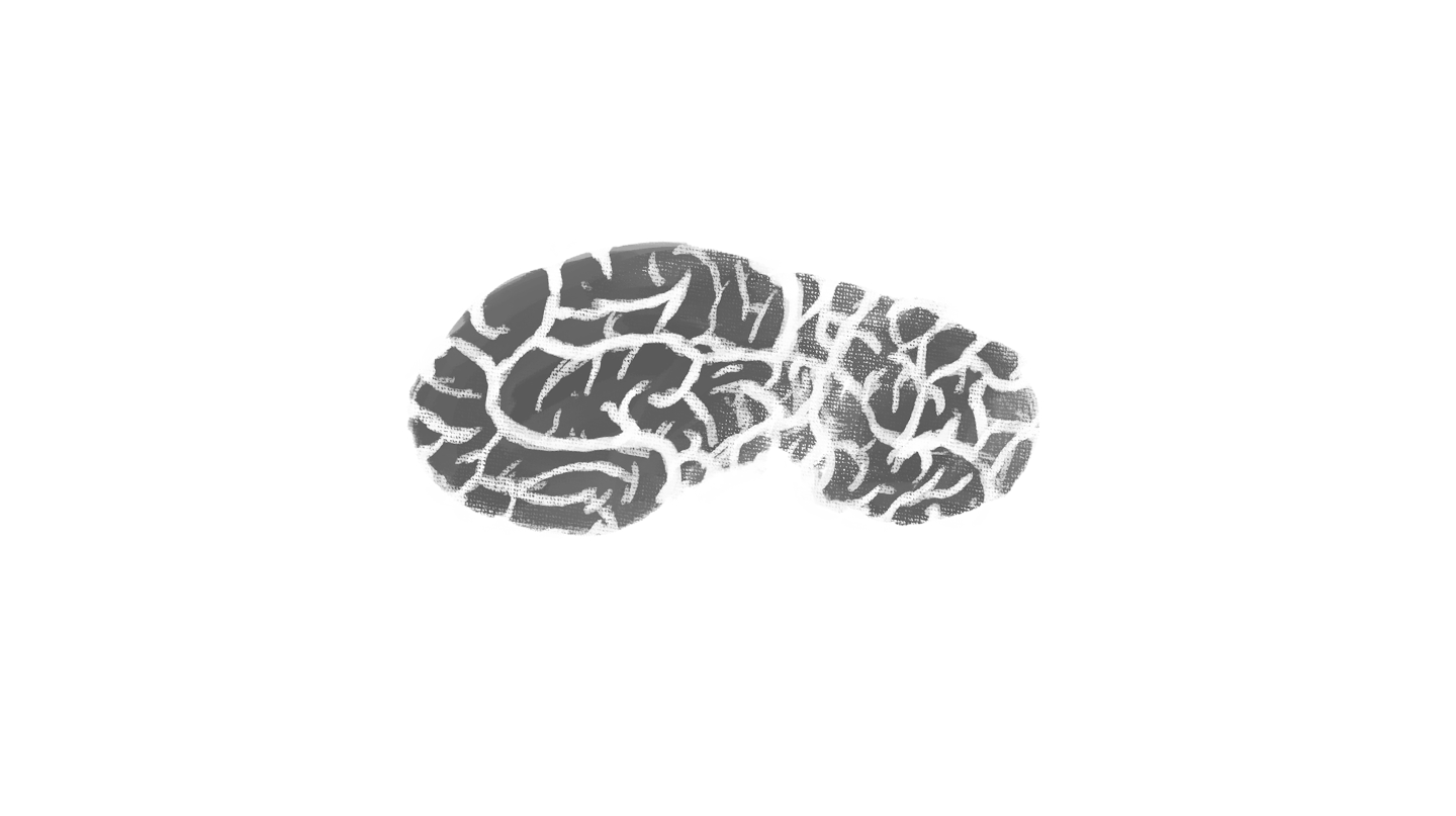
I started with a sketch of a shoe sole shaped like a brain. At first, I wanted to cover the design with multiple shoe prints, but it just looked… dirty — like someone had walked all over the book. Not exactly the message I was aiming for.
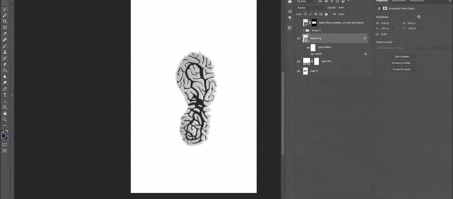
Then I figured — why not make it look like a real shoe sole? With a bit of help from Photoshop’s Generative Fill, I saved some time and gave it a more realistic look.
I had no idea where this idea would take me — but I decided to roll with it anyway.
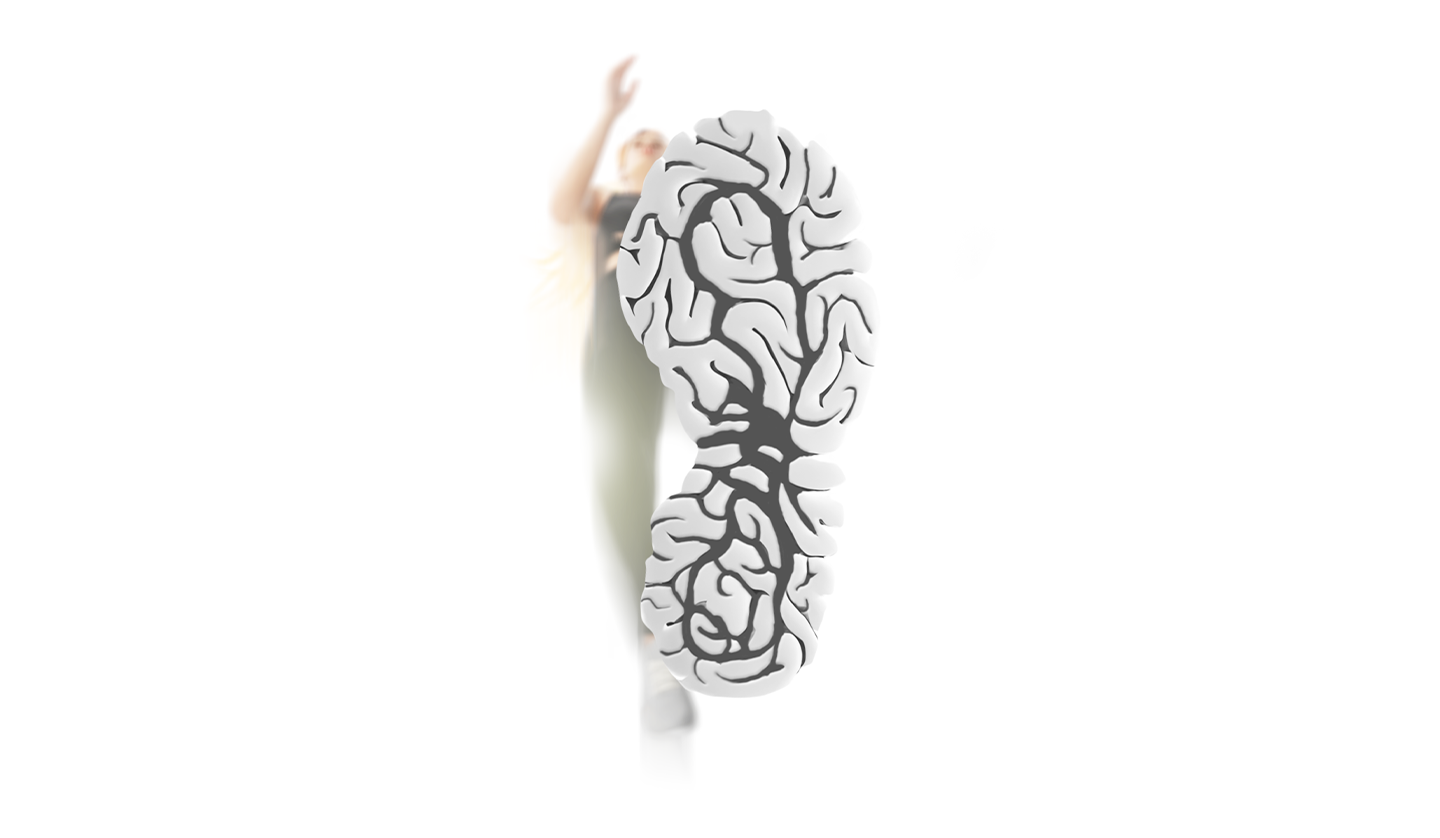
Just the shoe sole in the shape of a brain felt too empty, so I decided that someone should be wearing it. There was a problem, though — the sole was drawn from a strange angle, which made it tricky to show a person from that perspective.
To solve it, I used a 3D model of a woman and adjusted it slightly to fit the concept. The idea was to make it look as if the ground were transparent, letting us see the person running from below.
The image finally had movement, but visually it still felt off-balance — too much empty space on the right, and I wanted the shoe sole to stay centered. So I used the typography to anchor the layout, shaping it into a rectangle for balance. Then I added a few seagulls — a simple metaphor for the freedom of the mind.
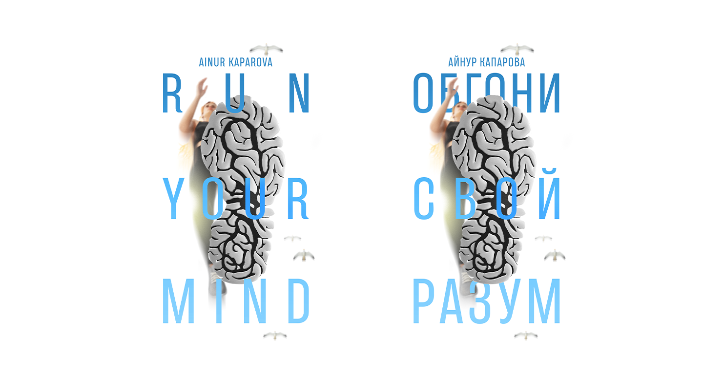
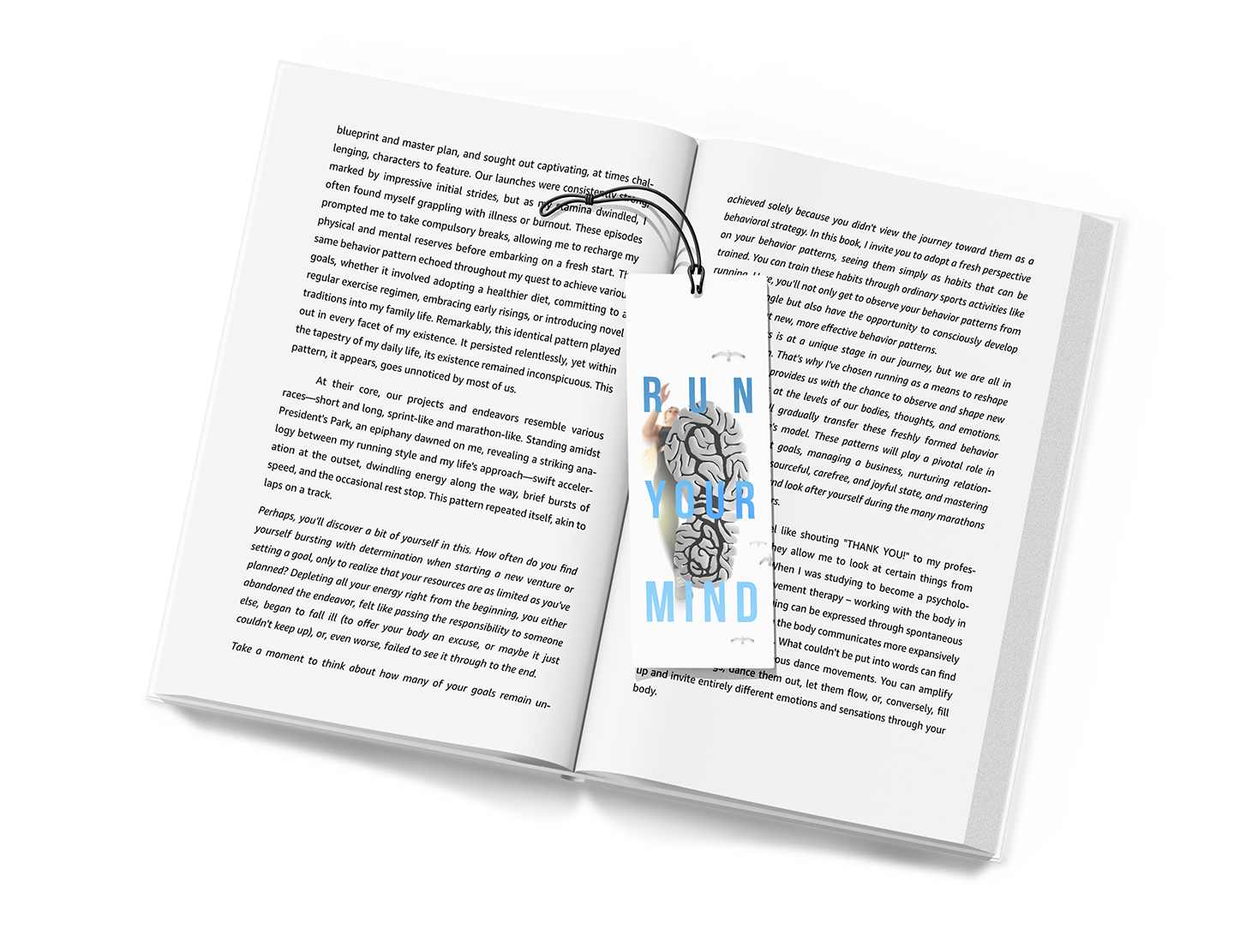
The book came out in two versions: one in English, and one in Russian.
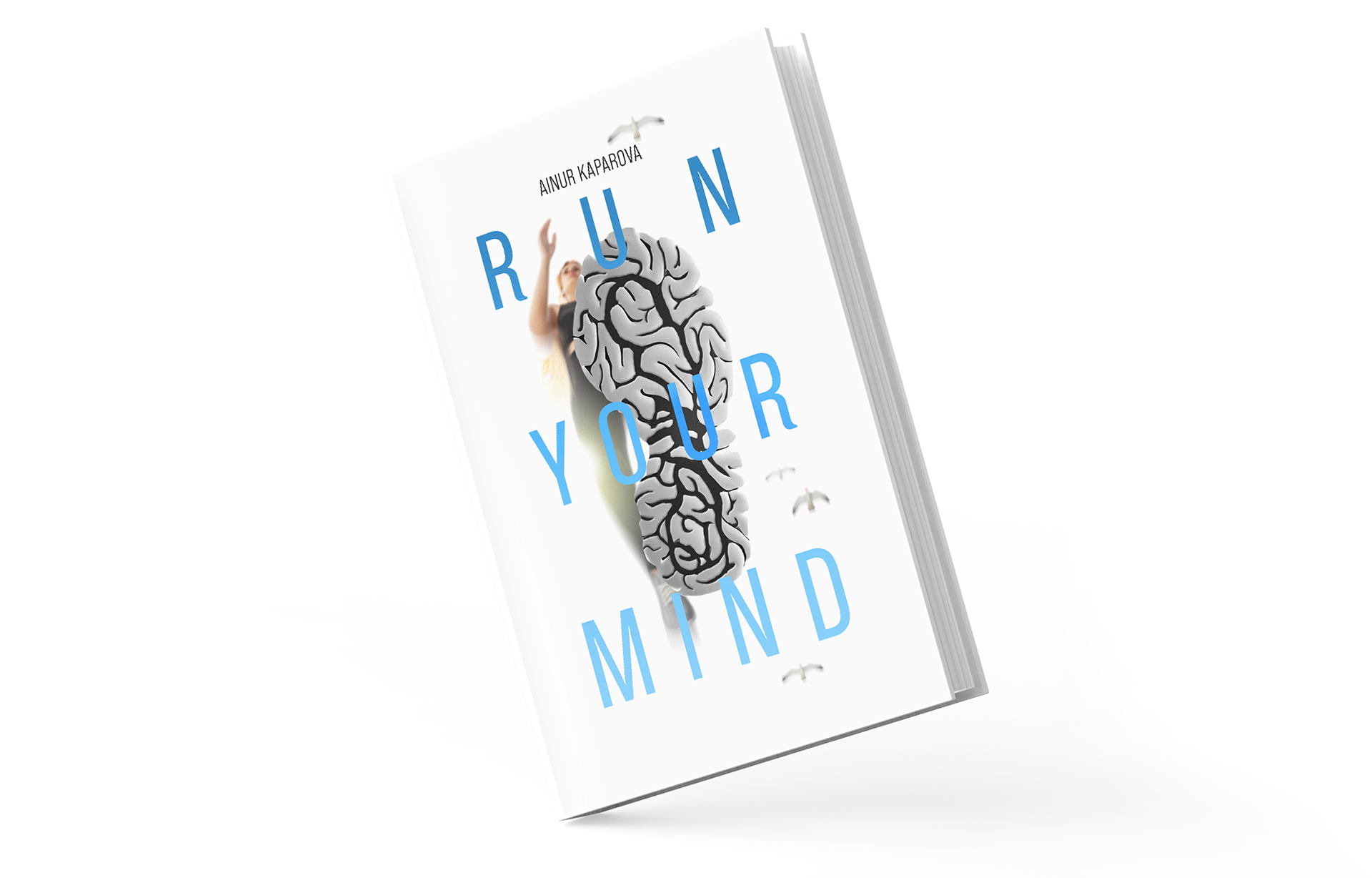
My goal was to make the cover design look bright, clean, and focused — just like how we want our minds to be.
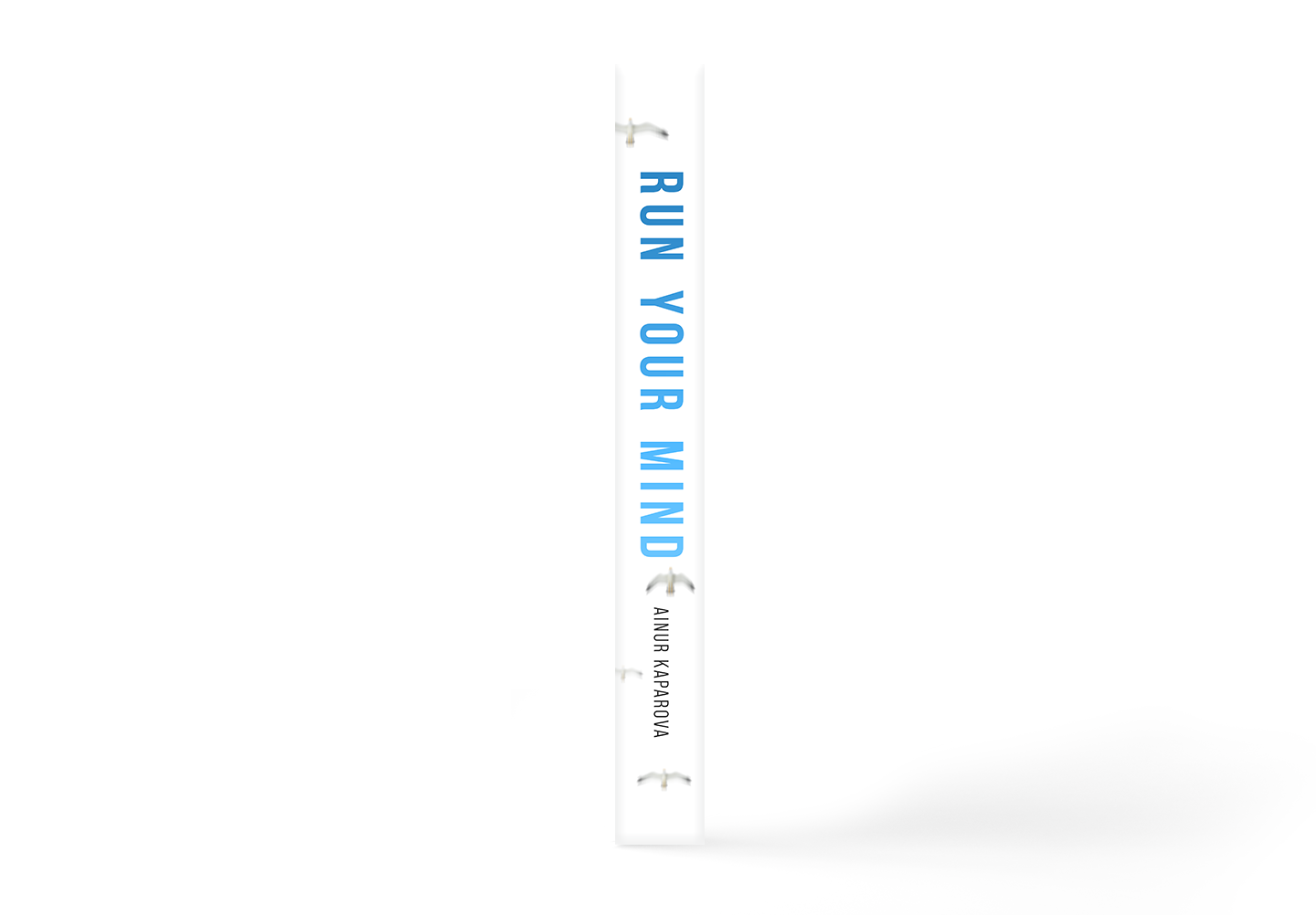
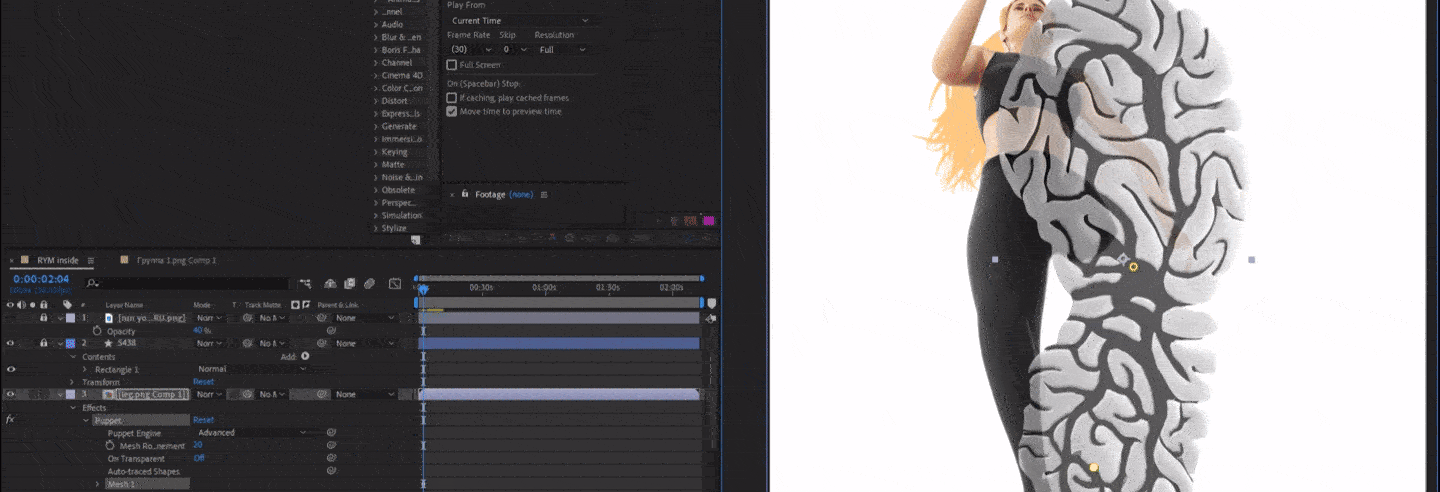
For the promo, I made an animation of the cover. The tilted view made it a bit harder to animate — but I love a good challenge.
The concept was to turn a feeling into a visual — freedom, focus, calm, and the relentless pursuit of your goals. It’s what I felt every time I ran, and I wanted the cover to carry a piece of that same energy.