
This project was a true game-changer in how I approached visual identity design and the way I explored creating a brand book. It was pure experimentation—testing ideas and trying approaches that weren’t common at the time.
Back in 2020, the new internet provider NETS approached our design studio, UstoDesign, to develop their visual identity. I was responsible for leading the process. Our goal was to make NETS stand out from other internet providers. To achieve this, we reimagined the use of brand colors, making them more dynamic. This shift inspired me to rethink the very structure and presentation of the brand book itself.

The inspiration for the NETS logo came from analog signal waves and the flow of data transmission through fiber optic cables. By abstracting these ideas into a series of zig-zag lines, the form naturally shaped itself into the letter “N” — a direct reference to the brand name.
My goal was to keep the design futuristic yet minimalistic: simple enough to be instantly recognizable, while still conveying the sense of speed, technology, and connectivity that defines an internet provider.

At that time, I noticed that most local brands in Tajikistan were relying heavily on static visuals for their social media presence. There was a clear lack of movement, energy, and animation in brand communication.
That observation became a turning point: from the very beginning, I decided to incorporate dynamic elements into NETS’ identity. Motion was not just an add-on, but an integral part of the design system—helping the brand feel more alive, modern, and engaging across digital platforms.


Another unusual aspect of this project was my approach to color. Instead of limiting the brand to a single fixed palette, I chose to give complete freedom in color selection. This flexibility allowed the identity to adapt to different contexts, moods, and campaigns without losing consistency.
What tied everything together wasn’t one specific color, but the core brand elements — the logo, typography, and distinctive graphic shapes. This approach made the identity feel versatile, dynamic, and future-ready, while still being instantly recognizable as NETS.

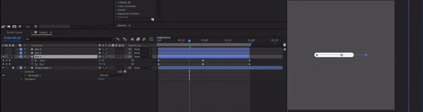
When it came time to design the brand book, I ran into a challenge. Traditionally, brand books are delivered as static PDFs. But since so many of my ideas for NETS’ identity were tied to motion and animation, a flat document simply couldn’t capture the essence of the brand.
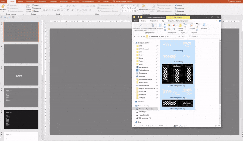
A web-based format would have been ideal, but it also meant additional costs for the client. I experimented with several options until I landed on an unconventional solution: PowerPoint. It might sound unusual, but it allowed me to embed videos, animations, and interactive elements directly into the brand book.
What started as a “mad idea” actually worked — turning the brand book into a dynamic, living tool instead of just a static manual.
Note: You may notice that the logo name appears differently down below. That’s because the company originally had a different name, which later changed to NETS during the design process.
Being able to include video files also meant I could demonstrate interactive elements in action. It’s far easier to show motion, transitions, and dynamic layouts than to try and describe them in text. This made the brand book not just a set of rules, but a practical guide that clearly showed the client how the identity should behave across different mediums.
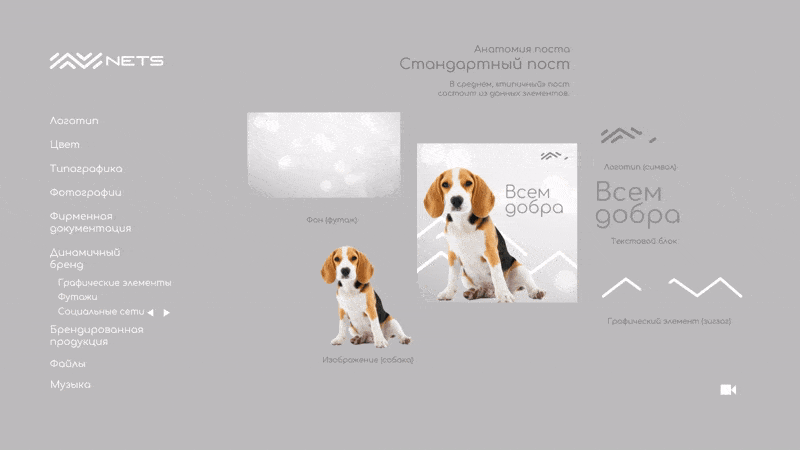
Another advantage of using a dynamic format was the ability to go beyond visuals. I could now demonstrate, with examples, how to choose music for brand videos. NETS had a specific vibe, and just like colors, typography, and motion, the soundscape needed to stay consistent.
This was something I could never have communicated effectively in a static PDF. But with an interactive brand book, I was able to embed audio and video examples, giving the client a much clearer understanding of how the brand should look and sound.
There was also something unexpected I was able to do with this format — something I hadn’t even planned. I could now embed files directly into the brand book itself. Not just as links, but as actual downloadable assets that worked offline.
This turned out to be extremely useful. I was able to include everything the client might need in one place: logos in all formats, brand fonts, print-ready materials, and more. The brand book became not just a guide, but a self-contained toolkit for implementing the identity right away.
In the end, the NETS brand book became far more functional and useful than traditional formats. It wasn’t just a set of static guidelines—it included smooth transitions, animations, and interactive elements that made the experience engaging and intuitive.
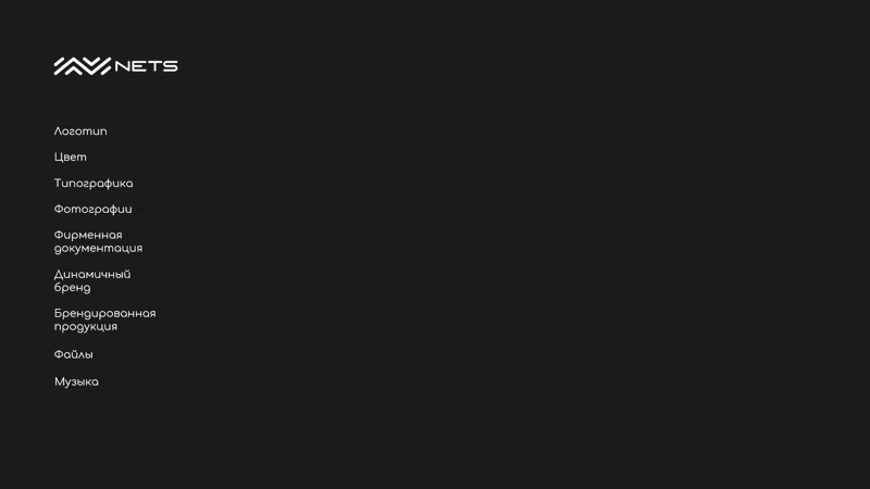
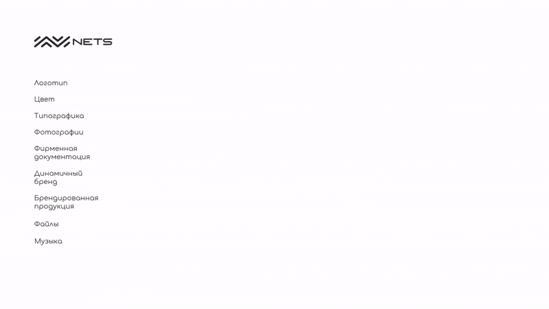
Down below, you can see a preview of how it looks when in use.

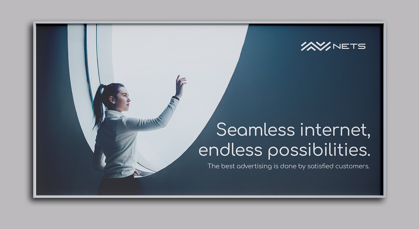
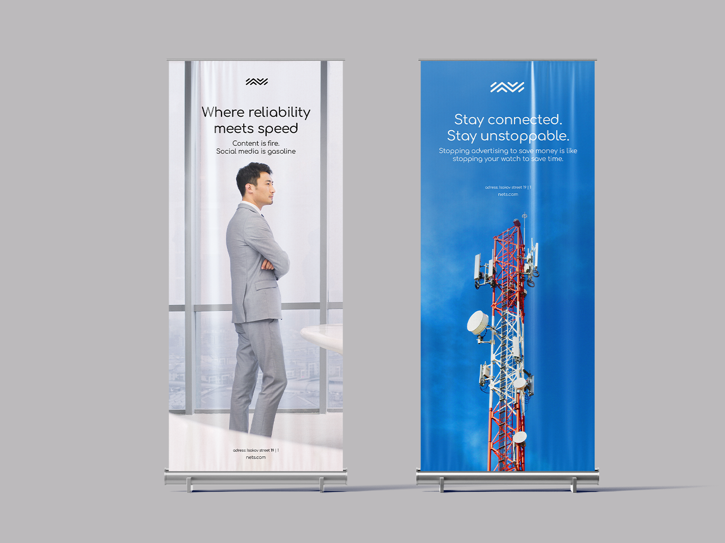
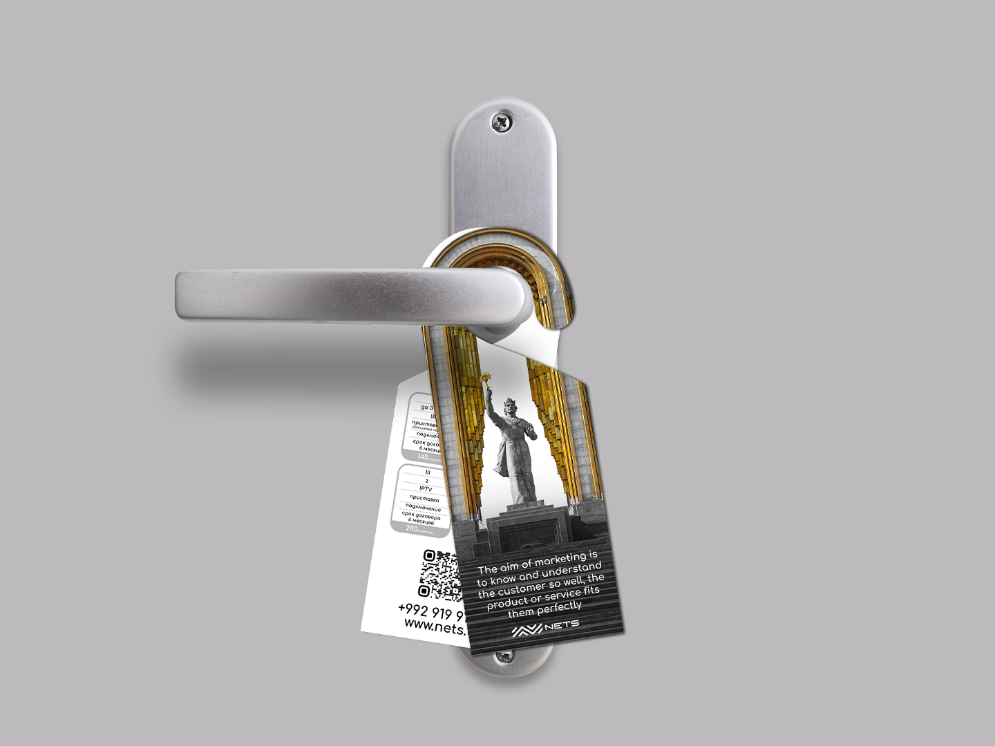
Now you can see how the brand comes to life across different materials and touchpoints.

This project represents my urge to experiment and find new ways of building brand books and visual guidelines. My goal was not only to rethink the format, but also to imagine how, in the future, it could evolve into a fully online platform — a space where designers could create, test, and showcase brand systems interactively.
It wasn’t a perfect idea, but it opened the door to new possibilities. Looking back, I believe we managed to create something truly special.
Thank you.