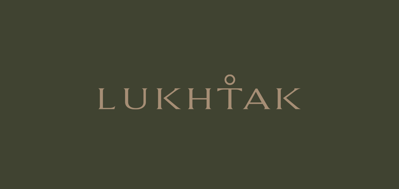
LUKTAK | Clothing Store Logo Design
Graphic Designer — Sherzod Sattori
From the very beginning, it felt like a true passion project for the client — and she came well prepared. She asked me to design a logo for her clothing store and already had a strong initial concept: using the letter “T” as a symbol that reflects the meaning of the shop’s name.
I’ll admit, it was a little bittersweet that I didn’t come up with that idea myself — but at the same time, I was genuinely impressed by how thoughtfully she had approached the project. It was clear she had put real time and care into shaping the brand, which made the collaboration even more enjoyable.
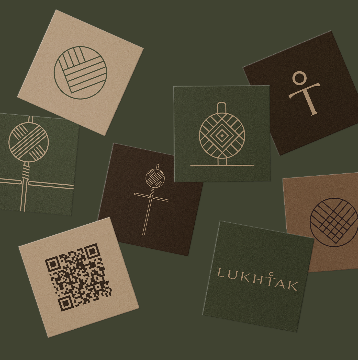
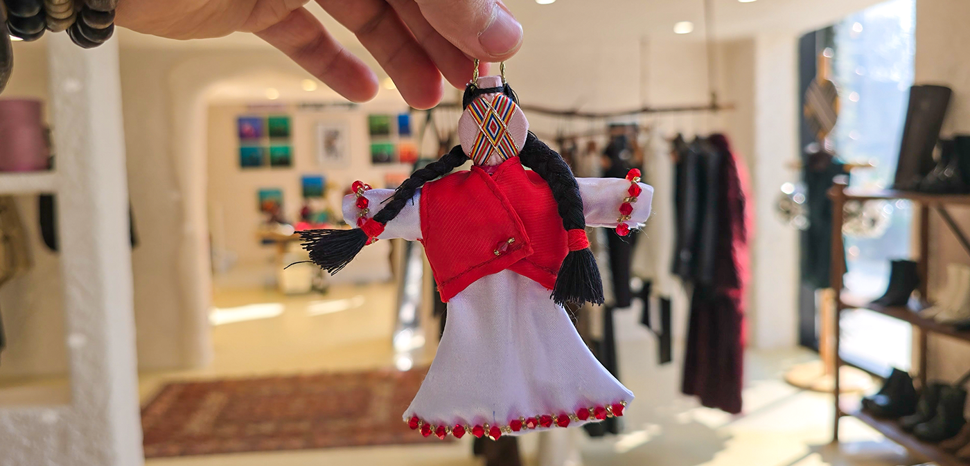
In Tajikistan, LUKTAK is a traditional handmade doll. Today, these dolls are rarely part of everyday life and are mostly created as souvenirs for tourists or as decorative interior objects. Because of this, the Lukhtak is associated with something small, cute, traditional, and distinctly feminine.
Since the store sells women’s clothing only, this meaning aligned perfectly with its target audience.
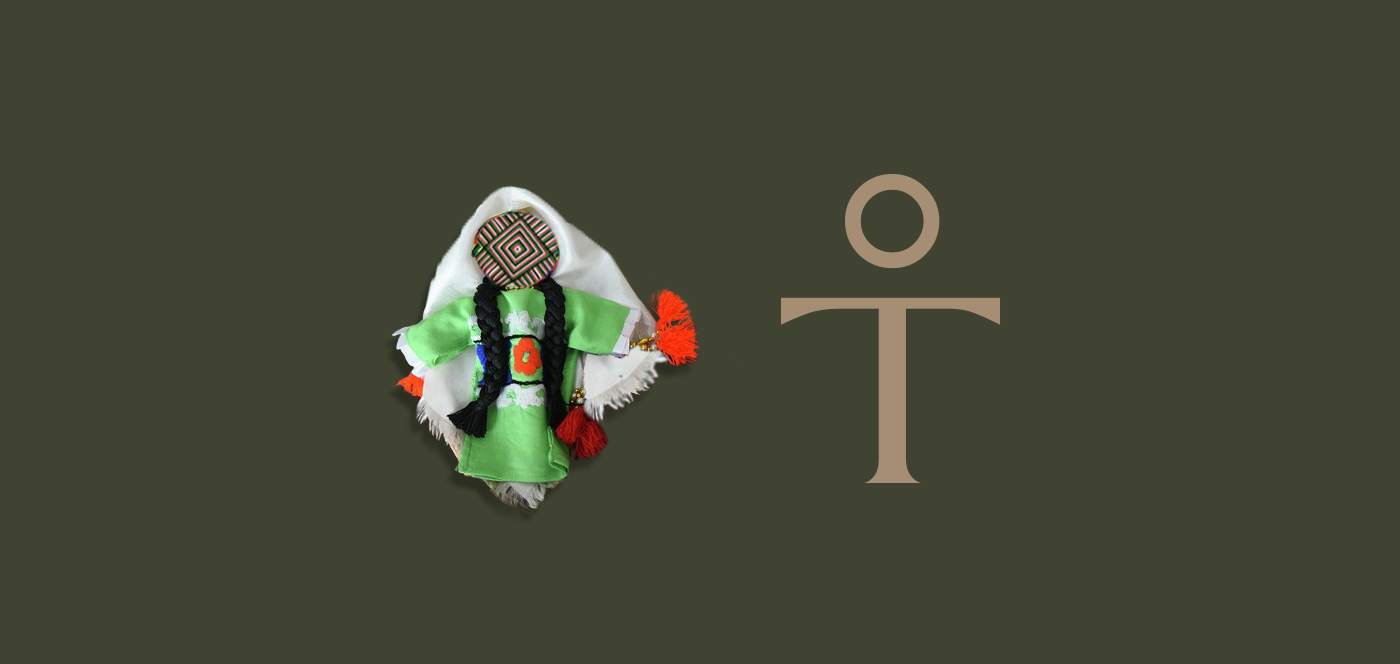
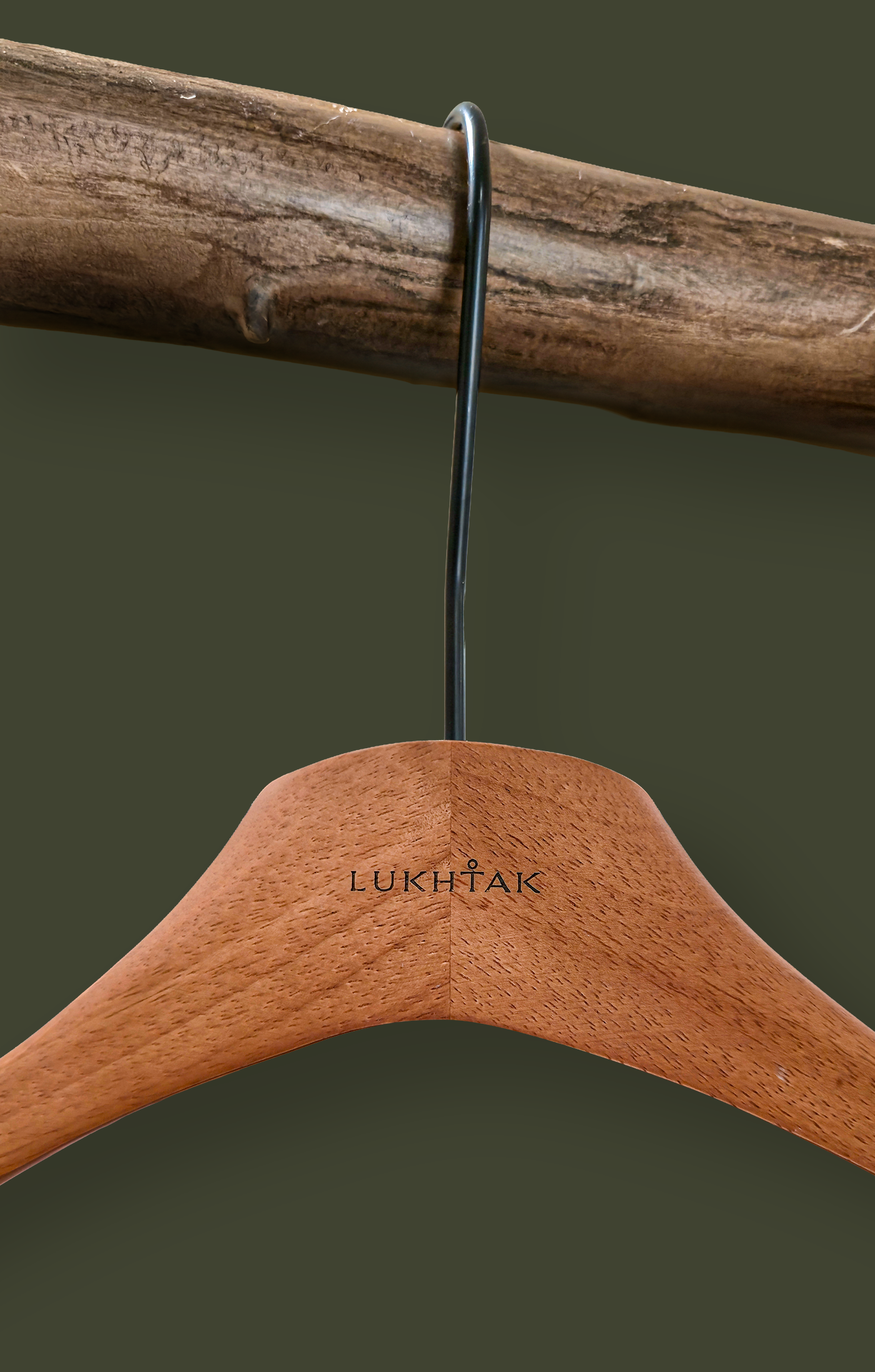
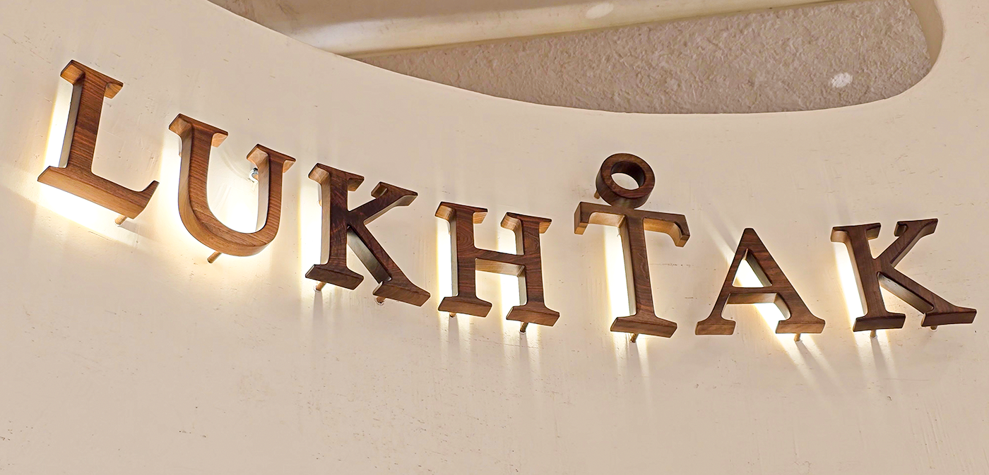
As you can see, the letter “T”, combined with a small circle on top, transforms into a simple symbol. It’s minimalist, intuitive, and easy to recognize — much like the idea behind the brand itself.
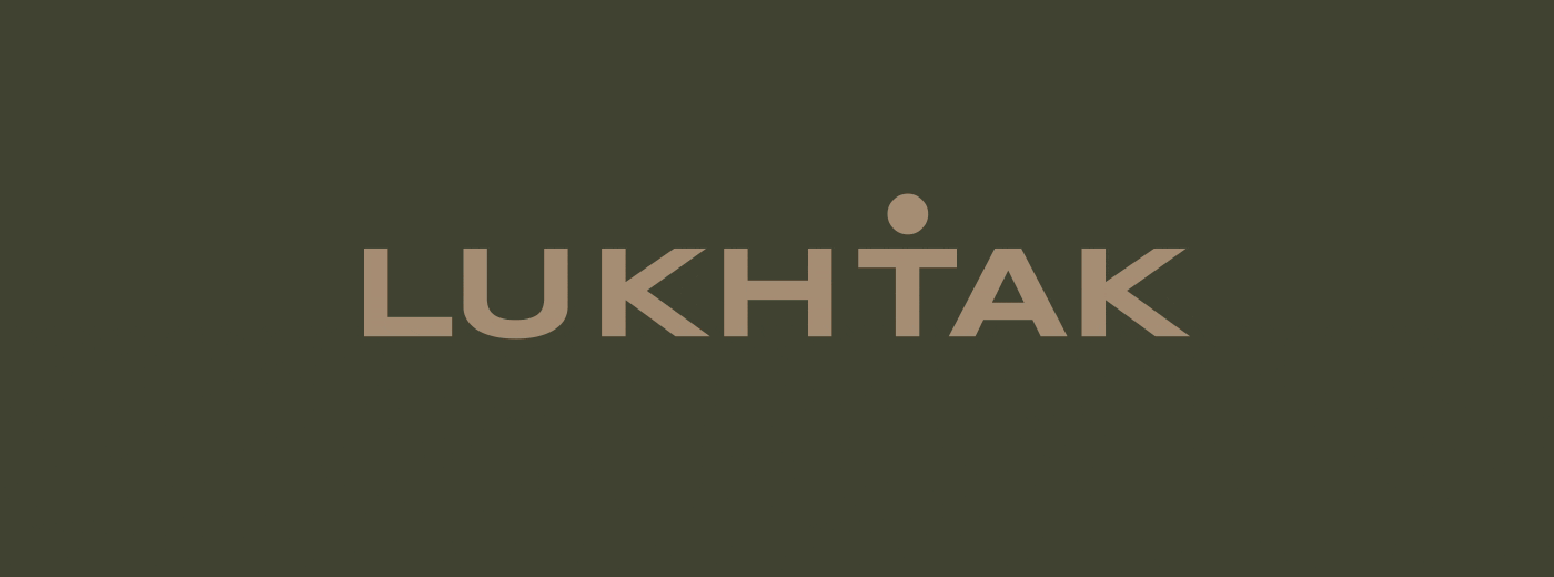
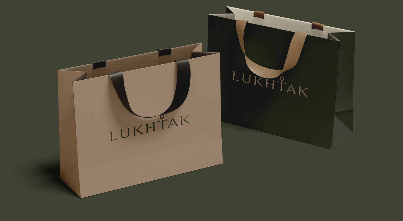
Sticking with the minimalist approach, I chose to design the logo using only letters — keeping it practical, flexible, and easy to print.

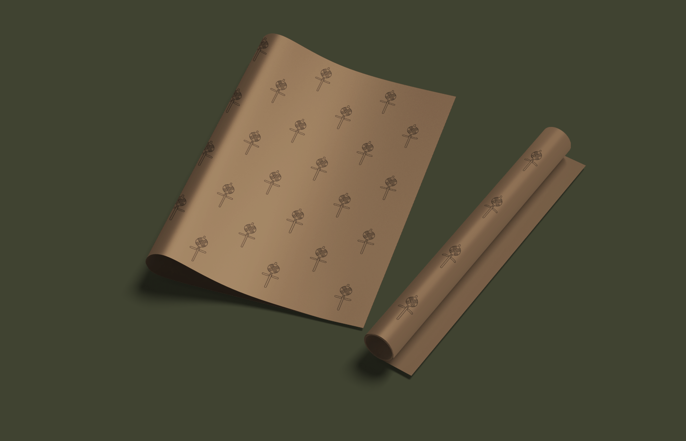
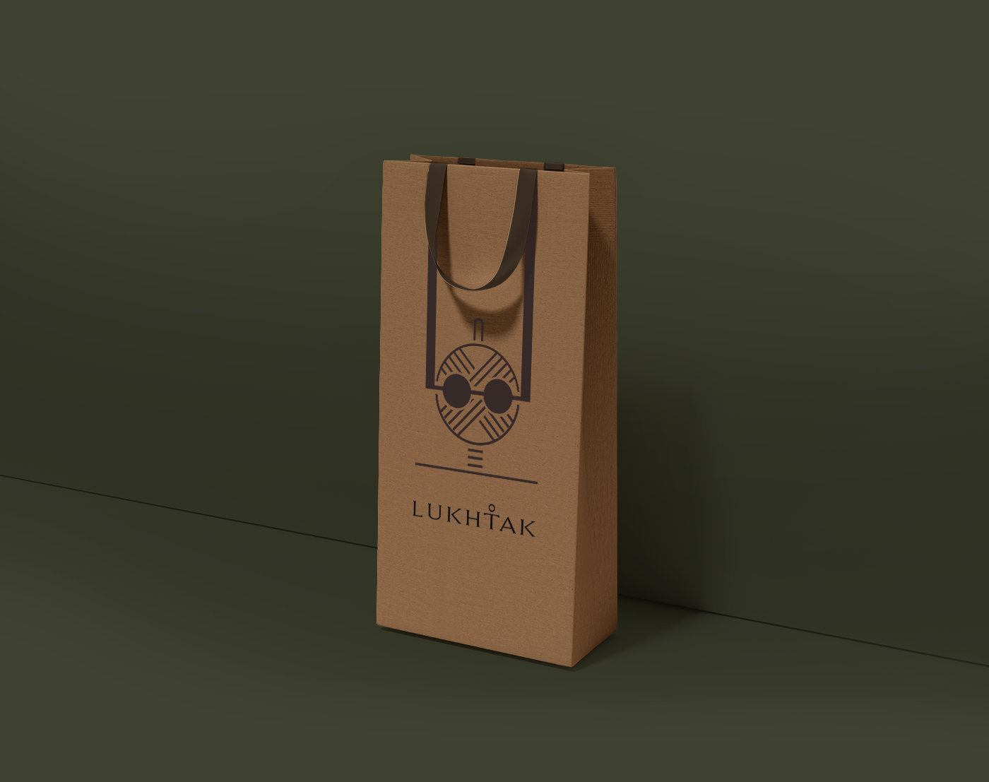
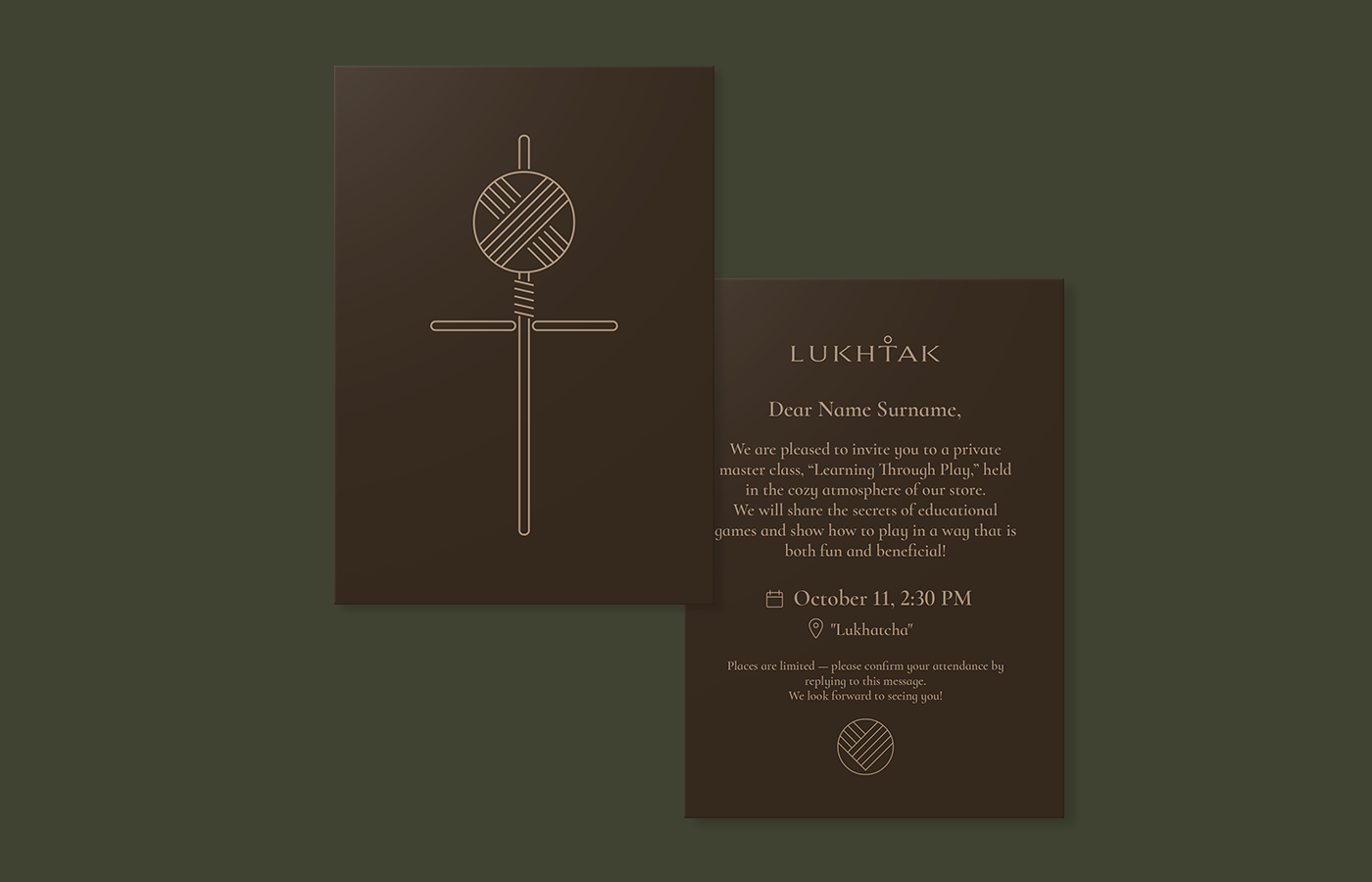
I experimented with the Lukhtak image, playing with its form in different ways. In some cases, I shaped it into a heart, and in others, I used only its most recognizable elements, adapting them for different contexts.
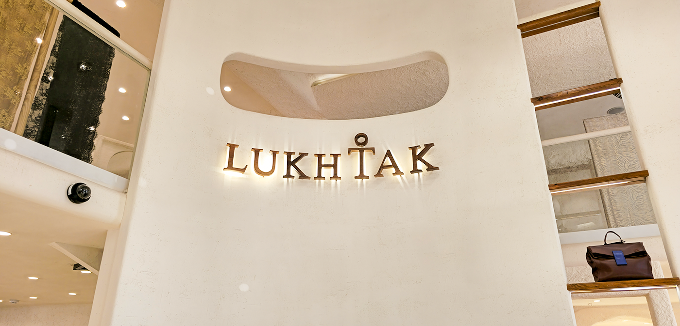
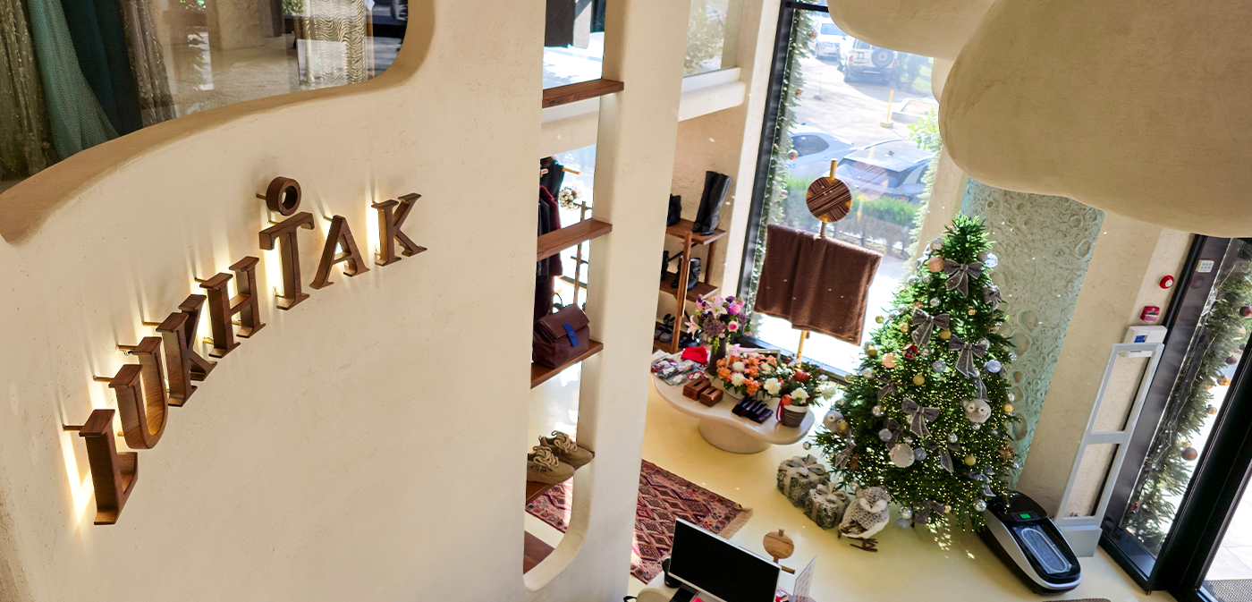
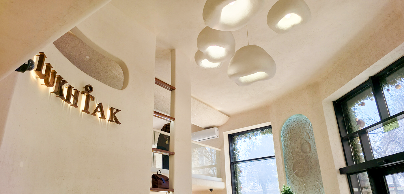
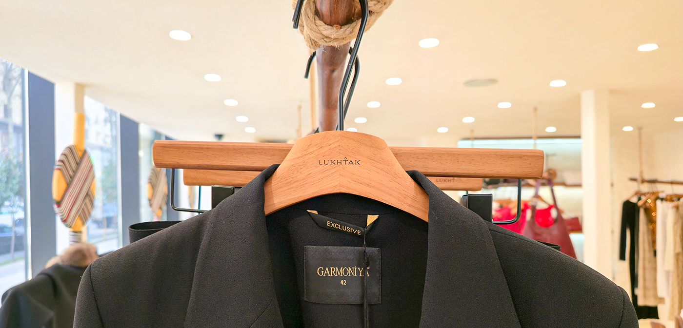
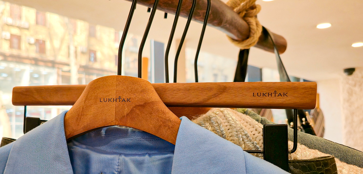
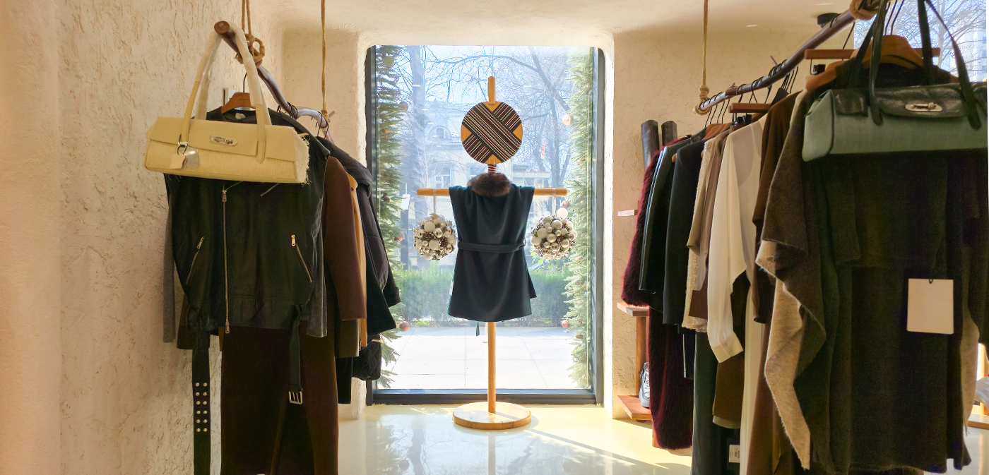
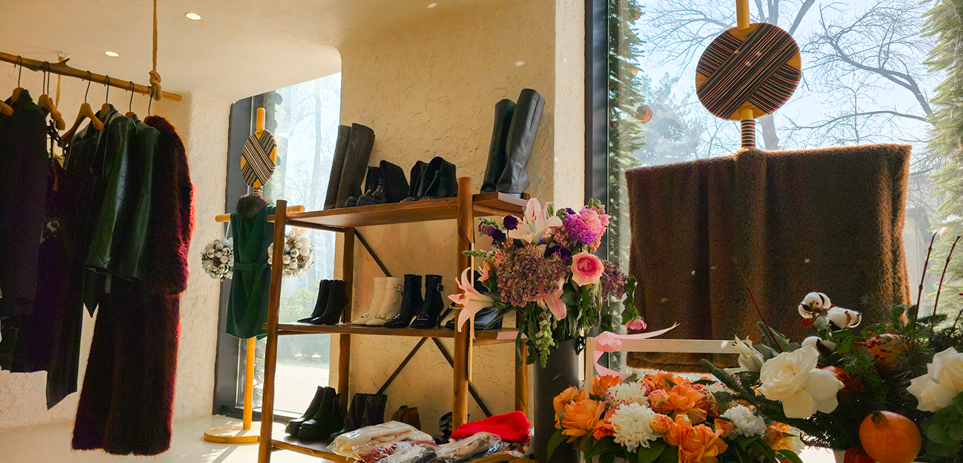
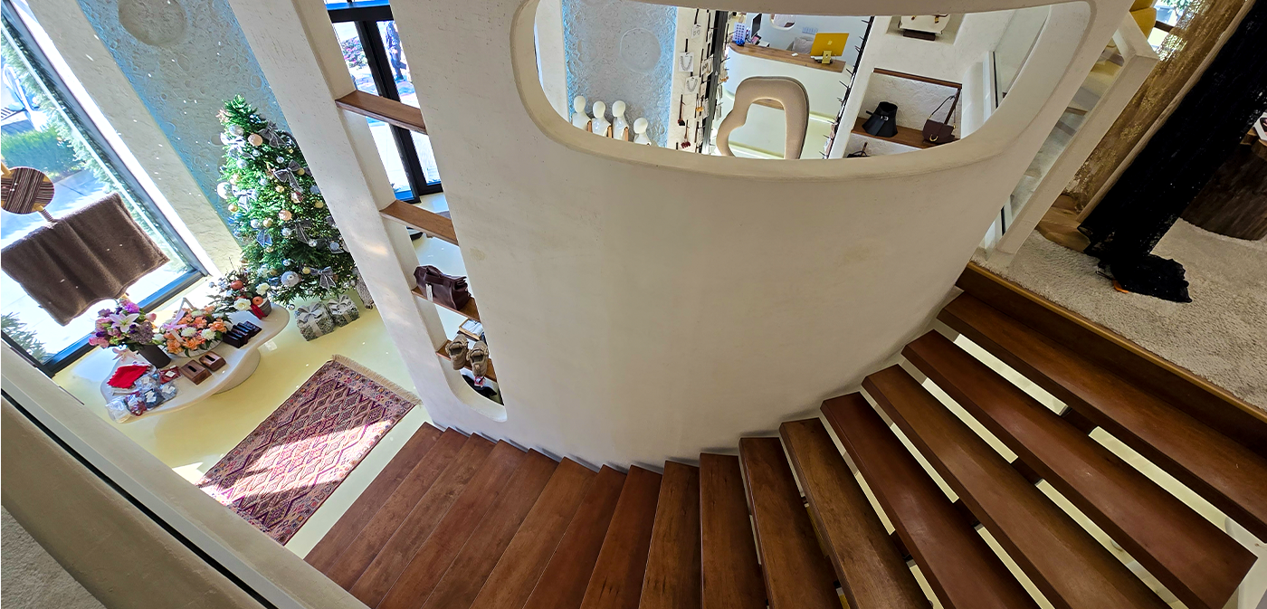
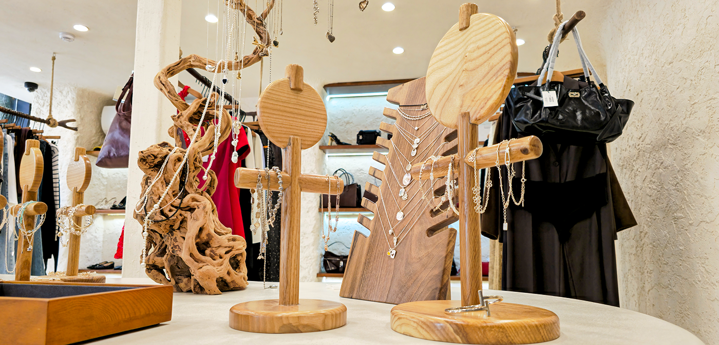
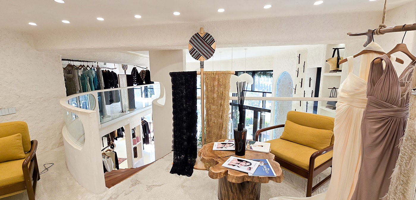
Here you can see how the logo works across exterior signage, interior spaces, and various objects. While I wasn’t responsible for the interior or exterior design, the client put a lot of effort into making everything feel just right. I really love how she incorporated the Lukhtak doll imagery in so many creative variations throughout the space.

I’m really happy with the final result of our collaboration, and I always appreciate working with clients who are truly passionate about their business. My goal here was to make the logo feel classy, premium, and easy to use across different applications.
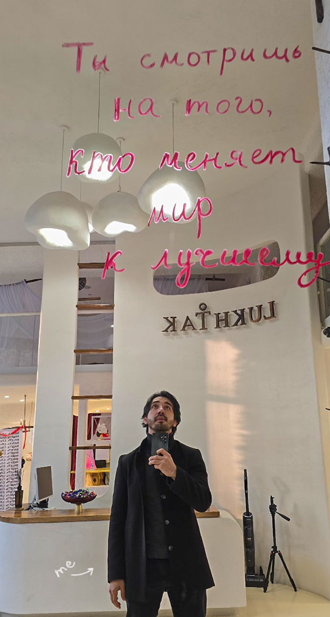
That’s me down below. Someone wrote on a mirror: “You’re looking at someone who’s changing the world for the better.” Hope we all see that person on a mirror.