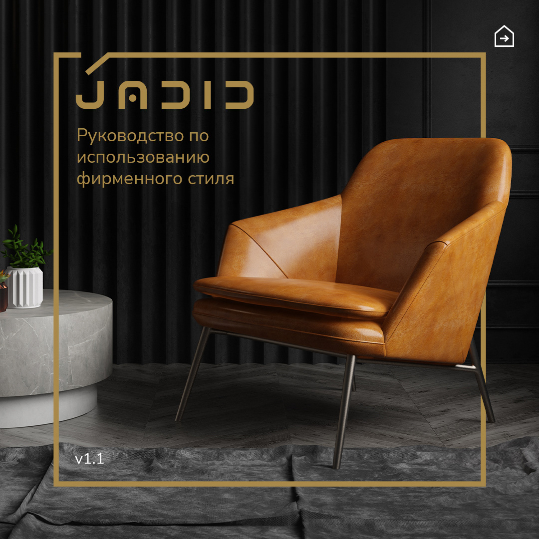
Telling a story with just a handful of letters and a couple of lines isn’t the easiest task. But that’s exactly what a logo is all about—capturing the essence of a company in its simplest form.
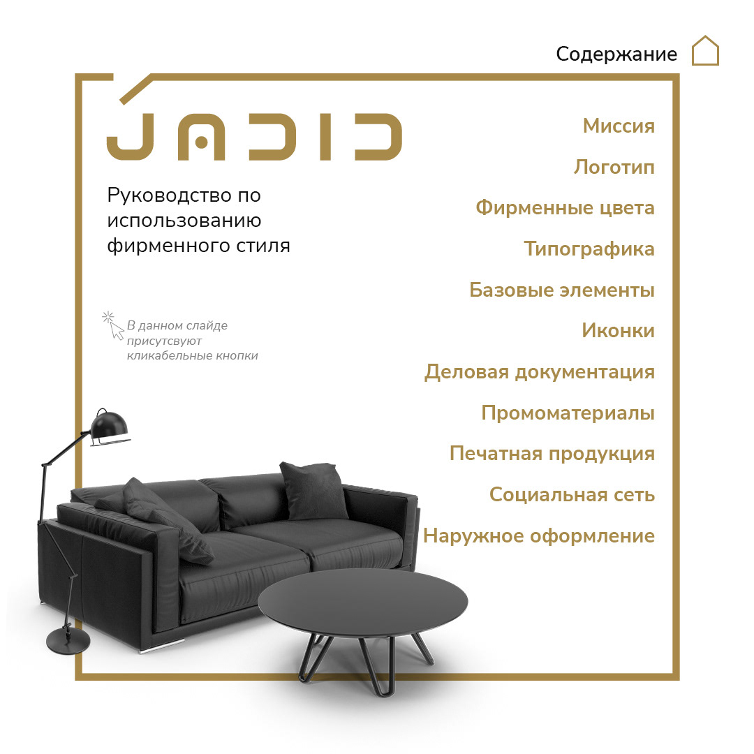
In this case, the guys are all about Interior Design, with a clear love for minimalism. Even the name Jadid—which in Tajik means new, modern, fresh—points in that direction. My challenge was to tie all of this into visual identity of a brand.
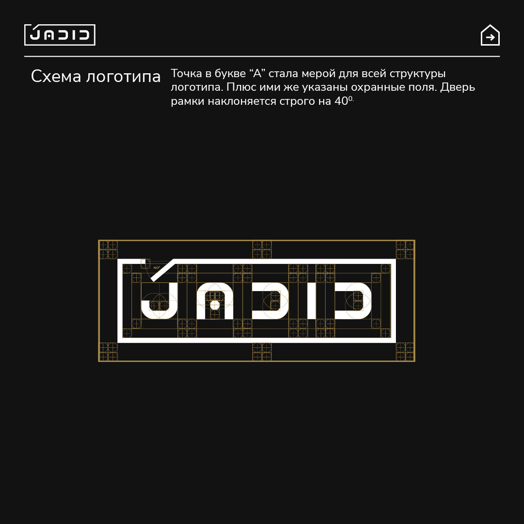
So, I started playing with fonts. I asked myself: what if the letters themselves worked like a floor plan—like a bird’s-eye view of a room? Suddenly, the shapes became cleaner, almost like tiny pieces of furniture. A chair here, a sofa there.
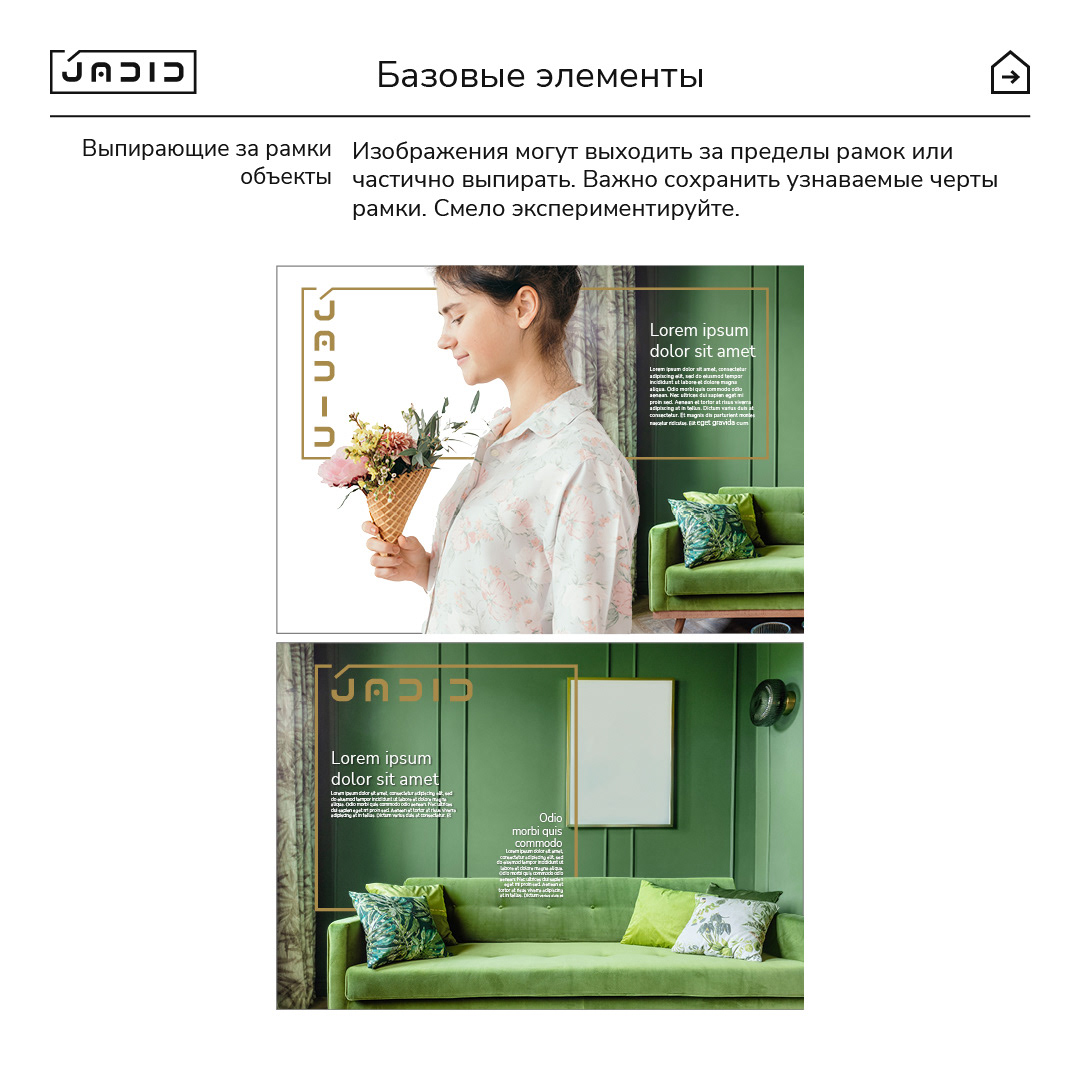
Now, I’ve never been a fan of fully closed logo frames. They tend to feel boxed-in, like the design is trapped. So I cracked the “door” open a bit—instantly the logo felt freer, more like an actual interior layout. Two wins in one move: no isolation, plus a clever nod to design itself.
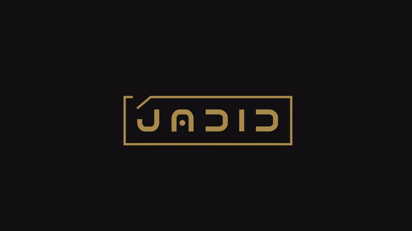
Think of it this way: interior design is about arranging space and its contents. In this logo, the frame is the space, and the letters are the contents. I even had to “furnish” the logo carefully, arranging the letters as though I were an interior designer balancing proportions, symmetry, and flow.
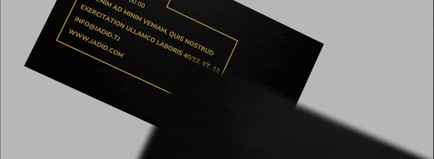
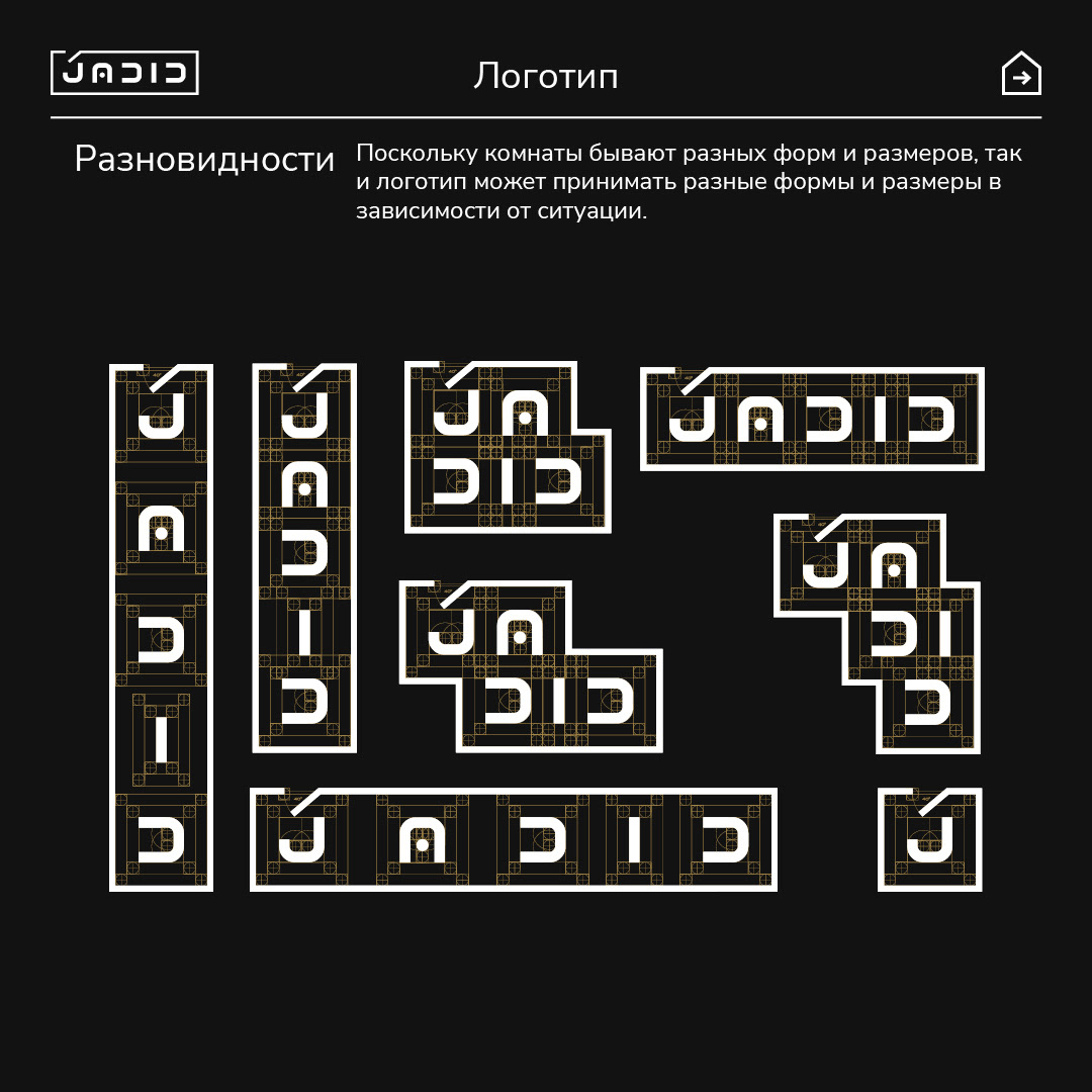
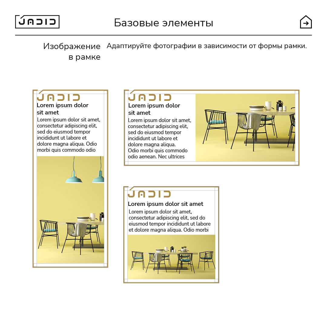
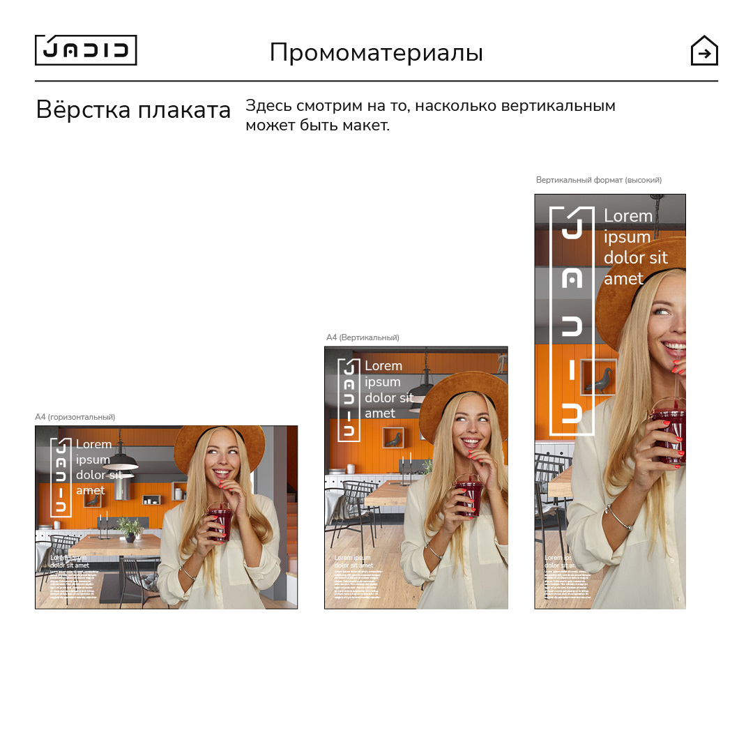
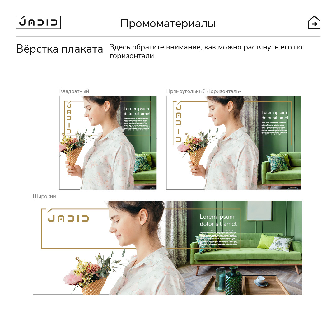
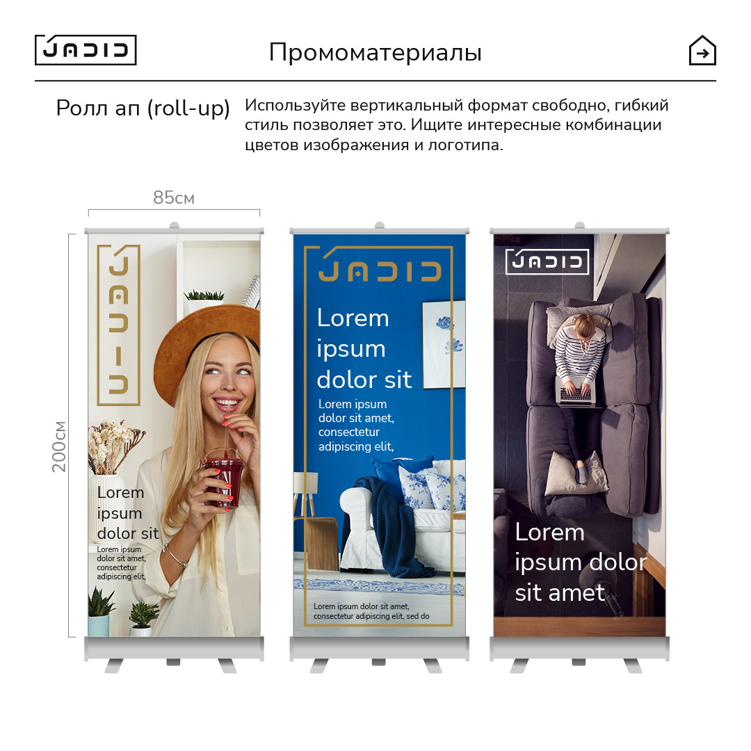
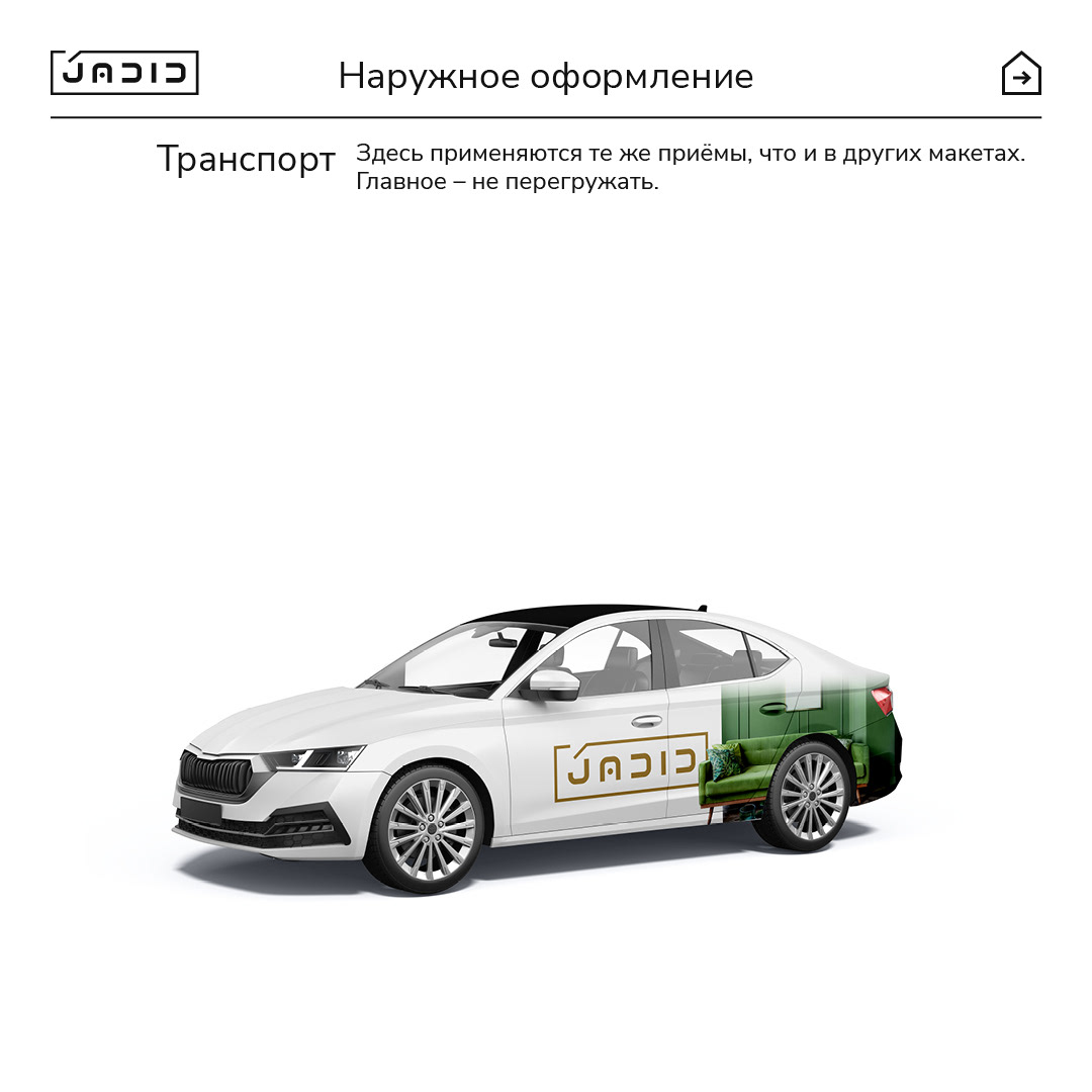
What came out was something I like to call a “transformer logo.” Just like rooms, logos shouldn’t all be one shape and size. This one can stretch, shrink, or even expand to hold more text or a full photo collage, without losing its identity. Not a gimmick—just a way to make the brand visually stand out.
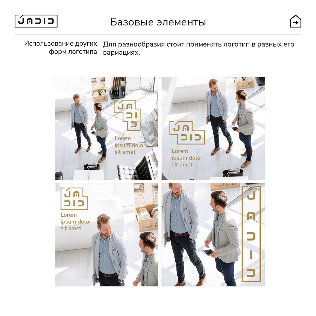

You might notice that I kept everything strict and steered clear of any random, spur-of-the-moment choices. The idea was to make sure the story behind the visual identity feels intentional—never messy or out of sync with what the company actually does. My hope is that people can pick up on that sense of order and meaning, even without digging too deep into the details.