This was my first attempt at designing a concert’s visual identity. These days, I do this kind of work more often — and on a much bigger scale — but back then, I was pretty nervous. It was a huge event, and I really wanted to create something special for the band.
The client had a clear vision of what they wanted, and I was able to build on top of that, adding my own creative touch. There was a great sense of synergy and trust between us, which made the whole process even more enjoyable.
That’s when I realized how much I love working in the music industry.
At UstoDesign Studio, I got to work on the visuals for a concert by the band called Avesto. “Avesto” is a Tajik musical group that performs in the genres of fusion, ethno-jazz-rock, and free jazz.
That project sparked an idea: why stop at designing just one concert when I could dive deeper and shape their entire visual identity?
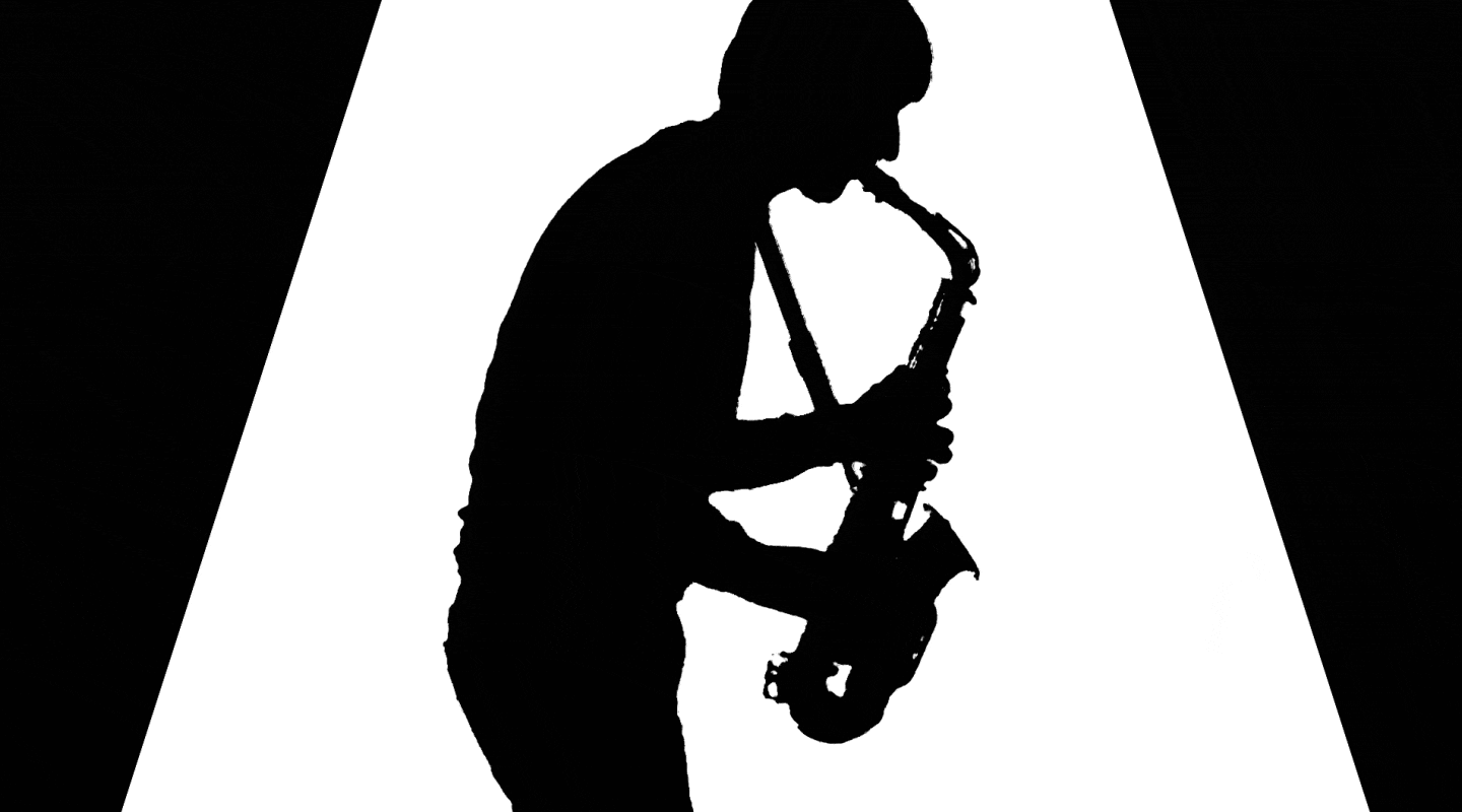
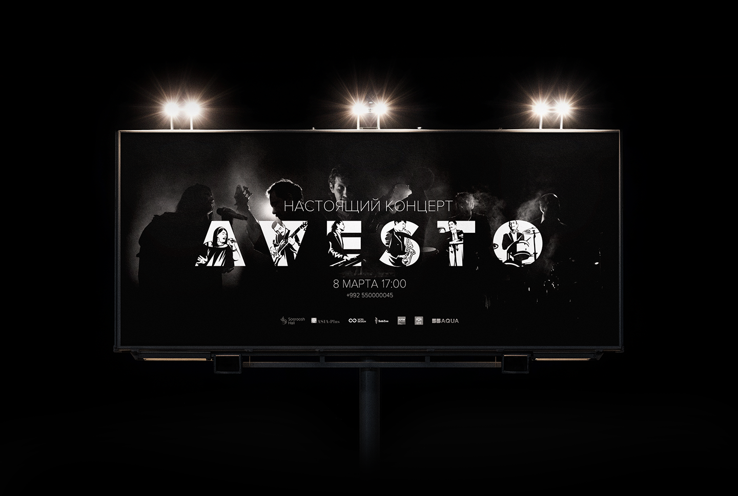
Even though the concert was meant to take place on International Women’s Day, the client wanted something less vibrant — the complete opposite of what most would expect. They wanted to stand out by going against the norm. It was a bold move, maybe even a little risky, but in the end, it paid off beautifully.
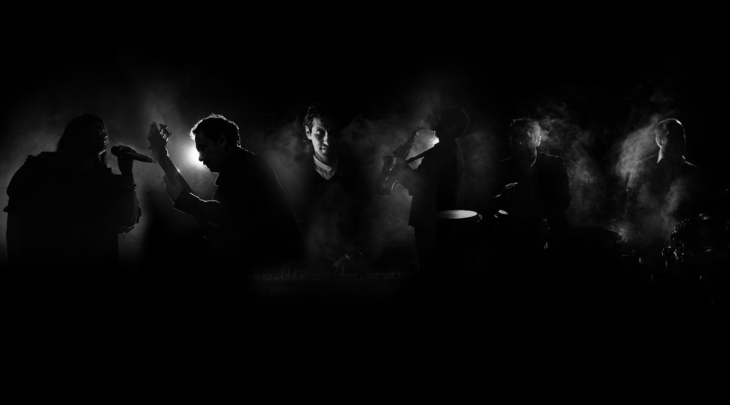
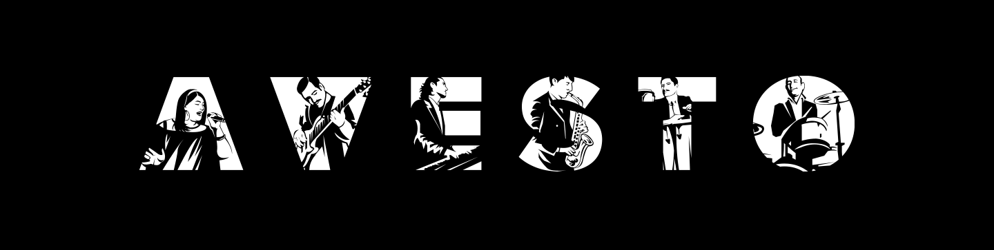
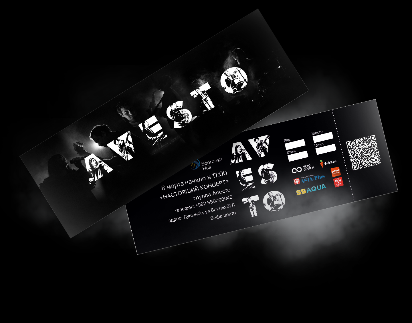
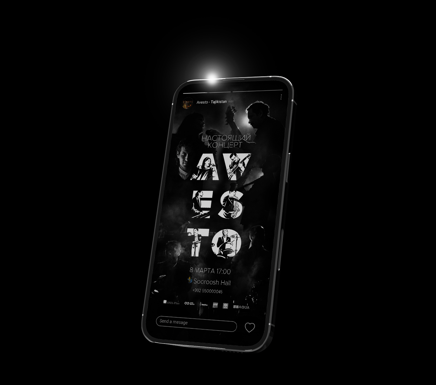
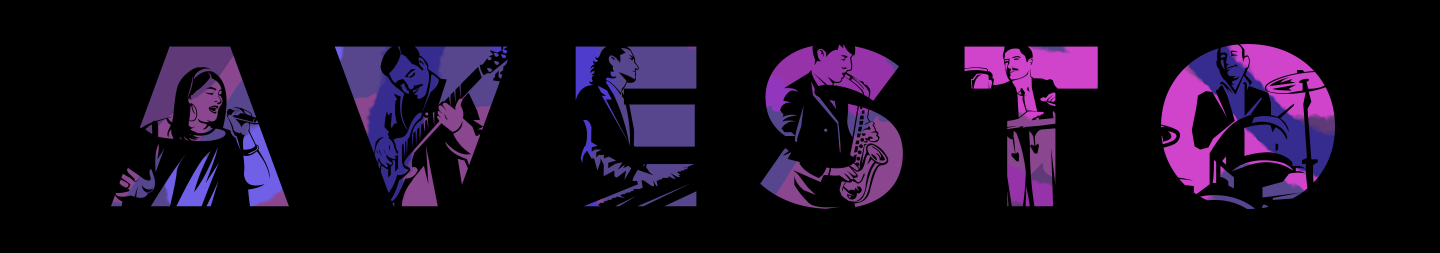
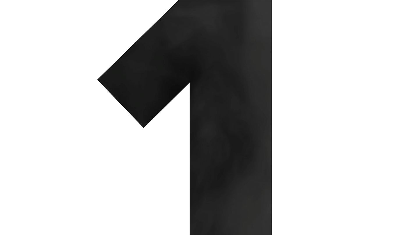
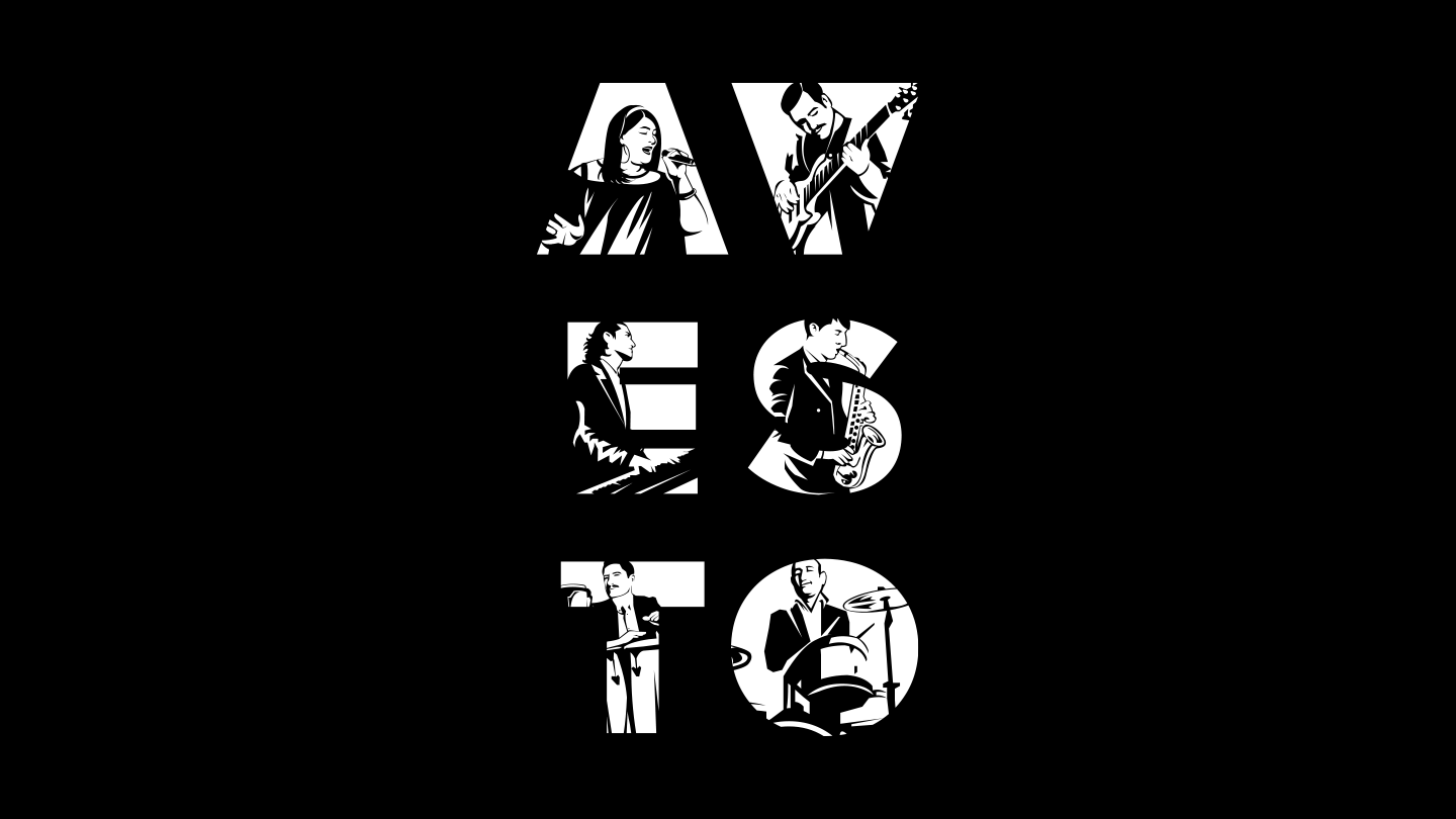
I was lucky — the band’s lineup matched the number of letters in their name AVESTO. Naturally, I couldn’t resist turning that into a design opportunity. But I didn’t stop there. I customized each letter to reflect the personality of every musician, giving the name its own rhythm — just like the band’s sound.
When the idea for the concert came up, I started sketching right away.
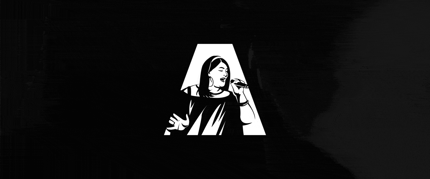
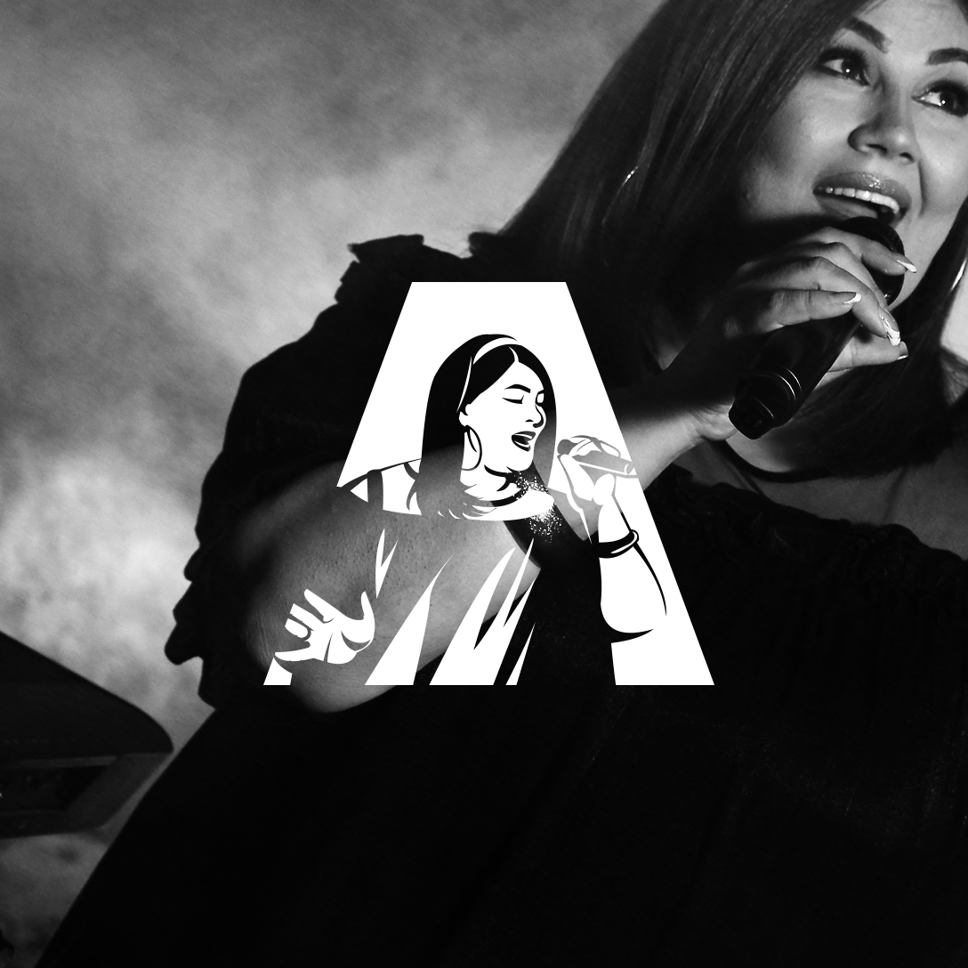
So at first, I turned the letter “A” into a spotlight. She didn’t have a musical instrument — just her voice — so I had to find another way to visually connect her to it and to the letter “A.”
Surprisingly, the very first letter turned out to be the hardest one.

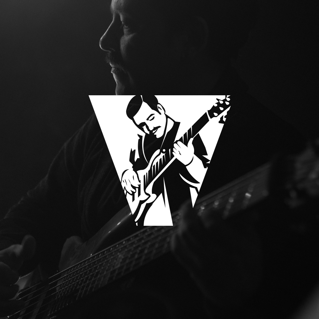
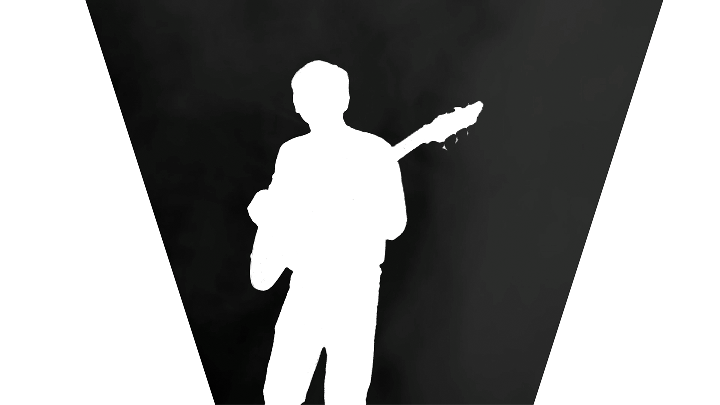
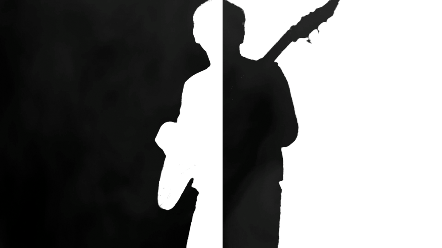
The second member plays guitar, so I turned the letter V into a guitar headstock.
An interesting detail — the lead singer and the guitarist are actually married. This gave me a nice excuse to place their letters close to each other.
But there’s even more: the letters A and V also subtly resemble the symbols for female and male — just like the ones you see on restroom doors. Maybe that last touch wasn’t strictly necessary, but it became a fun little bonus metaphor.


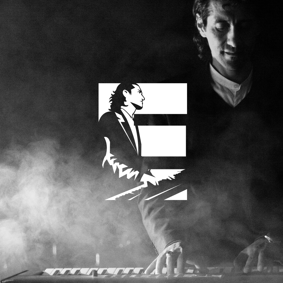
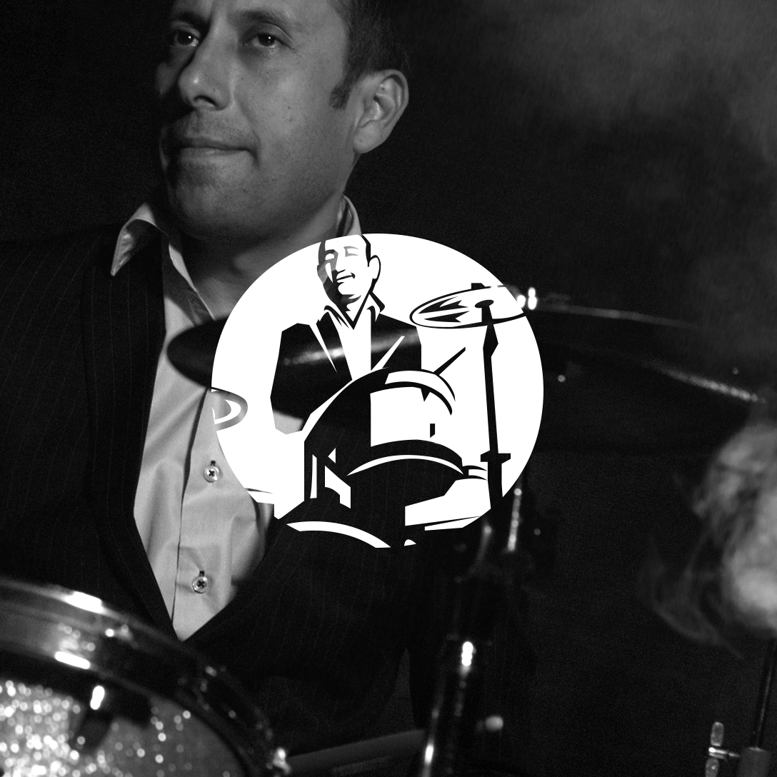
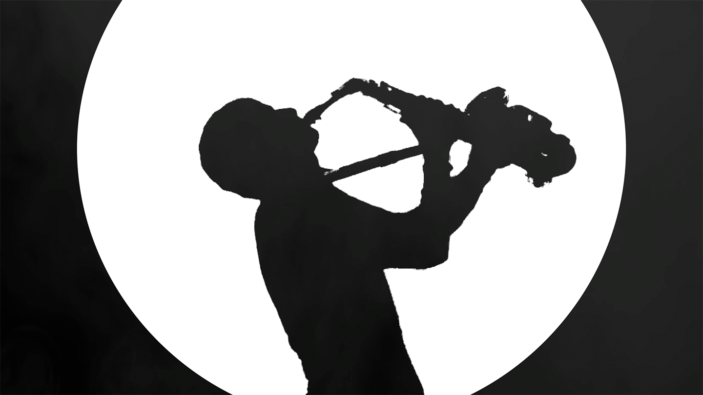
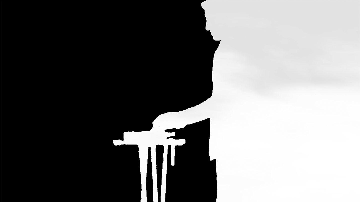
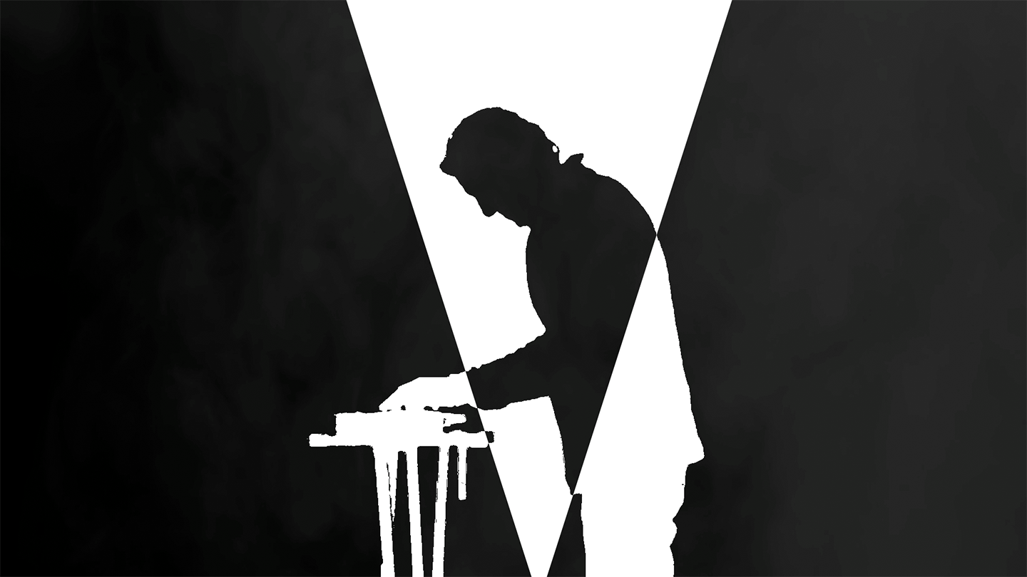
In this part, the piano player merges with the letter “E,” whose shape naturally echoes the look of piano keys.


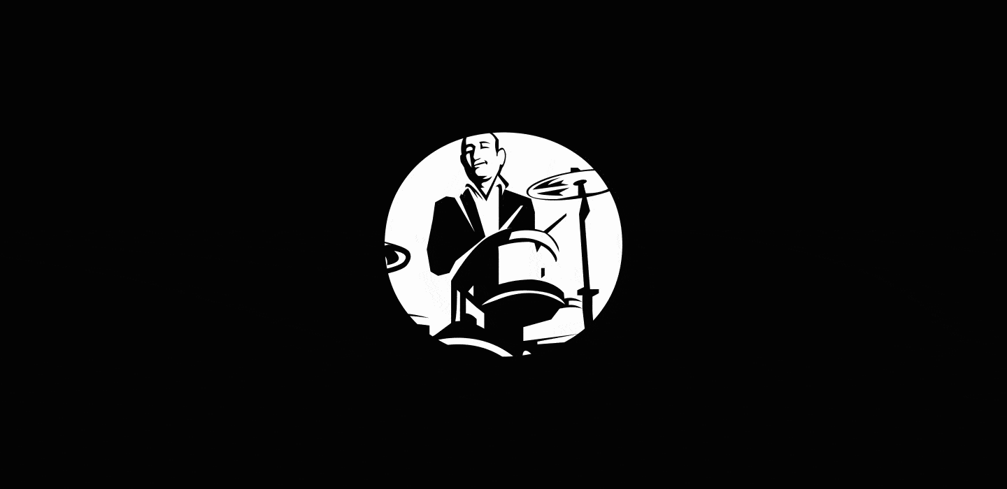
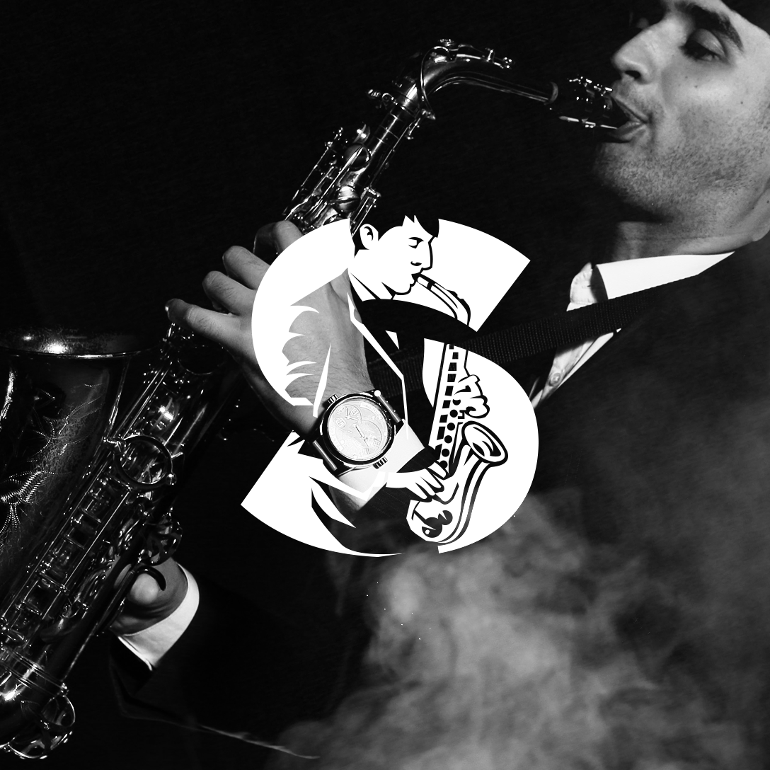
Here we can see all the musicians together, each one represented by a letter. Once again, I got lucky — the number of letters in the band’s name perfectly matches the number of members.
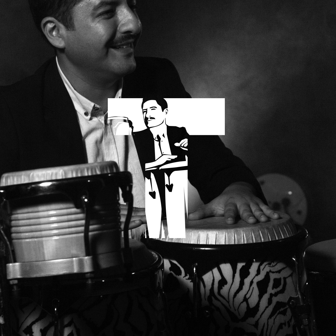
They’re all related to each other, so in a way, they’re not just a band — they’re a family. The lineup has stayed the same all these years, and that’s exactly why I wanted to cement each of them into the band’s name, making it both personal and timeless.
By the way, all photos and video footages that I used were captured
by the talented Pavel Lee.
Here’s a little demonstration of the concert’s visual identity.
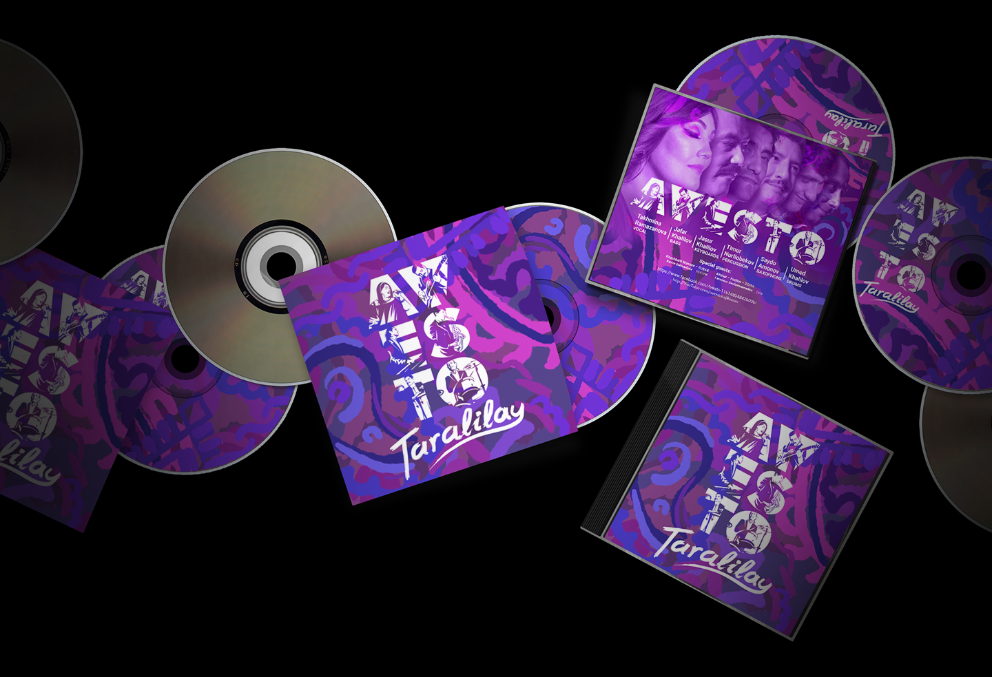
Here, in a different setting, I experimented a bit more with the design and made it more colorful. This version eventually evolved into an album cover and was also featured across other printed materials. I created it sometime after the concert, as a continuation of the original concept.
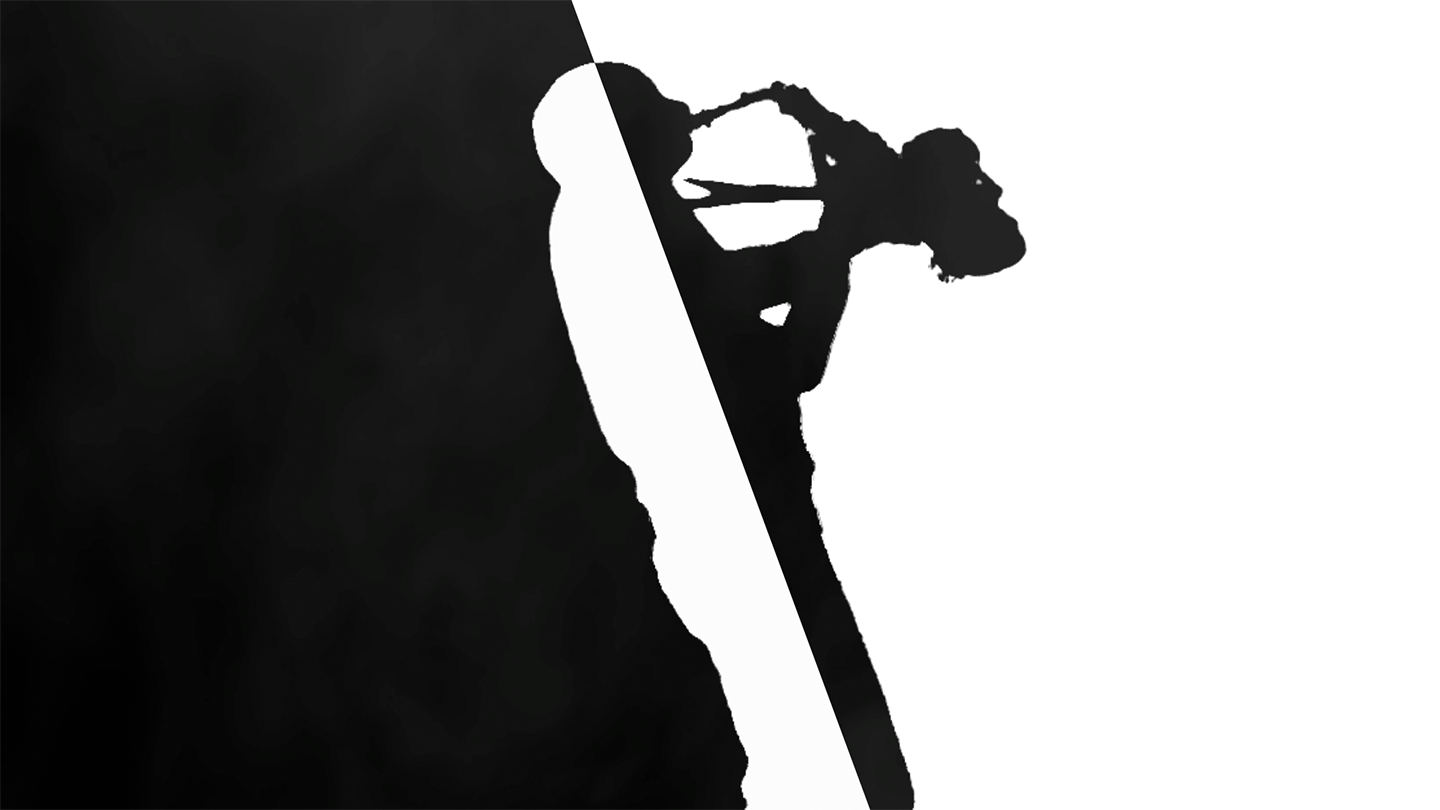
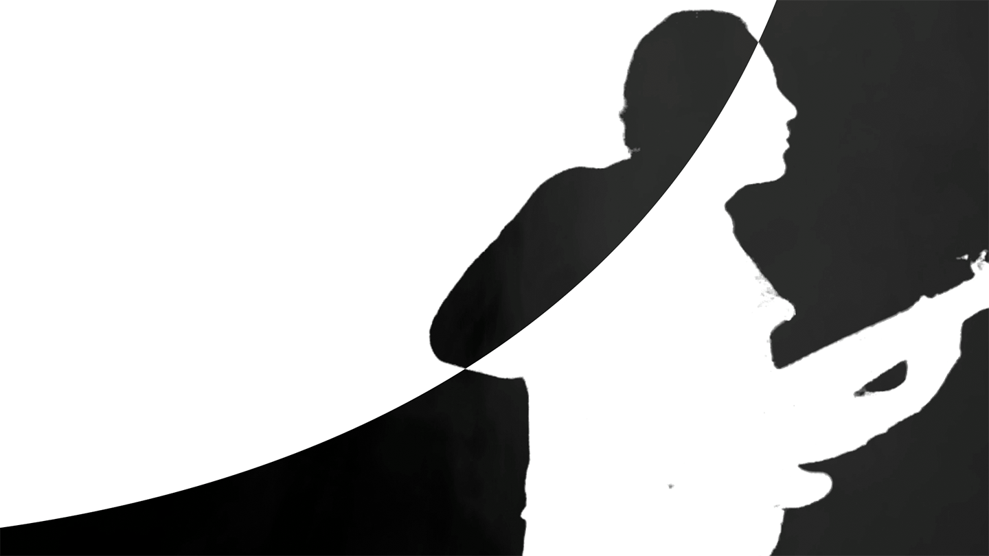
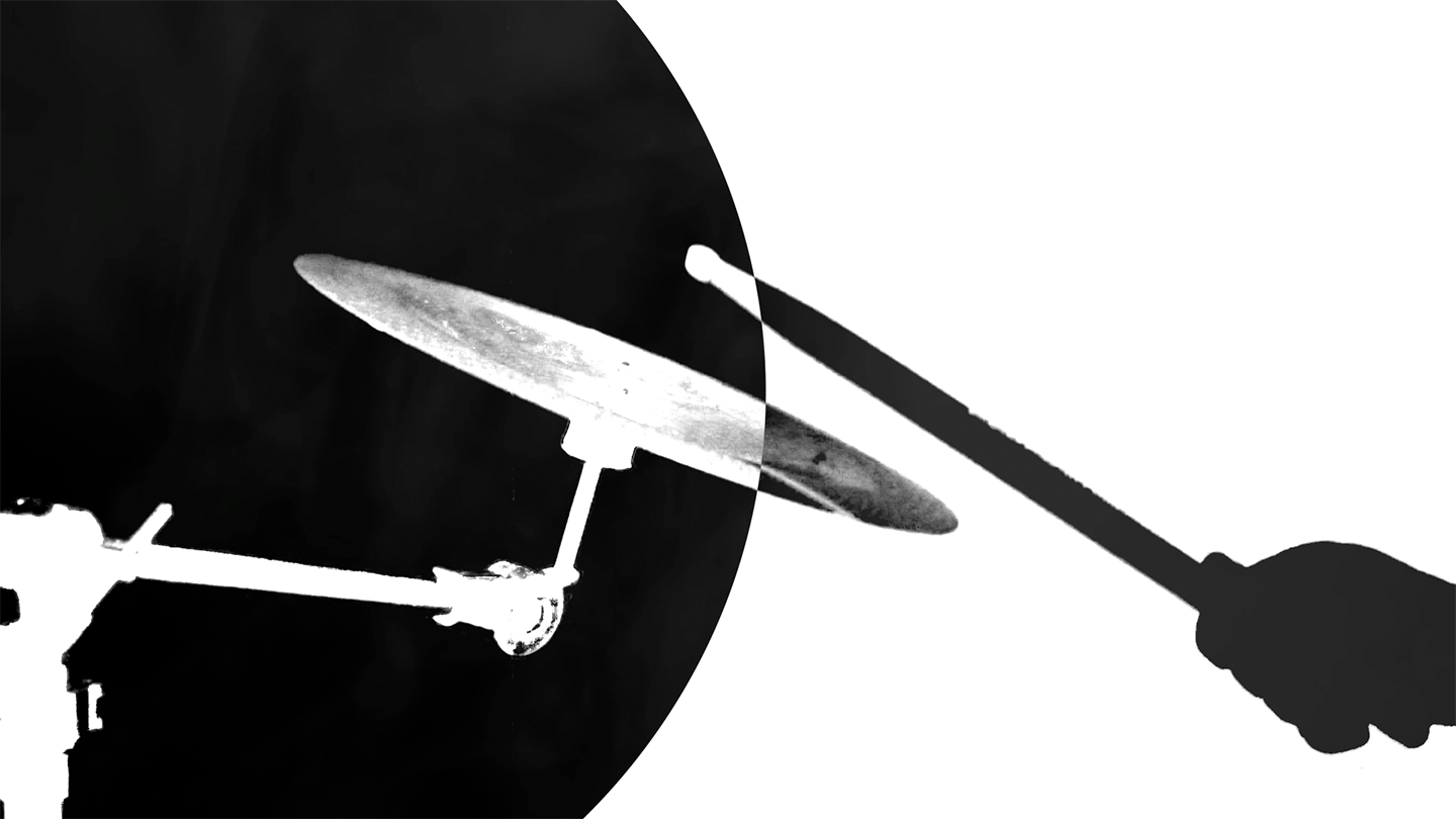
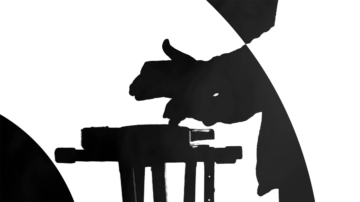
At the beginning of the concert, the musicians were supposed to perform this piece alongside the intro animation I created for the big screen. Synchronizing the visuals with the live music turned out to be quite a challenge. During rehearsals, they struggled to match the timing, and it never quite clicked.
Then came the concert day. The audience settled in, the lights dimmed, and the band began to play. To everyone’s surprise — and relief — they performed the piece perfectly in sync with the animation, for the very first time. The timing was spot on, and it made the whole intro feel more powerful and alive. You should’ve seen it — the energy in the room was incredible.
As for the animation itself, it combined green screen footage with motion graphics. The lines, circles, and other shapes intersecting with the musicians weren’t random — they were actually fragments of the letters from the word “AVESTO.”
Here’s the link to the full version of that concert video — you can also find all the other songs performed live on stage that day.
The concert itself was unforgettable: full of energy, emotion, and a touch of nostalgia. That day, I knew for sure — I wanted to design the visual side of events like this more often.
Client
AVESTO
Project manager
AVESTO
Project manager
Ekaterina Arakelova
Graphic Designer / Motion designer
Sherzod Sattori (Me)
Photography and Video
Pavel Lee
Graphic Designer / Motion designer
Sherzod Sattori (Me)
Photography and Video
Pavel Lee